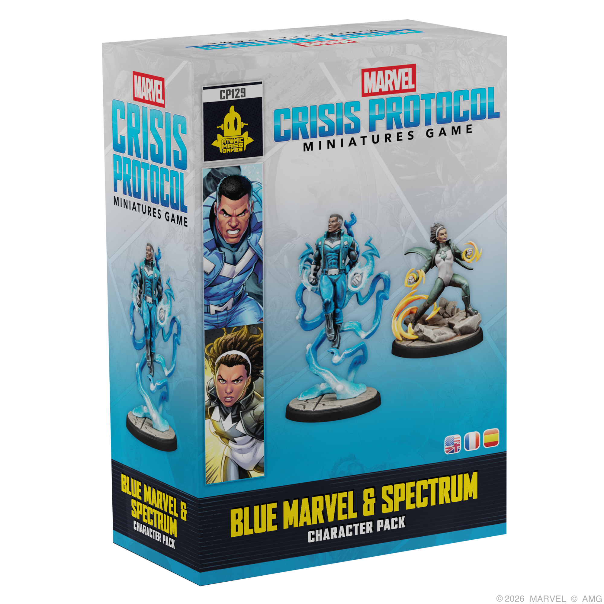
I love models with easy color schemes. Granted, the artist can choose any color scheme they want for a model but when it comes to Marvel Crisis Protocol tutorials, I do what I can to match up to the box art.
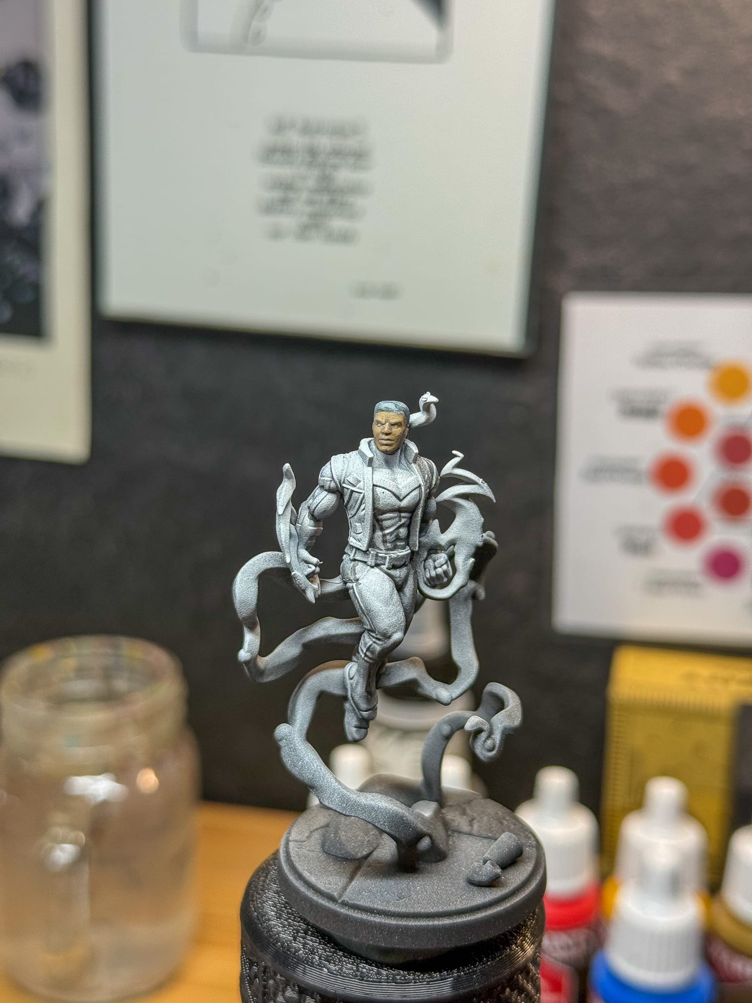
Blue Marvel and Spectrum are excellent examples of this. If you analyze the Box Art, you’ll see some familiar patterns. Both models feature dynamic poses with a multi toned costume in a single color scheme. Blue Marvel is classically blue, but those blues include deep blue, denim, and black blue. Even the gray tone for the white elements of the costume have a basis in blue, just very desaturated.
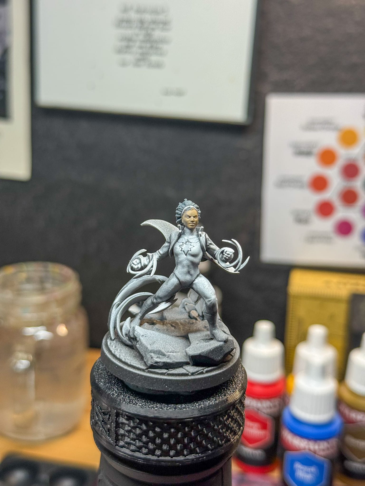
Spectrum has a wonderful gray-green outfit with a lot of desaturation. This is offset by her headband and energy circles, creating some good contrast. In this tutorial, we’ll spend time focusing on matching up to the colors of the box, but I’ll give it my own spin and explain the differences between my painting style and the artwork provided by Atomic Mass Games.
The Plan:
Both models have fairly simple paint schemes and the skin tones are also the same, which will make my process easier.
For the skin:
I’ll focus on a light chocolate color as a start, and then create highlights with yellow and shadows with a bluish/red mixture. Army Painter’s Mocca Skin, Kimera’s Cool Yellow, Phthalo Blue, and Red will do the trick.
For the hair, belts, boots:
Turnbull Turquoise from Army Painter is one of my favorite speedpaints, and it really excels in this use.
Blue Marvel’s Suit:
I want to really highlight all of the blues on this model, so there will be black blues, vivid blues, and desaturated blues throughout the model. The Darkness and Royal Blue from Army Painter combined with Phthalo Blue from Kimera will do the trick, along with some Off White Artist Dense from AK Interactive and some Titanium White for the final highlights from Golden.
Spectrum’s Suit:
Lots of greens happening here but the majority is a forest desaturated green. Blighted Green and Evergreen Fog from The Army Painter will be the big lifters here, with the Off White from AK helping to desaturate and Pine Hollow Shade from Army Painter to help with bringing in the wash. For the white, I’ll actually keep the majority of my white primer along with the Off White to help accentuate.
The Energy:
Both models have cool energy effects, but I don’t want to spend forever doing OSL on these models, I’m going to really focus on the fronts and hero sides of the energy. For Spectrum, it’ll be really easy. A few passes of Citadel Iyanden Yellow contrast paint will give me a lot of orange in the recesses, while Moonbeam Yellow will give me depth and brightness. Off White added to the mix will brighten it further, with Titanium White giving me the highest. For Blue Marvel, I’ll use Power Blue, a quick gen paint from AK Interactive to give everything an overall blue tone, then I’ll layer in Royal Blue + Off White in varying amounts, focusing on several raised areas to create the highlights.
Stylistic choices. Let’s see how they end up.
The Process
To start with, I primed both models with a zenithal highlight. If you need help with priming and setting up your miniatures, we have an excellent primer that can help you!
To start, I went for the skin as the skin is a smaller part of both models. This is also something I learned a while ago from other painters; if you start with the smaller stuff, it’s like taking on a hard task first. It’ll make everything else easier!
For both models, I used the same technique. I went in with Mocca Brown all over, then backfilled my shadows with a Red/Blue mixture via the Kimera paint, which goes on transparent. This gives me the value I want without changing the color of the model.
I then went over the hair on both models with Turnbull, which is also transparent, and leverages my prime job to really do the work for me on both highlights and shadow.
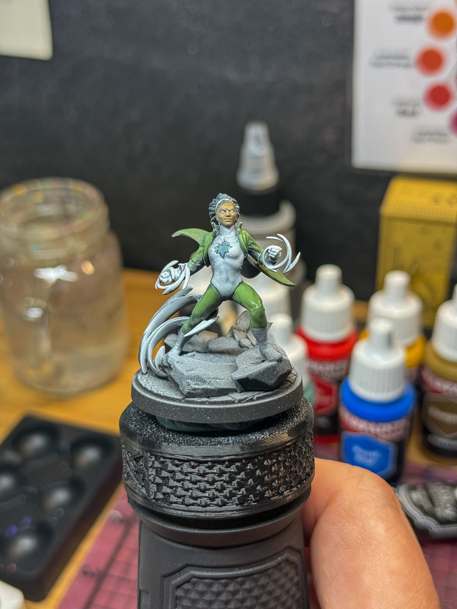
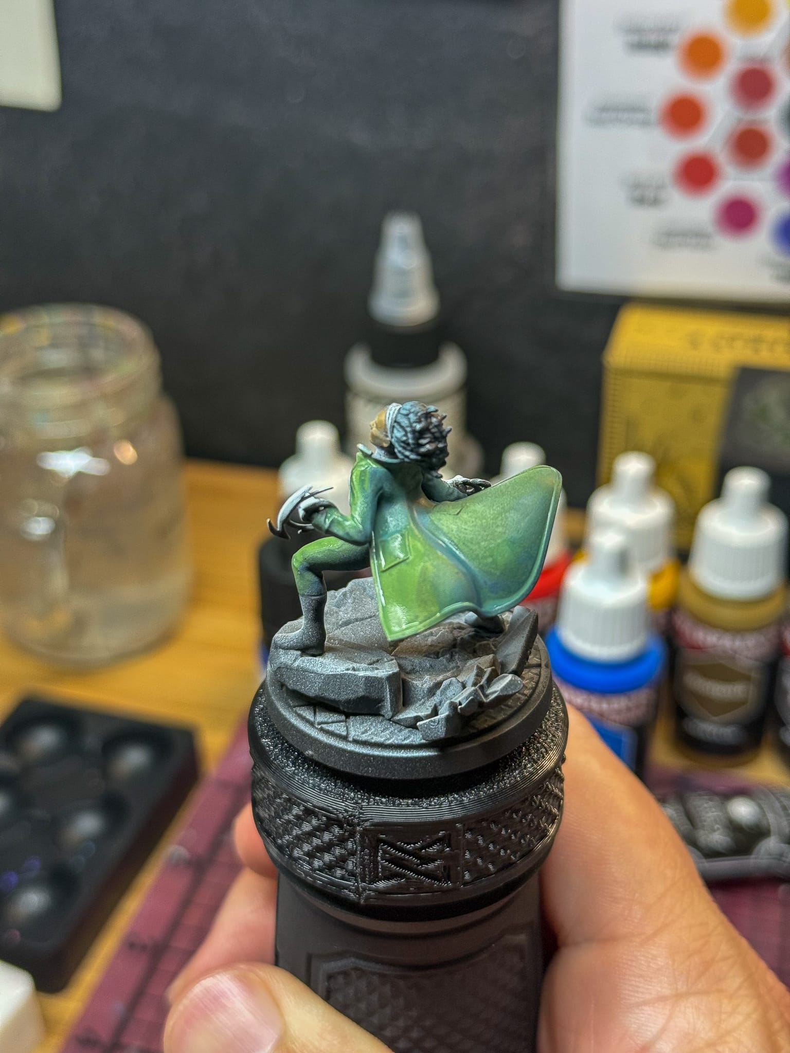
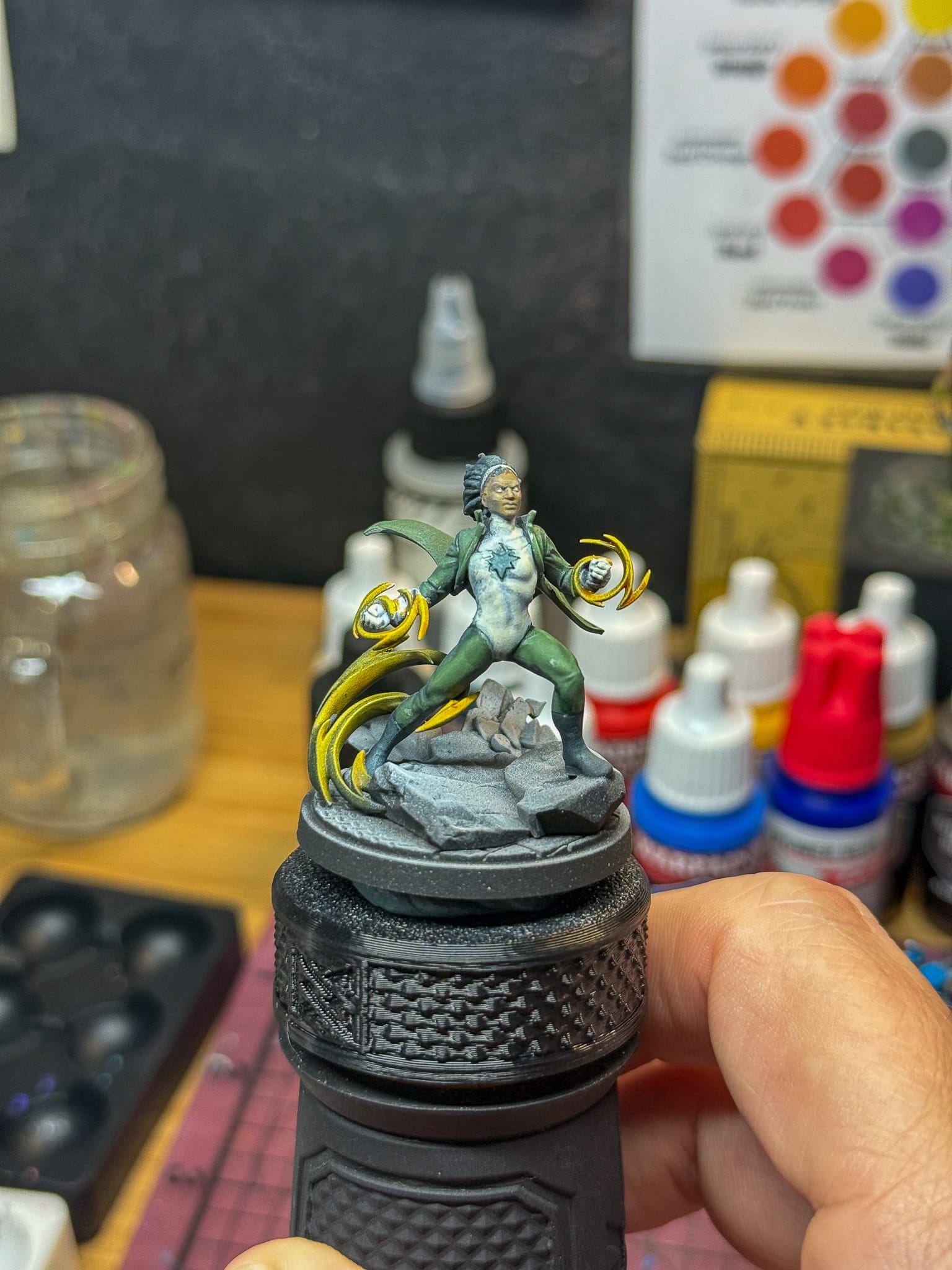
Costume time. For Spectrum, I basecoated the entire jacket and pants in Blighted Green, avoiding the light parts of the model, which meant Blighted went under the jacket, in the big fold on the back, and behind the legs, arms, and shoulders. Then, while the paint was wet, I blended in Evergreen Fog, which gave me some nice transitions. I’m aiming for speed in this stage, as I can go and refine later.
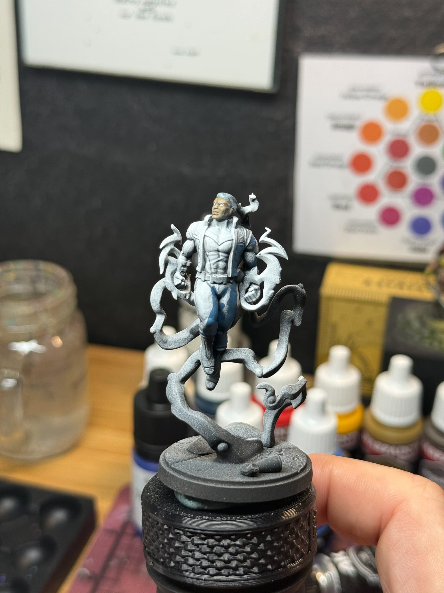
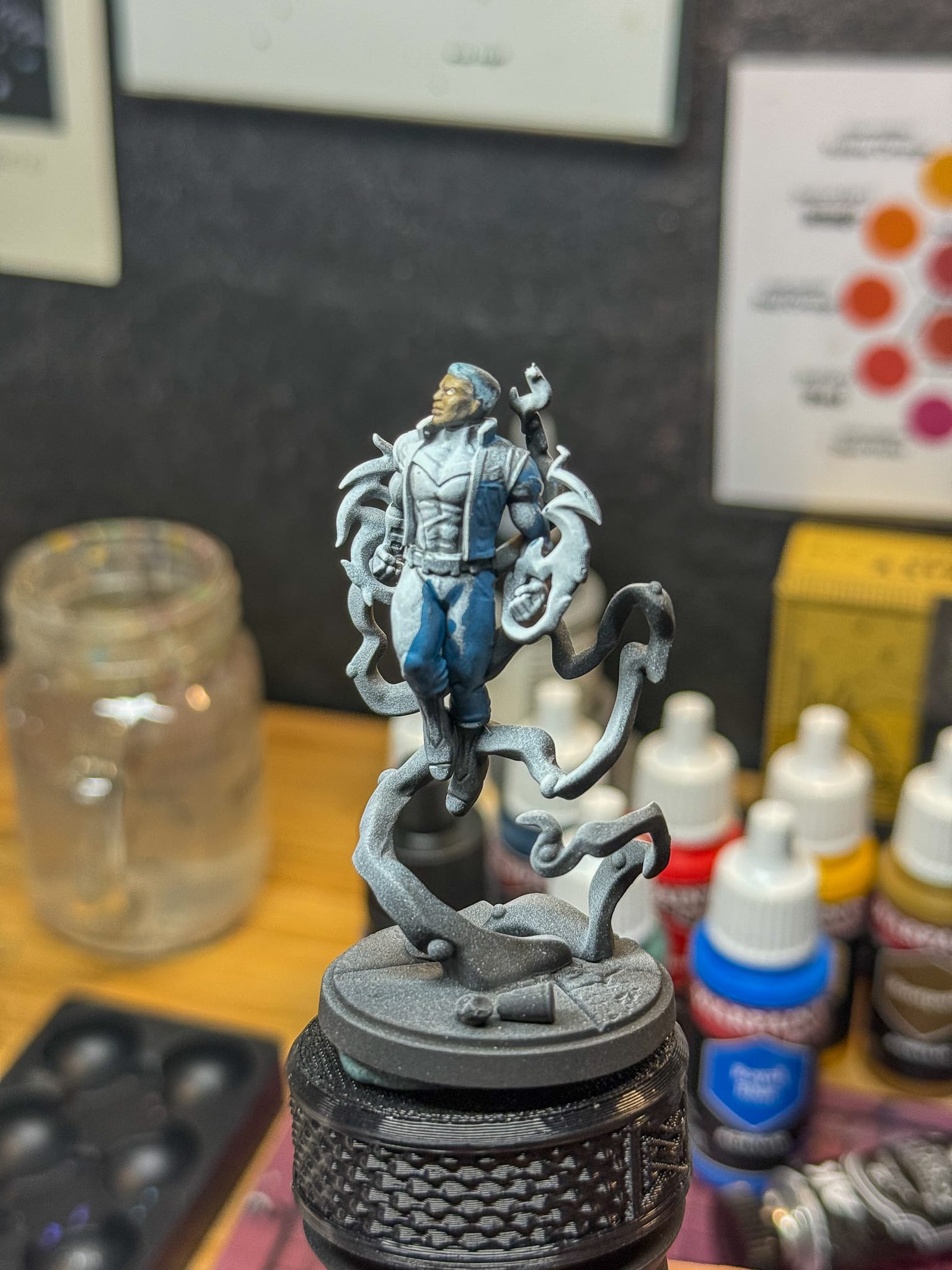
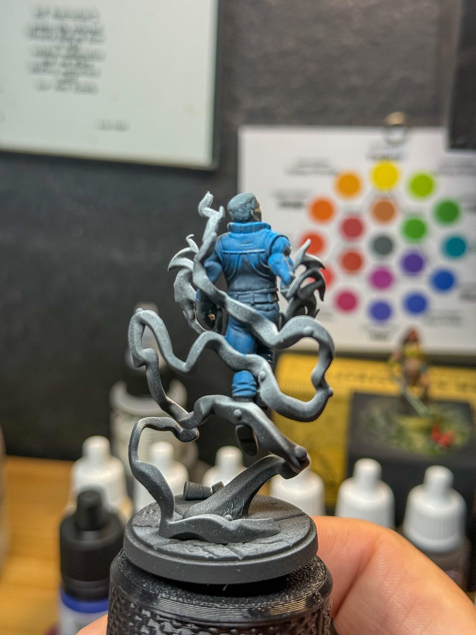
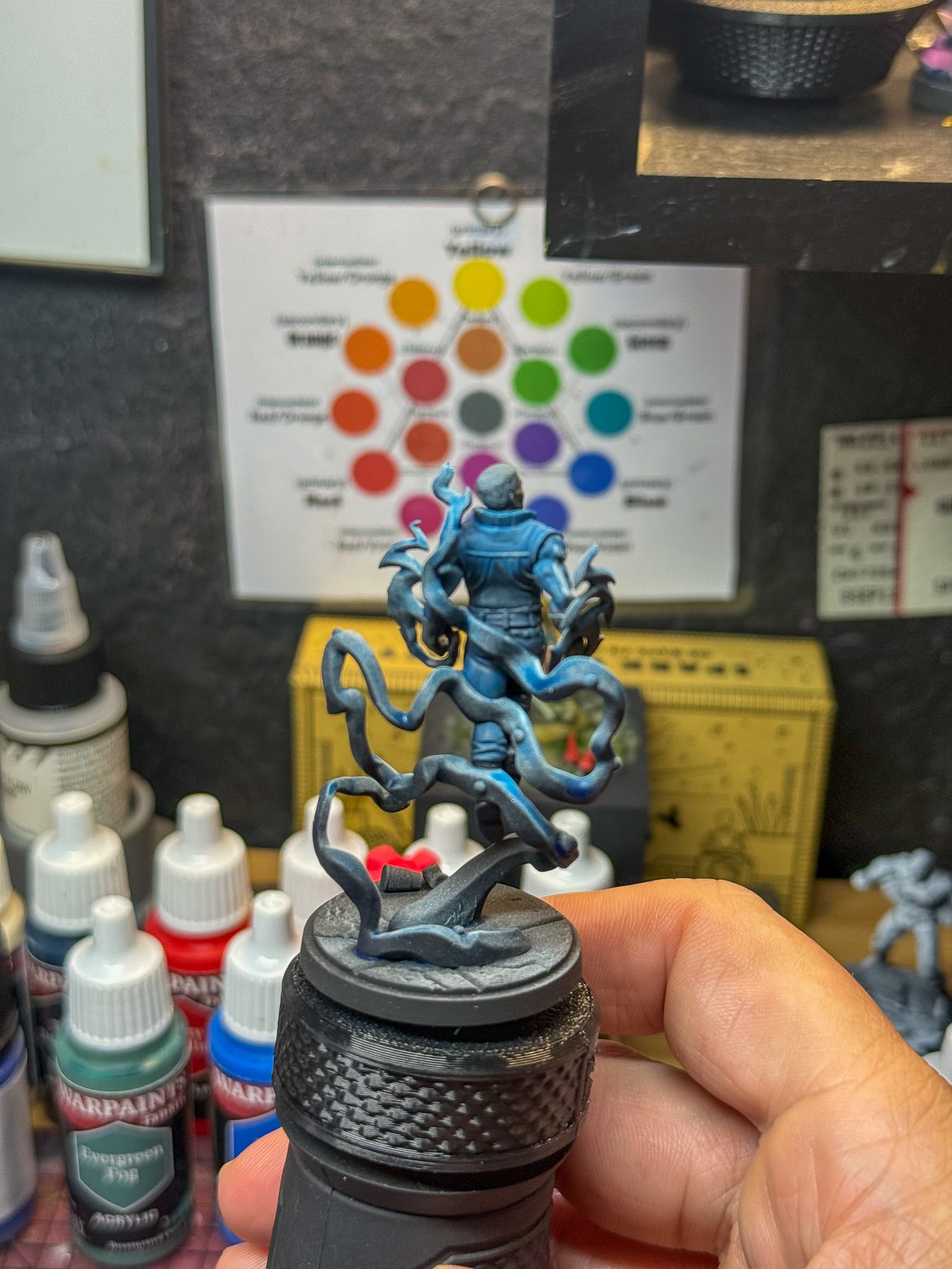
For Blue Marvel, I made a mixture of The Darkness and Royal Blue and put it in all of the shadows on the model as you can see in the picture. I then came back through with more Royal and put it on the rest of the model. I did keep some specific areas very dark. I established some early highlights just by adding white to the mixture.
After both models dried overnight, I came back the next day to fill in more details.
On both models, I used Pine Hollow Shade to help fill in shadows and create outlines, most notably on Spectrum. She has a star shape on her chest that will require some precise work, so it’s good to get all of the darker linework done before getting into Off-Whites, as it’s harder to fix.
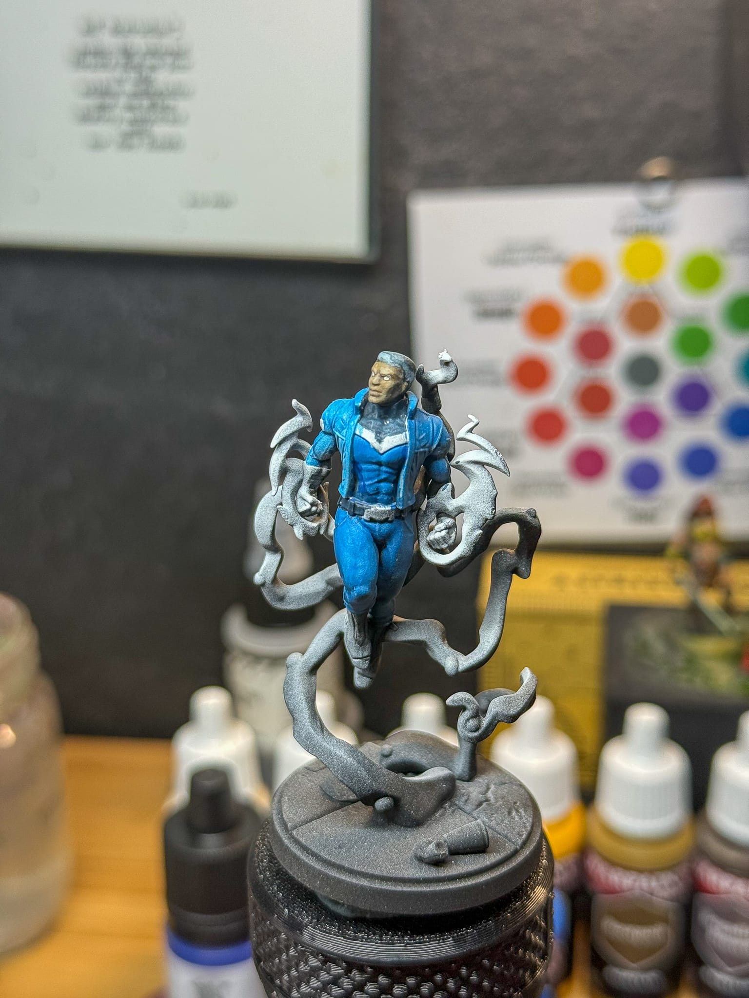
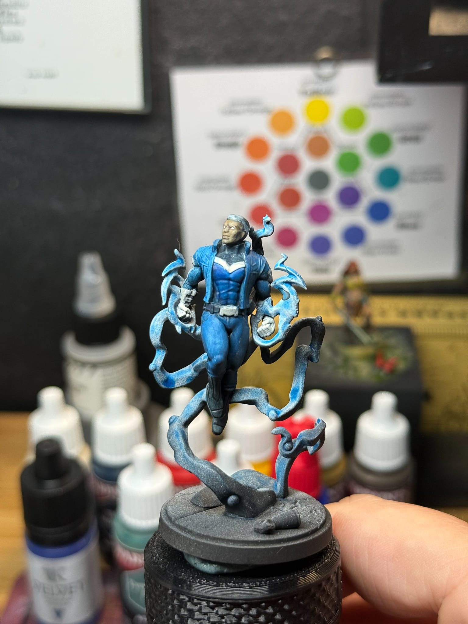
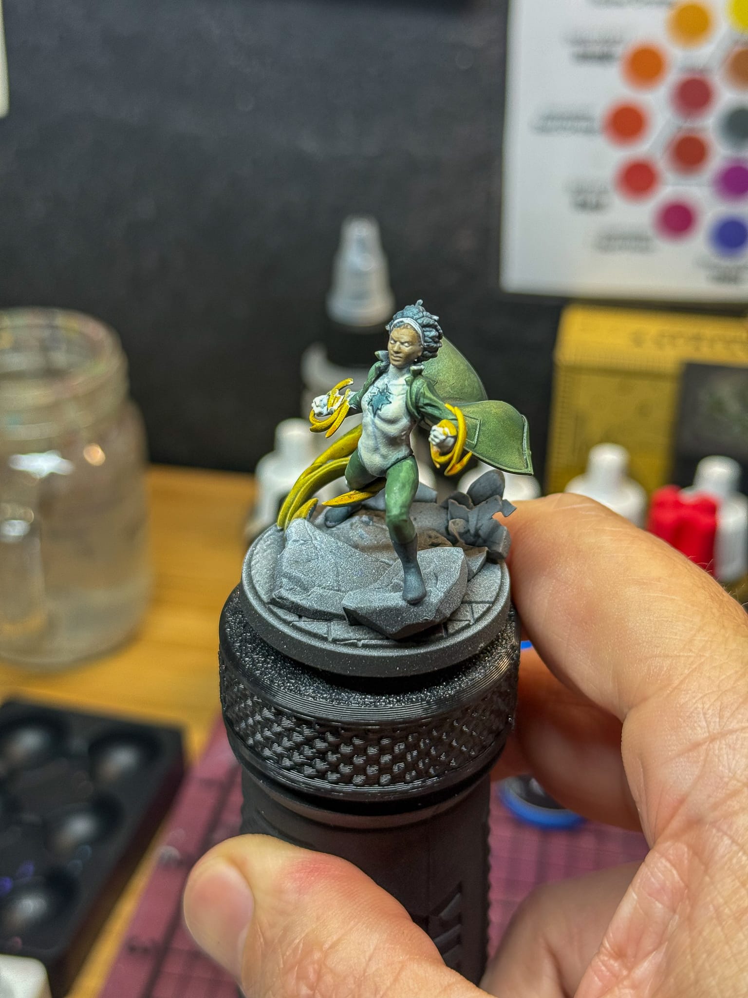
Once that was set, it was time to pick out the white elements of both costumes. Blue Marvel has several M shapes, gloves, a belt buckle, and some buckles on the jacket. Spectrum has her entire front, gloves, and a nifty headband. I used Off White from AK for a few reasons. An artist's dense acrylic has more pigment, which could help cover up any mistakes I made, and I also really like using it. Sometimes, I just choose a paint because I like the paint!
To create the shadows, another Quick Gen paint from AK, White Shadow came into play. If you read my article on creating Clones, this is a quick hack to create shadow on white. A few more layers of Off White on top, and I’ve hit my highlights.
Let’s nail down the energy and basing elements to bring these home.
As I mentioned up top, I’m making a stylistic decision to really focus on the front side of the energy. This is because I really want these to just look good on the table, I’m not looking for any awards on them. Just practice and look solid from a few feet away.
Both will get contrast style paints to establish the tone, and then on Spectrum, it took a few passes of Moonbeam Yellow mixed with Off-white to hit my mid tones and highlights.
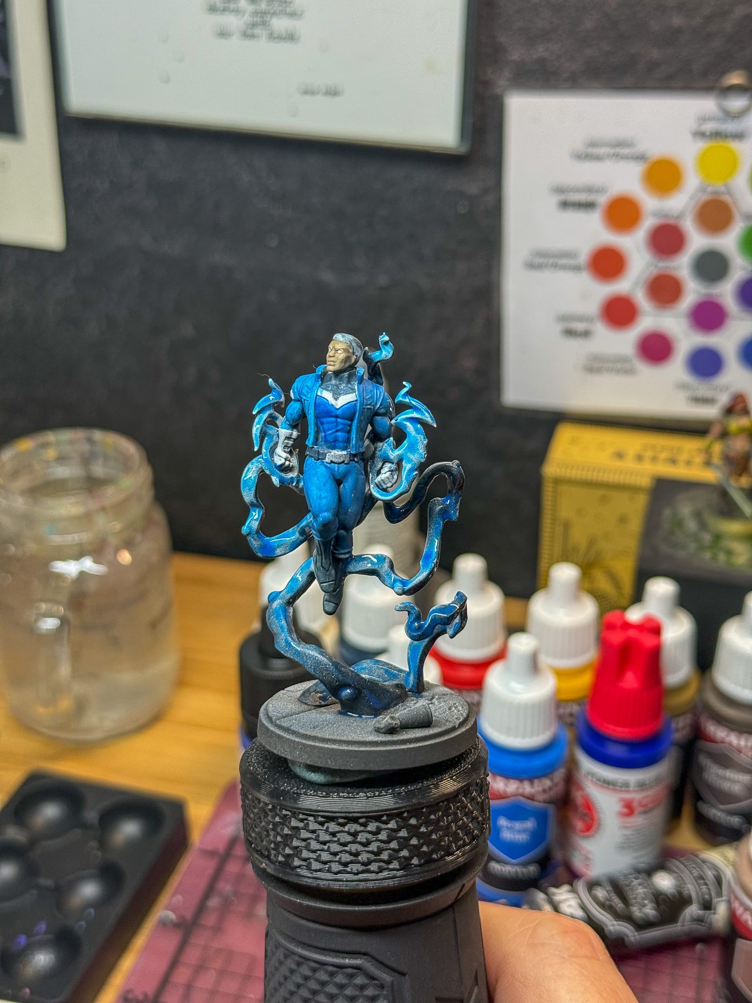
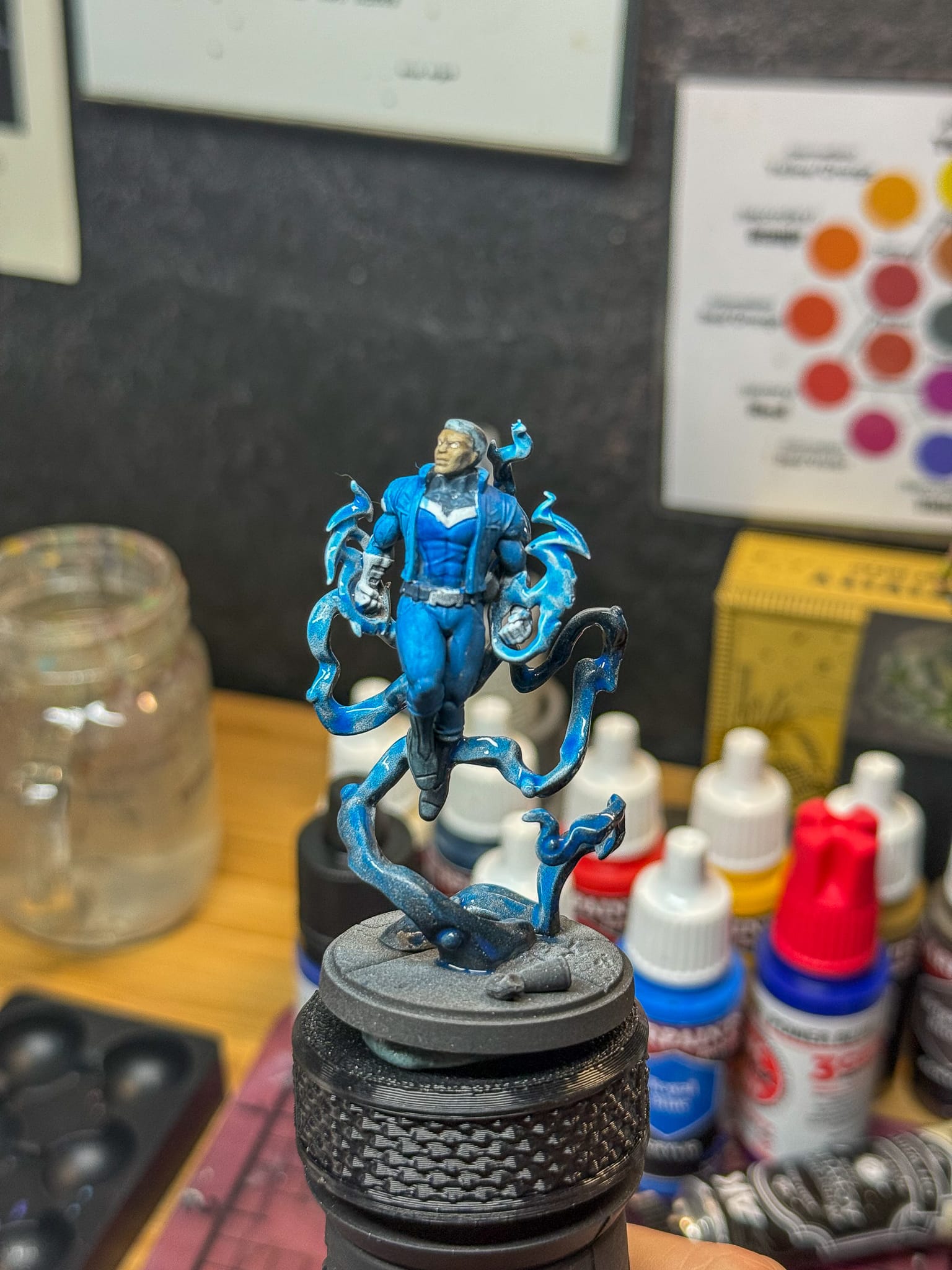
On Blue Marvel though, a lot more work. Each “energy orb” on the lines got a mixture of Royal Blue and white, eventually layering up to a stark white. The lines themselves got an almost random mixture of midtones and highlights. I honestly just chose areas I felt looked good. Same with his hands, which got the same mix, but with more white around the fists.
A fun thing to do was to do some stippling around the energy orbs. Not entirely noticeable from the table but a fun easter egg for me!
In a later article, I’ll use an airbrush on him to help create more highlights, but for now, this rules.
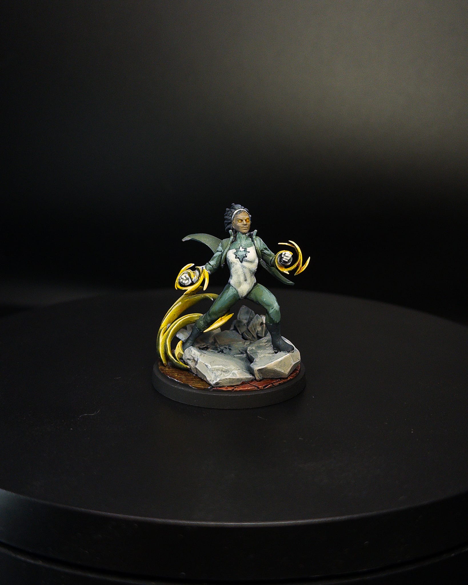
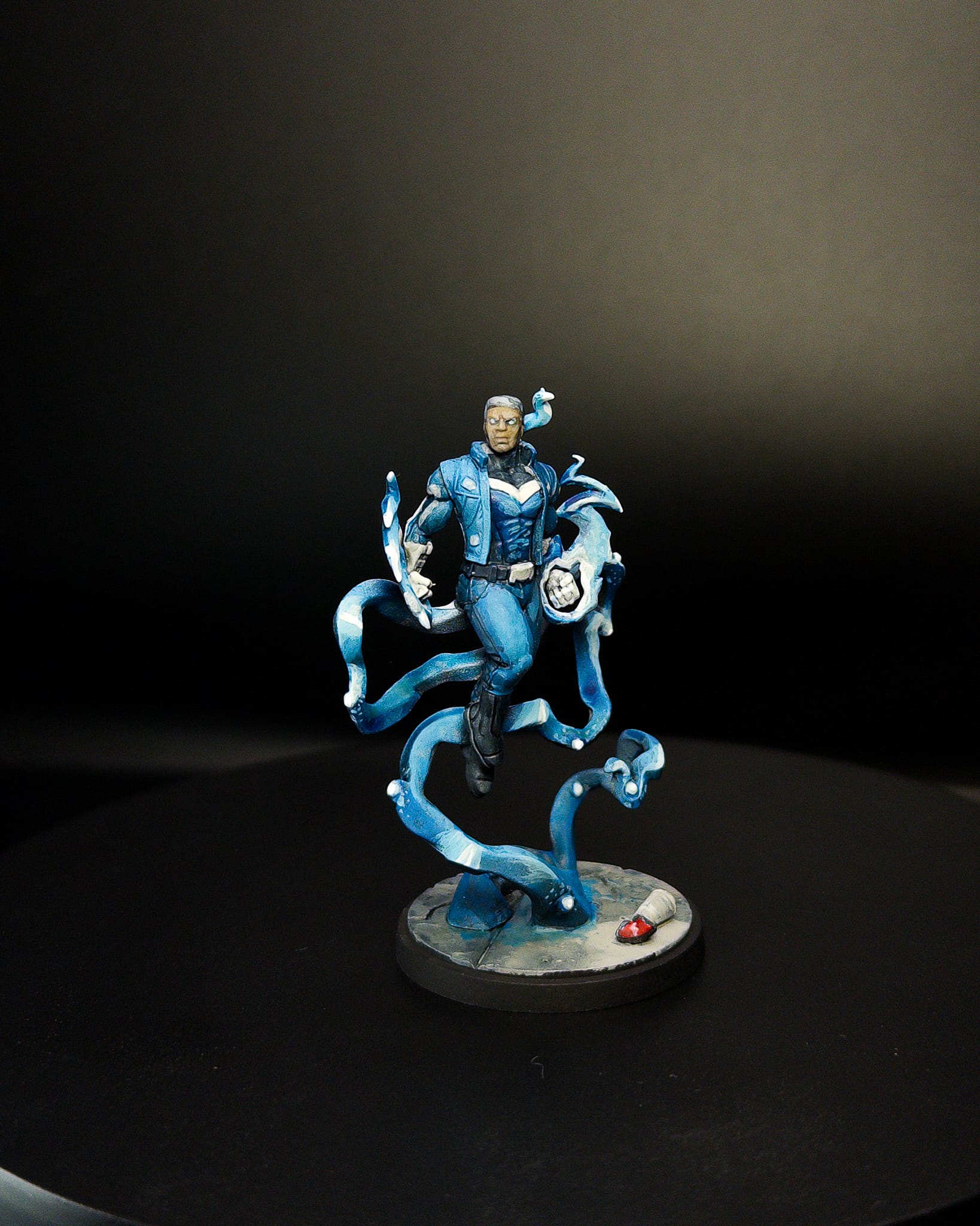
For the basing, I used Grey Castle as my base and mixed in some of the greens to help give a colder tone to the warmth of the grey in the shadows, and kept it brighter towards the front of both models. I also used some off white to help outline some parts of Spectrums broken concrete base, which is one of the more awesome sculpts I’ve seen.
For the metal on Spectrums base, I used Cobalt blue plus some Dirty Down Rust to really make it contrasty and rusty. The bricks got one pass of Kimera Red to change them from Grey to Brick, and a quick pass of Pine Hollow filled in all the cracks across both models.
And that’s it! Total time took 2 nights of focused painting, but if you wanted to go deeper, it’d take more. But these models were a fun exercise in keeping my colors mostly in the same area, and I can’t wait to see them on the table.
Thanks for reading, and see you on the next one!