Youthfulness in Painting
The very first set of paint I ever purchased was a Reaper paint set. I was new to painting, and to be fair, I didn't do a whole lot of research, despite having a background in art and design. I had that "new hobby" honeymoon vibe, and I just wanted to get started. So I purchased a plastic hard shell case of Reaper (not even a primary set, but a set with a ton of skintones) and got to work on some older Reaper and Wizkid models.
After that, I slowly grew my collection of paints. I tended to purchase based on the model I was painting. For example, I had backed the Hellboy Kickstarter from Mantic years ago, and followed a tutorial where they used Citadel paints, so of course I bought the corresponding paints.
Then, the YouTube influence. Watching popular painters online, I learned about Monument Hobbies, Scale 75, AK Interactive. In my head, I started to build this sense of perceived value, derived from what I was seeing on my screen. But I kept having issues. Scale 75 paints were gel-like, causing me to paint a ton of layers. Monument Hobbies paints hated my wet palette, breaking up consistently. AK Interactive, while nice, felt like a special luxury that I would only use on my most important pieces.
Now, don't get me wrong. I was having fun painting, but I was still painting with this childlike sense of wonder. There was no focus, just grabbing whatever paint I saw on a screen and going for it. Monument Titanium White was presented to me as "the best" so of course I had to have it. AK's Ice Yellow, Citadel Evil Sunz Scarlet, Nuln Oil.
I finally broke out of this a few years ago when I reviewed The Army Painter's Fanatic Line. It finally gave me a chance to sit and absorb what a full line of paint does. Because of their labeling system, I was able to understand the colors that went into the medium, which ultimately gave you the specific teal, orange, pink, and gray that you're looking for.
I thought I was done. I thought that I had discovered that I didn't need any other paint, that this was perfect. I filled 2 drawers with Fanatics and said I was good.
Shoshin and the color wheel
Shoshin, or the Zen Buddhist concept of the "beginner's mindset" is about having an attitude of openness, eagerness, and lack of preconceptions, even at advanced levels. I had fallen into the trap where I thought I knew paints. That triad systems were all I needed to advance, that I had found the cheat. But when I compared my display pieces to others, mine were all kind of flat. Well-painted, but there was a level of saturation, which is the vibrancy of color, that was missing from my pieces. They were muted.
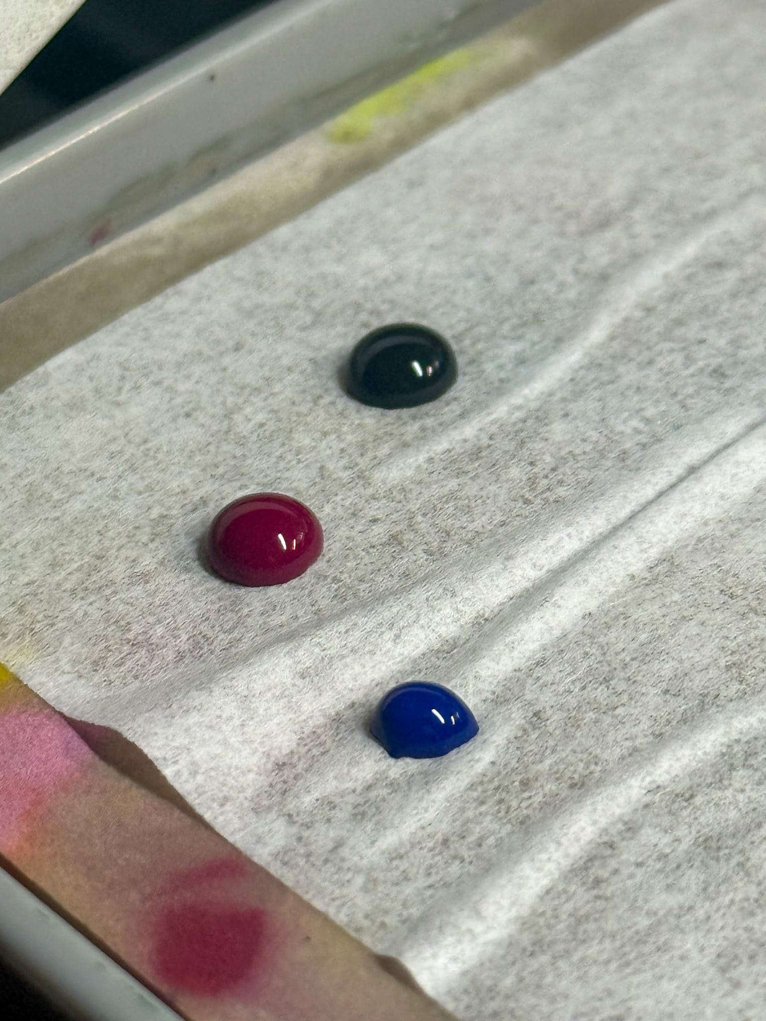
The majority of Kimera Velvet Inks are single-pigment, high-saturation "inks". I use quotations because in my experience, these function more like a high saturation paint but have some fun qualities that inks possess. Because they are so highly pigmented, you can add them to other paints to help give those paints a boost in vibrancy. For example, I used some heavy-body AK Interactive acrylics, and to help change up the colors, I added in some Kimera. My off-white became a perfect off-green, or off-blue. An ice yellow was easily achieved by adding small brush-fulls of Cold Yellow until I had hit the level of saturation I was hoping for.
Additionally, these paints are excellent when thinned down for glazing, washing, or tinting. In my tests, I never saw the paint breaking. This includes water, High Flow Medium from Golden, and Wash/Glaze medium from Monument.
Because the majority of them are single pigment, you can dial in the color that you actually want, which brings us to an old friend, the color wheel.
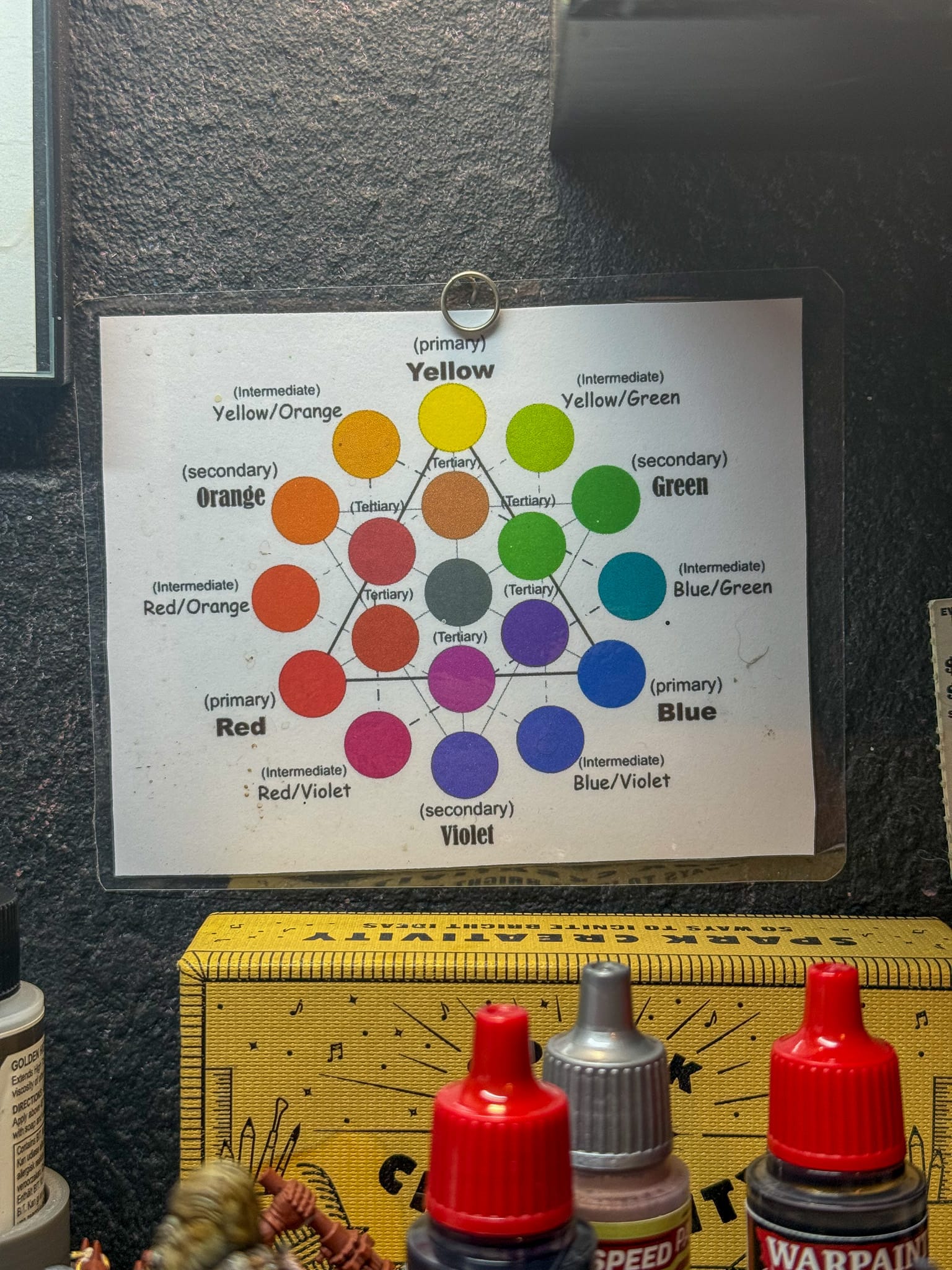
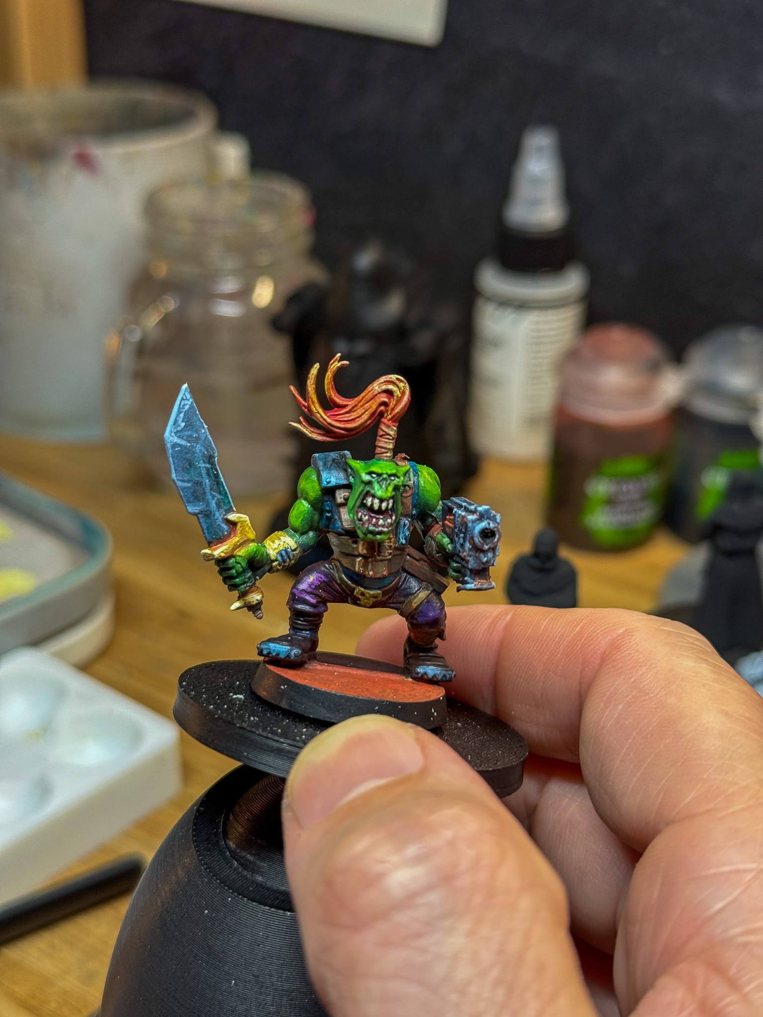
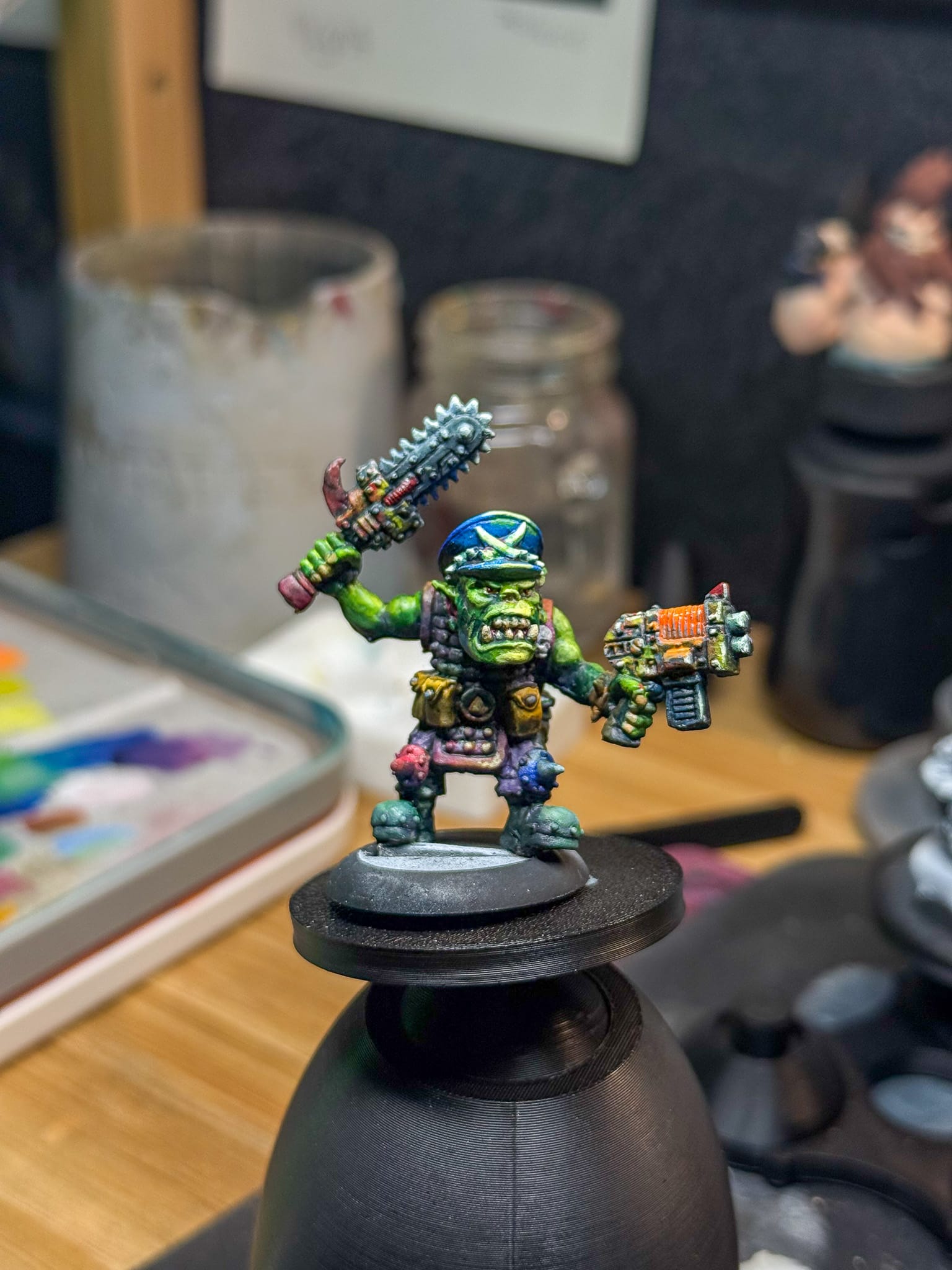
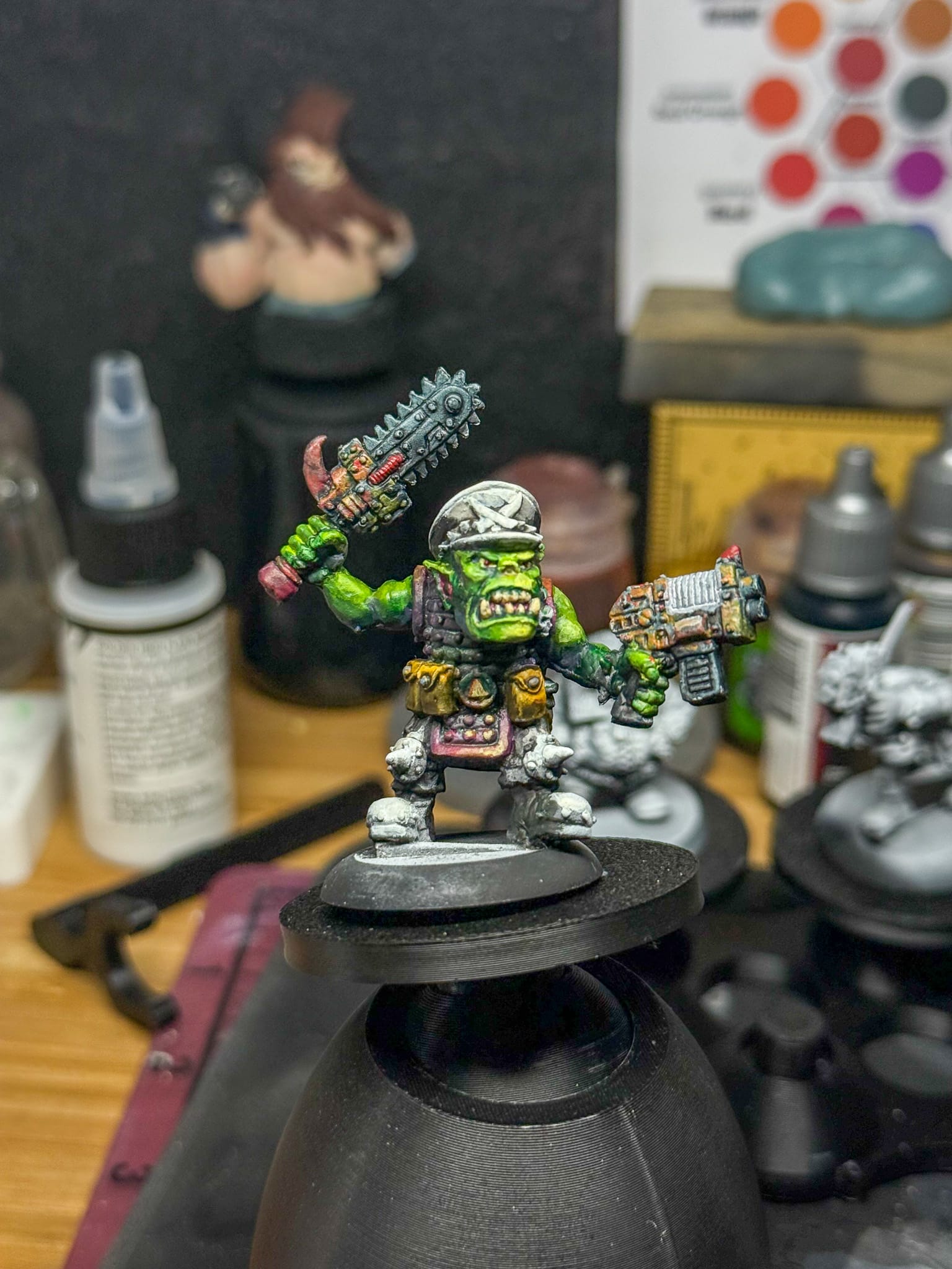
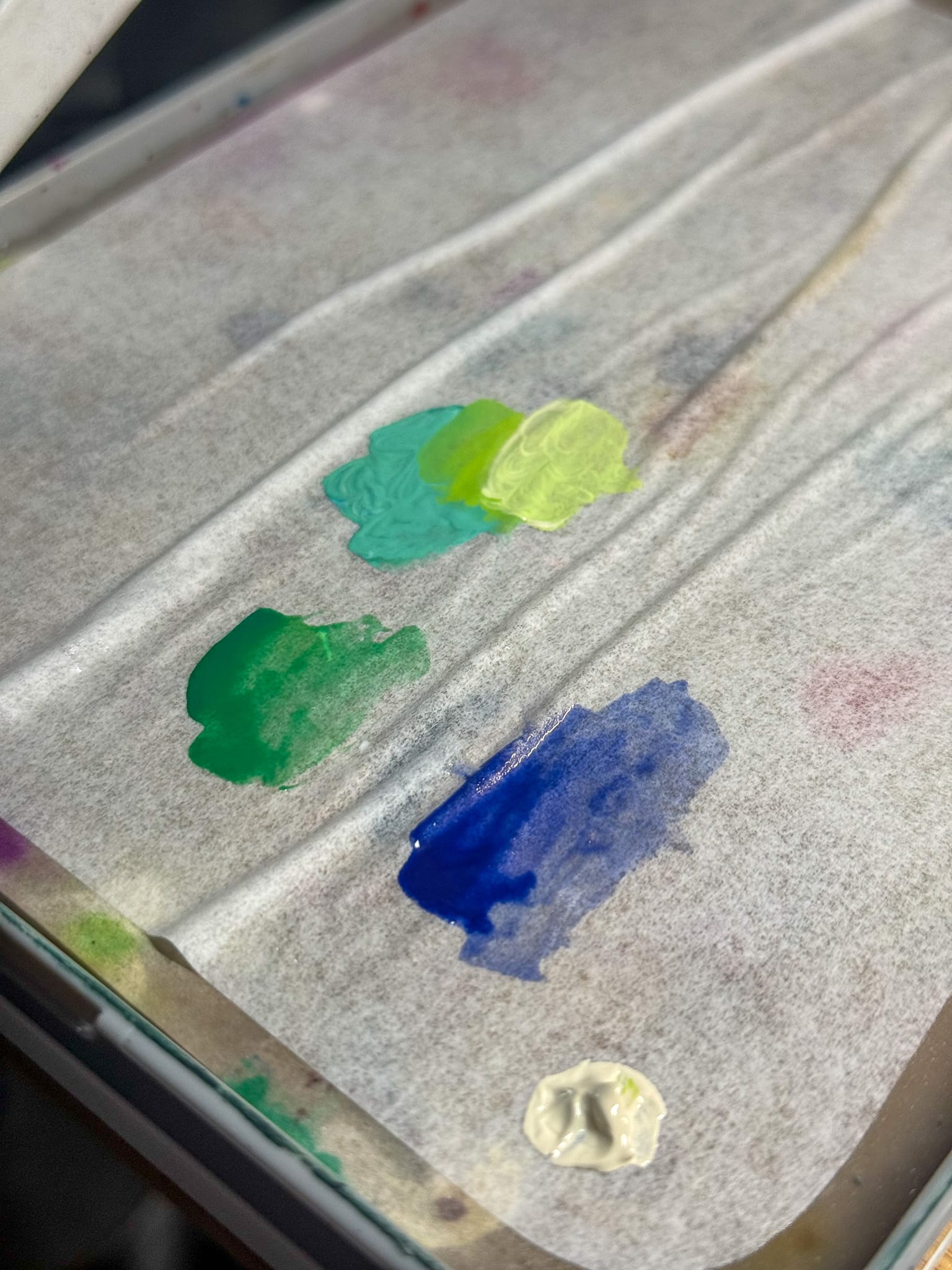
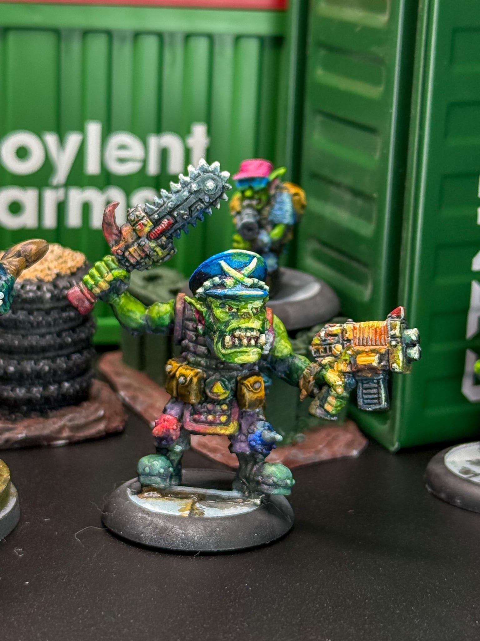
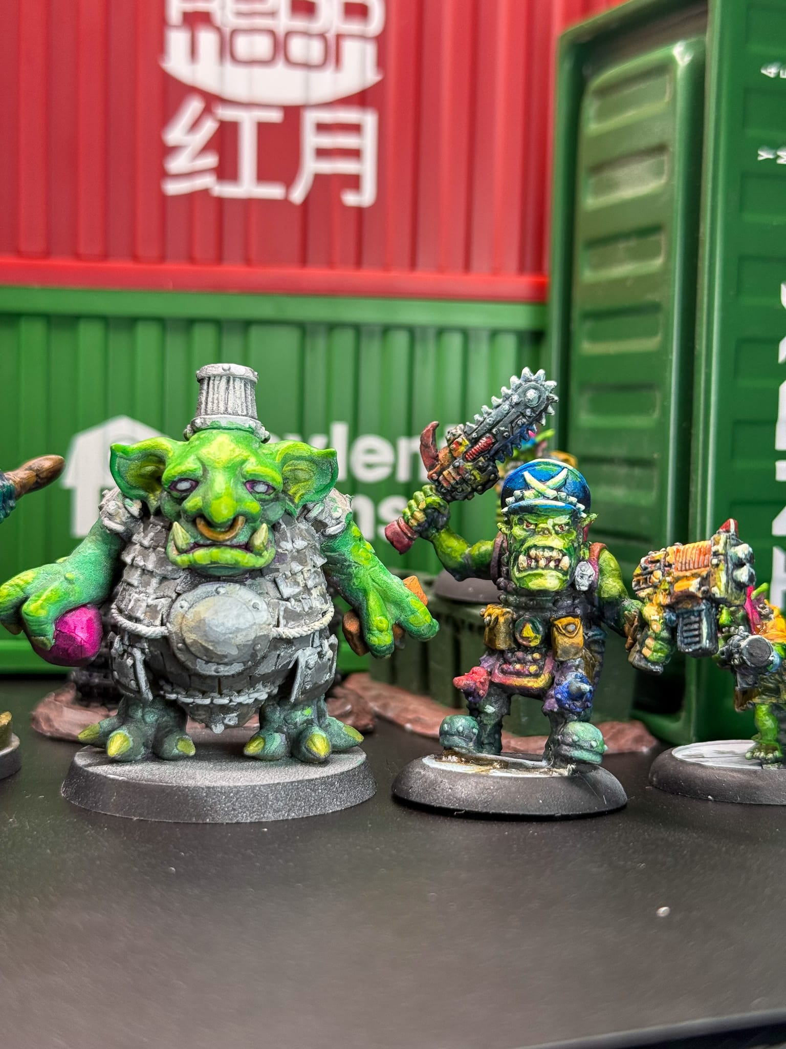
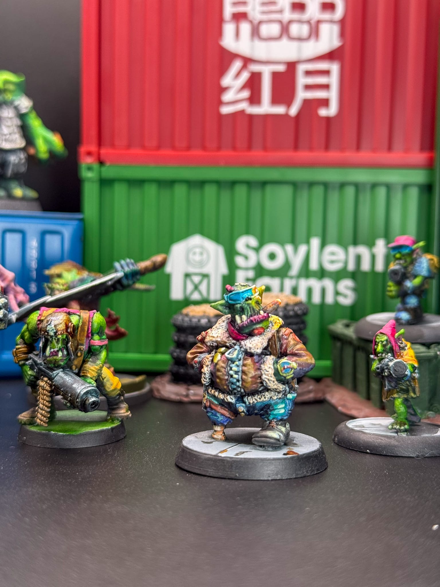
A color wheel is a simple tool that is an organization of hues around a circle. This highlights the relationships between colors. For a miniature painter, this is a guide to creating attractive mixes for a piece. I tend to enjoy complimentary colors, where you choose opposite sides of the color wheel. In order to really test Kimera Paints, I set to work on a ton of Orcs that I'm paining for a game. For some of the outfits, I went for complimentary mixes, but then for the skin and shadows, I went for analogous colors. Green is highlighted with Yellow, and darkened with Blue, or even Purple for a more vibrant color.
Kimera Velvet Inks and a lot of Orcs
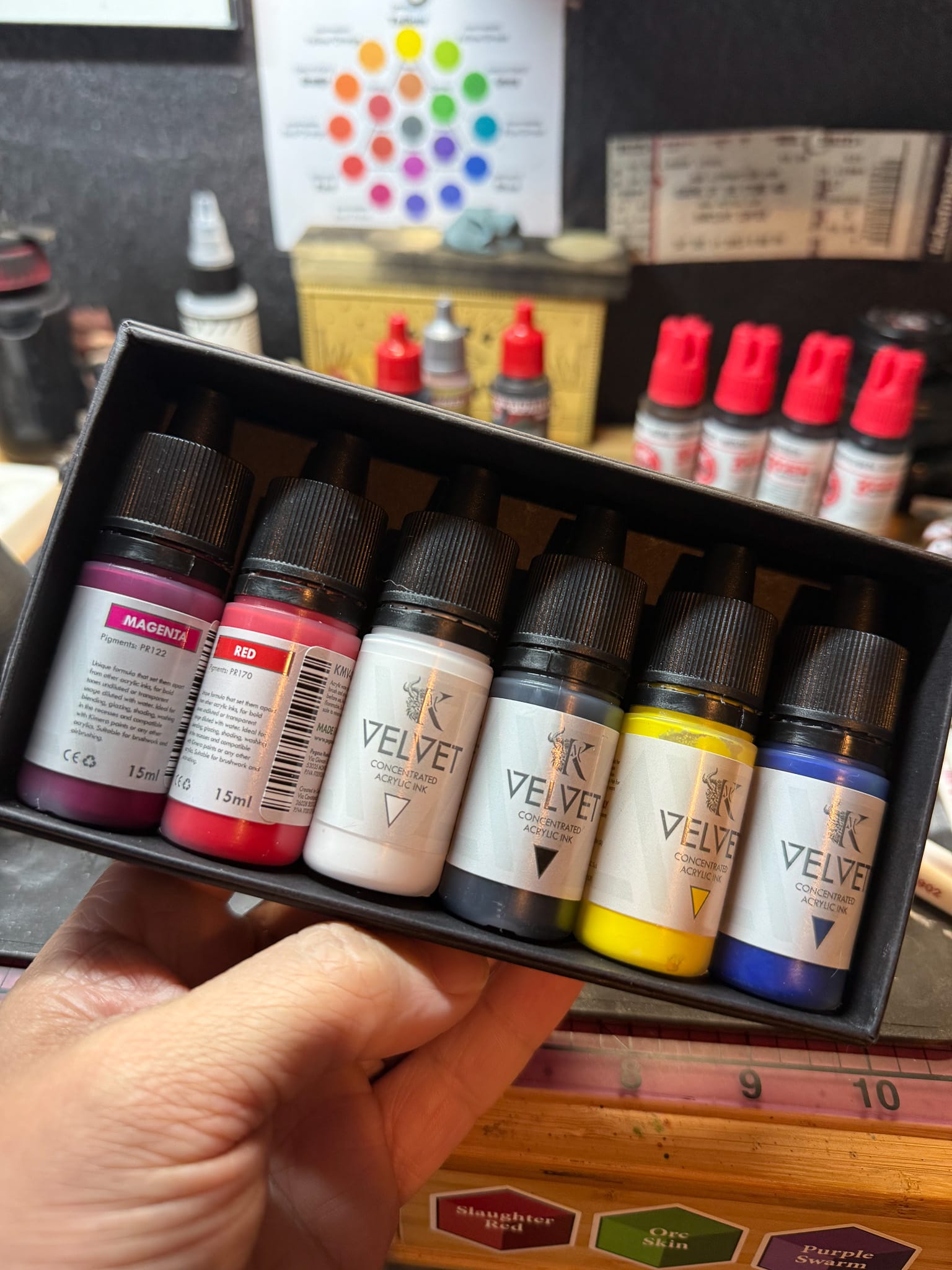
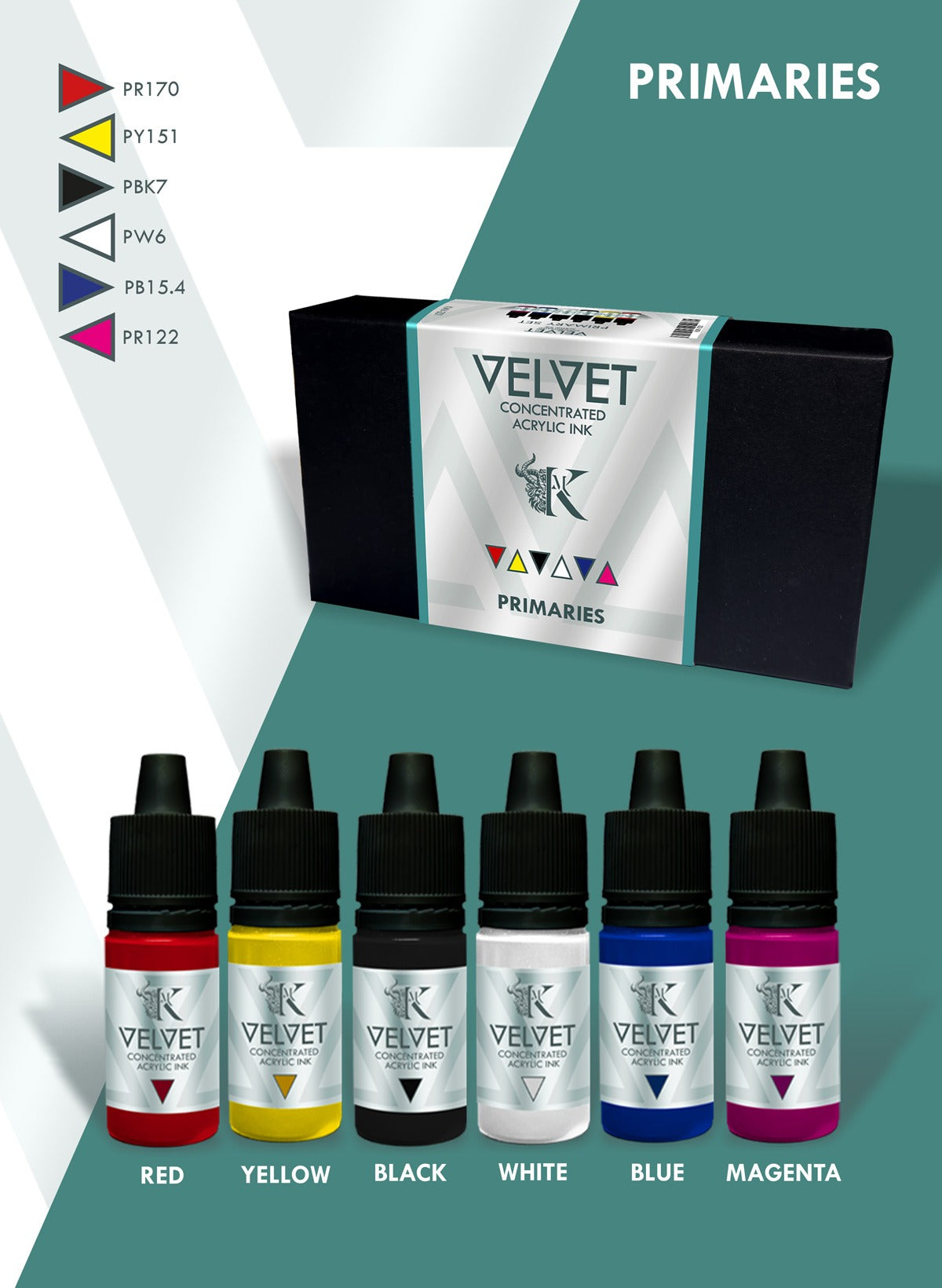
At Adepticon, I picked up the Kimera Velvet Ink Primary Set, which contains six 15ml bottles of paint, including Red, Magenta, Phthalo Blue, White, Cold Yellow, and Black. I paid $60 for this set of paints, which is a steep price, I'll admit. But the value I've gotten out of these paints far exceeds that price.
With these six paints, I can create any color, and with ease. By paying attention to the color wheel, I created Violet from mixing Magenta and a bit of Blue. I then used Yellow to brighten the Violet, and then White to make a Pink. Yellow and Blue resulted in a deep teal, and with a little bit more Yellow, I created a perfect Green skin tone—with just minimal amounts of paint, mind you.
I'll take a moment to explain both Phthalo Blue and Cold Yellow. Cold Yellow is yellow paint that has a hint of green in it. This makes it a great pairing for blue and green tones. On the other side, you have Warm Yellow—a yellow with a slight red tone, making it more orangey. Phthalo Blue is a member of the Phthalo pigment family, which are blue and green synthetic pigments based on copper phthalocyanine.
It goes without saying, but do not lick your brushes. These paints, while non-toxic, still have chemicals that would be harmful to you. And it's disgusting. I don't want to hold your spit covered model.
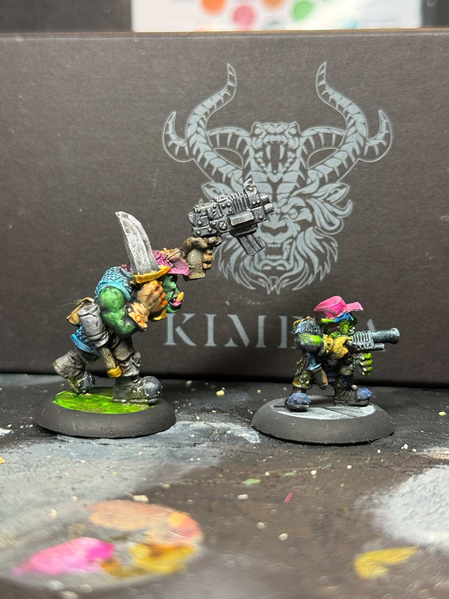
On the left: Full Kimera. On the right: Kimera painted over Contrasts
When painting through my orcs, I tried several techniques. On all of them, I underpainted the model to help establish highlights and shadow placement, then I layered in Kimera paints in varying levels of dilution. The model on the left is full Kimera paints, and the model on the right started with an application of green contrast paint, then I layered Kimera on top. I think the one on the left has a smoother blend, but the one on the right is plenty bright, and both serve well on the table.
Same orc, but different stages. You can see how the underpainting worked with the transparency of Kimera paint
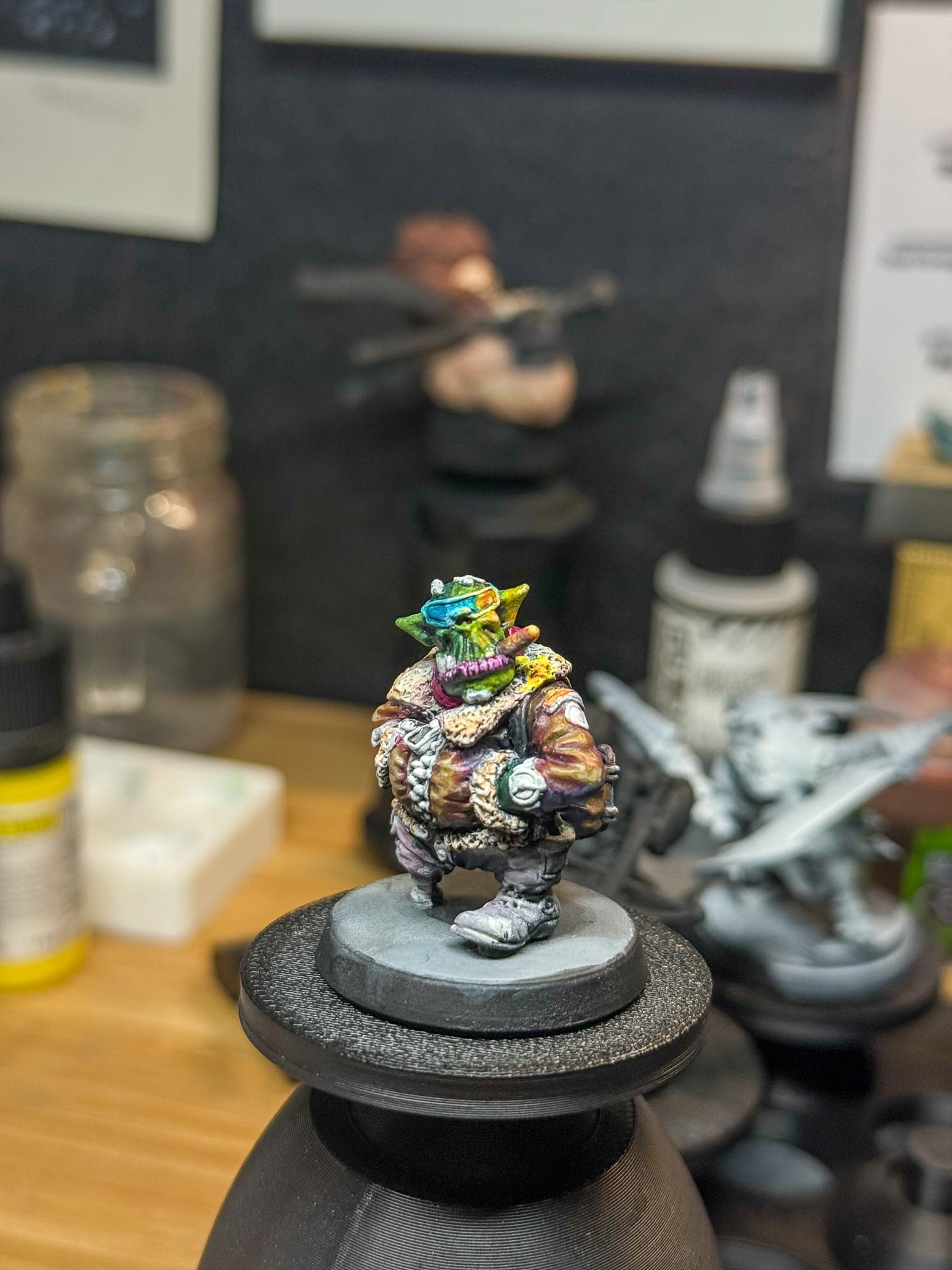
For this larger model, I used AK Heavy Body Acrylics tinted with Kimera Inks. This resulted in a fun wet-blended model with a ton of color applied throughout the piece. I will admit this took a lot more time, so maybe not for army painting, but still vibrant and blended. I also used some Kimera White to brighten up some neon paint from Lethal Shadows.
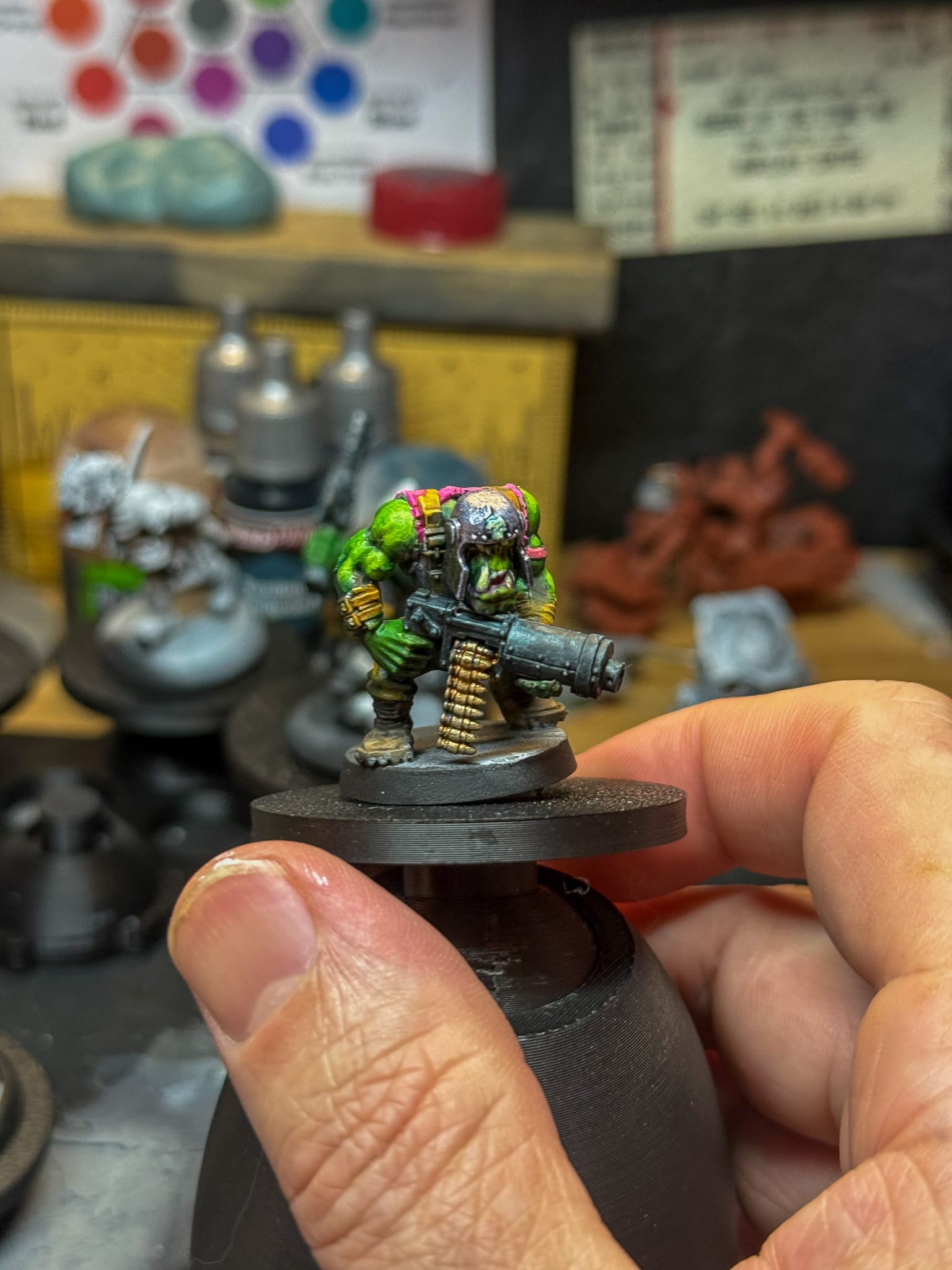
My favorite model of this bunch, a pilot from Kromlech, was all Kimera paints. I achieved various browns by mixing both oranges and greens together for warmer brown, and reds and purples for colder browns. I then used the colder browns in the recesses and warmer ones to make my highlights. This also helps create better color usage across a model, something you see out of high quality display painters, and that I will explore in future display painting. For my tabletop orcs, it really helps create some character and helps them stand out on the table.
And for fun, I took a model and painted it strictly with contrast paints (on the left) and when compared to a model painted with Kimera (on the right), the results are stunning.
Not once did I encounter the issues I do with other paints during these sessions over the last two weeks. The paint never separated, old paint hydrated well, and even when mixed with old heavy-body paint, the Kimera paint still did its job in maintaining high vibrancy and pigmentation.
The Kimera Velvet Inks dry to a satin finish, which is an in-between for gloss and matte. If you're seeking that Instagram finish, you could hit your models with some Ultra Matte varnish, but I wouldn't really recommend it for just the tabletop. But you do you.
A better version of ourselves
During a conversation with fellow editor Alec Kozak and the American distributor of Kimera Paint, Dracoya, we discussed that growth as an artist is a combination of technical skill, practice, and the adoption of high quality tools. For the last three years, I've been intimidated by Kimera paints. The idea of a single-pigment paint at a premium worried me, and anxiety took over. What if I messed up models, what if I didn't know how to use the paint, what if I hated the outcome, what if I wasted my money, what if, what if... what?
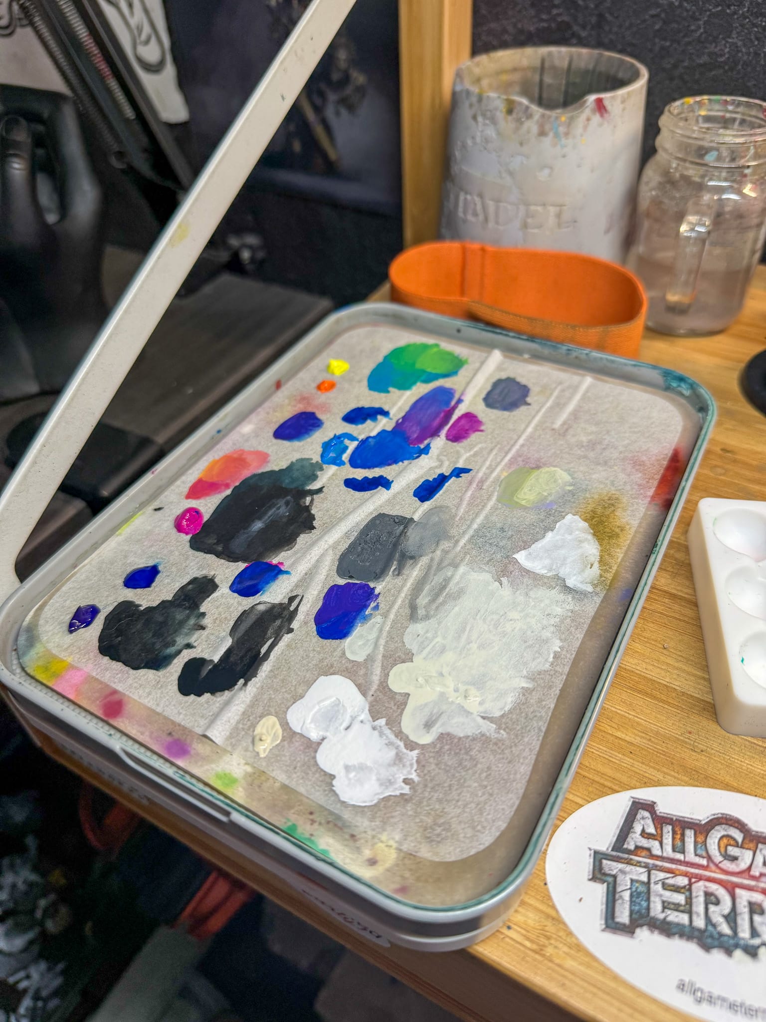
Check out the palette. Paints blend very well, and don't separate. The thicker paints are AK heavy bodies.
Paint is just another tool to master, and it is on the artist to understand how to master it. Over this time I've spent with Kimera, I've realized that my shortcoming was relying on a crutch or a perfectly named paint instead of just mixing it all myself, truly understanding the power of color, contrast, and how to apply it in a way that makes a project stand out.
For now, Kimera Velvet Ink is my dominant go-to for paint. Used in combination with other paints, I now can push vibrancy and truly control it because of the single-pigment paint. I don't have to be worried about what other colors might exist in the mix.
I'm giving Kimera Velvet Inks my highest recommendation because of all of these benefits. It mixes perfectly, it blends perfectly, it dilutes perfectly. I can immediately see the vibrancy, and I don't have to use a ton of paint to do it. I've been able to achieve a wide range of colors, and while the price is high, it's well worth it.
Purchase Kimera Inks through the American Distributor, Dracoya
An addendum
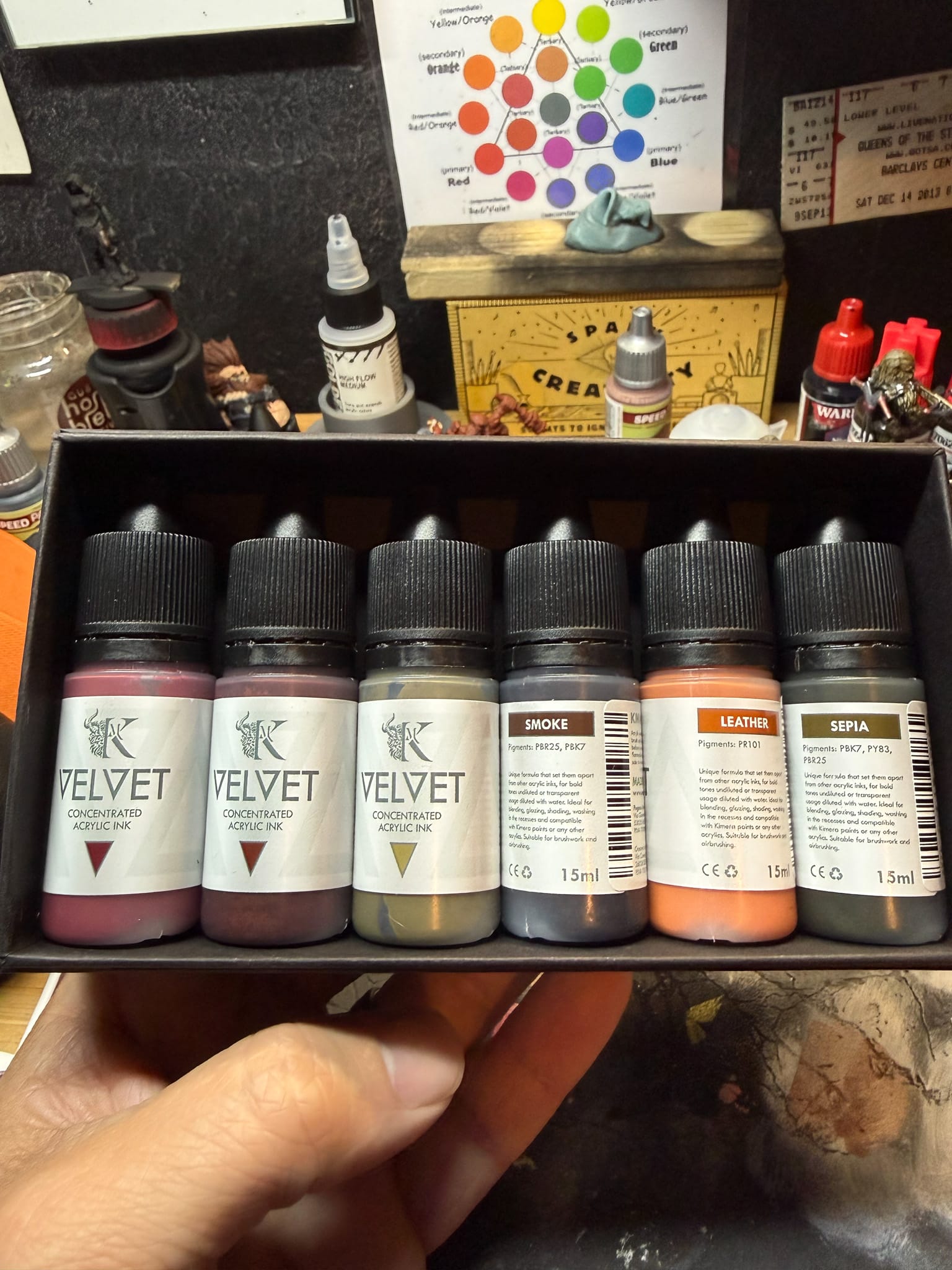
The Kimera Skin, Leather, and Parchment set looks wonderful. Review in the future.
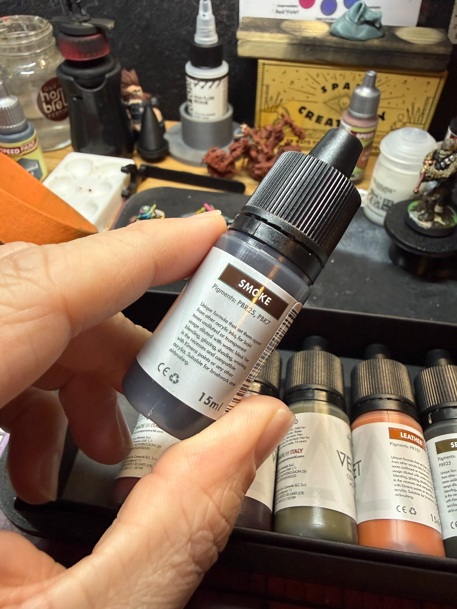
At the time of this writing, I received a package from Dracoya: the Skin, Leather, and Parchment set. This is a set of six paints that focuses specifically on tones found in skin, paper, and light leather, including the paints Smoke, Sepia, Royal Brown, Alizarine Crimson, Leather, and Papyrus. Three of the paints are single-pigment, and three are multi-pigment. A quick test of them also reveals the same level of quality and expandability I've highlighted above, but I've only just started painting with them. That being said, I'm still highly impressed. A deep dive into these paints will occur in the future.
Check out the final orcs!
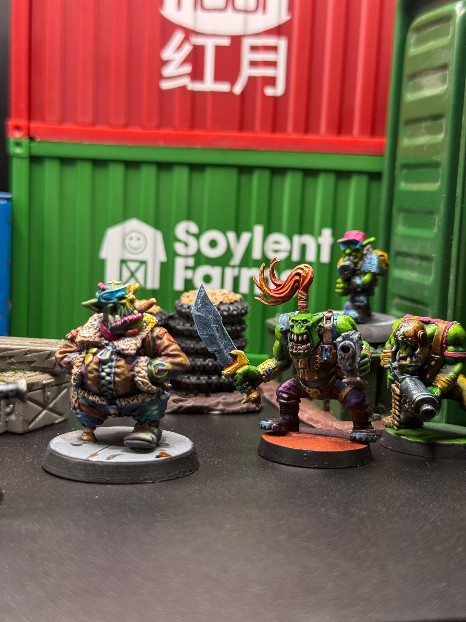
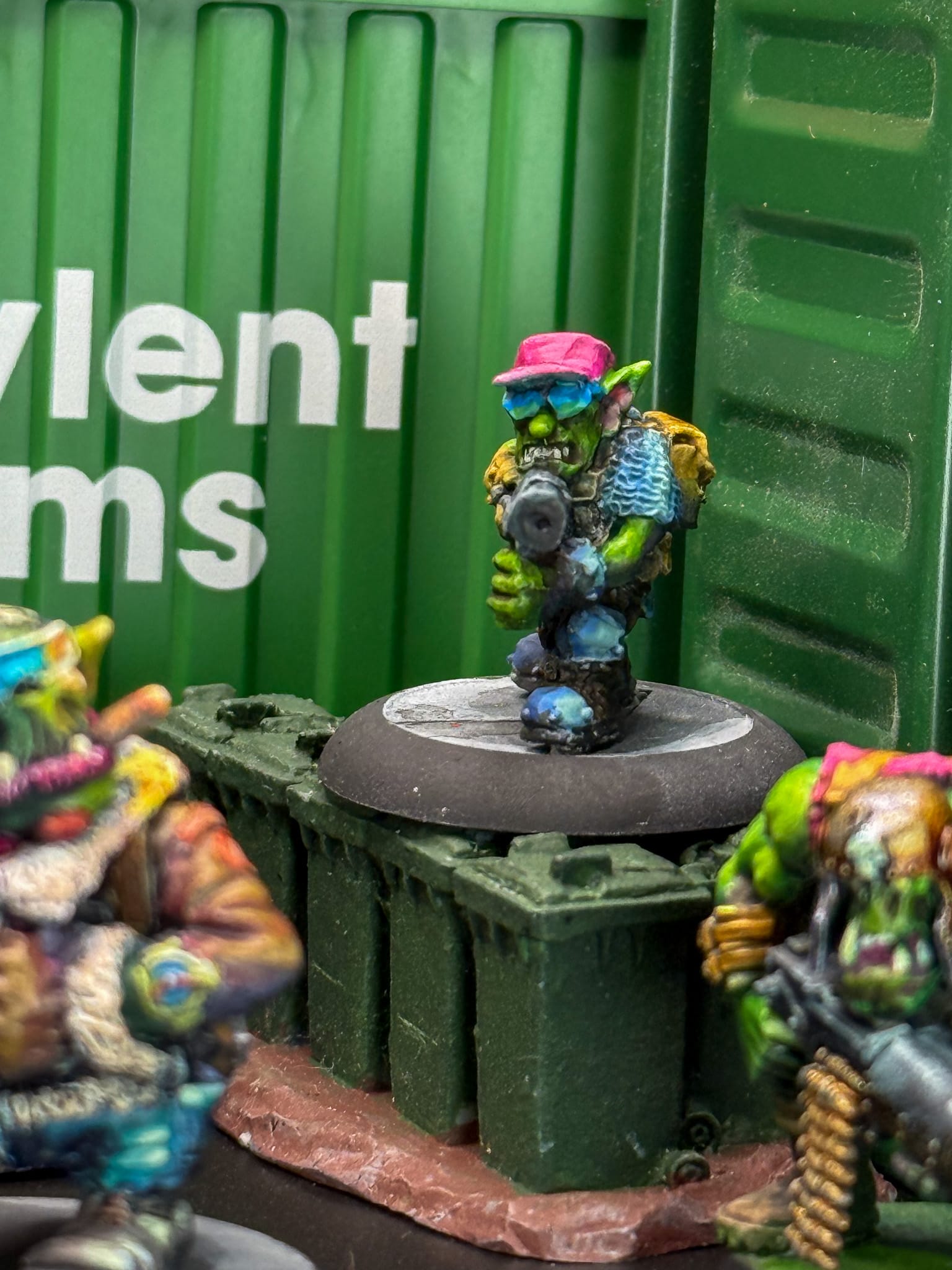
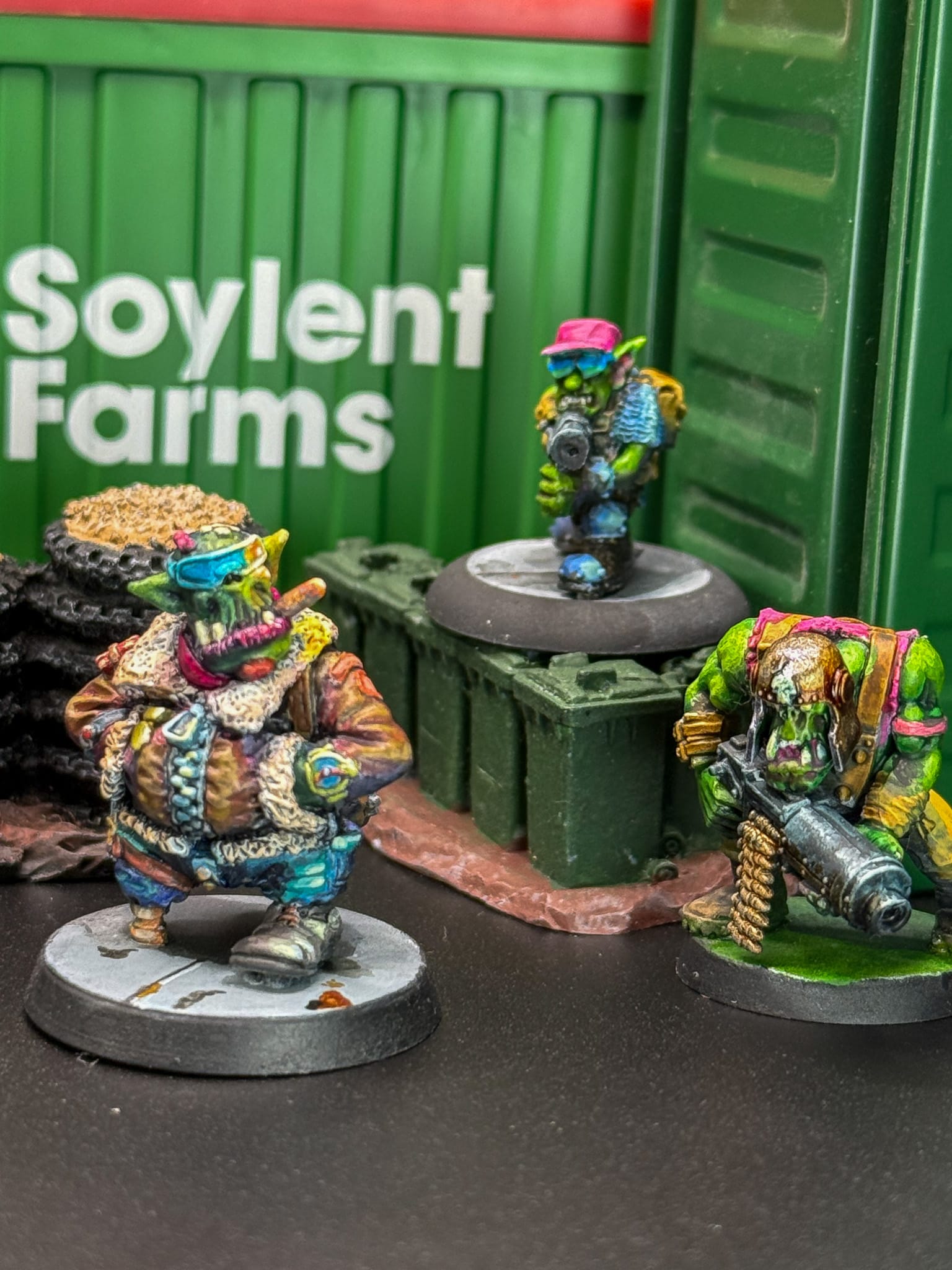
Orcs by Badger Games, Orc the Brand, Kromlech, and GW. Paints by Kimera
Kimera Velvet Inks
Phenomenal
Kimera Velvet Inks are the finest paints I have experienced. They've made me re-evaluate how I approach projects, and reward my efforts with brightness, depth, and a wonderful finish.
Pros
- Each paint is consistent from a hue and mixture perspective
- Paints mix with other brands effortlessly
- Paints dry to an excellent satin finish
Cons
- Price point is high