I’ve experienced a lot of growth in my hobby lately. I attended three classes at Pigment, Austin’s first miniatures painting convention, and took classes focused in several areas: light placement, reflective materials, and texture. Then, a week later, I took a masterclass with Alfredo Font, multiple Slayer Sword winning painter. In that class, I “rewrote” my brain on how paint works, what should be matte vs. semi gloss, the notion of multiple light sources on a piece, and taking time and being more simple with my usage of paint.
And now I turn to my never ending list of Marvel Crisis Protocol miniatures. I love these models. As a child of the 90s, I will always love the X-Men, and Atomic Mass Games sent me lots of X-Men over the last 6 months. Out of the pack, I’ve painted Colossus, and I wanted to paint up Bishop next.
As I called out in my unboxing, the only choice for Bishop is the jheri curl variant, and everytime I look at the model, I can hear the harmonica sound…my fellow X-Men fans will know what I’m talking about.
So, before I start going off about how much I love Bishop, I need to remind myself that this is a painting tutorial, and you’re here for that!
The Plan
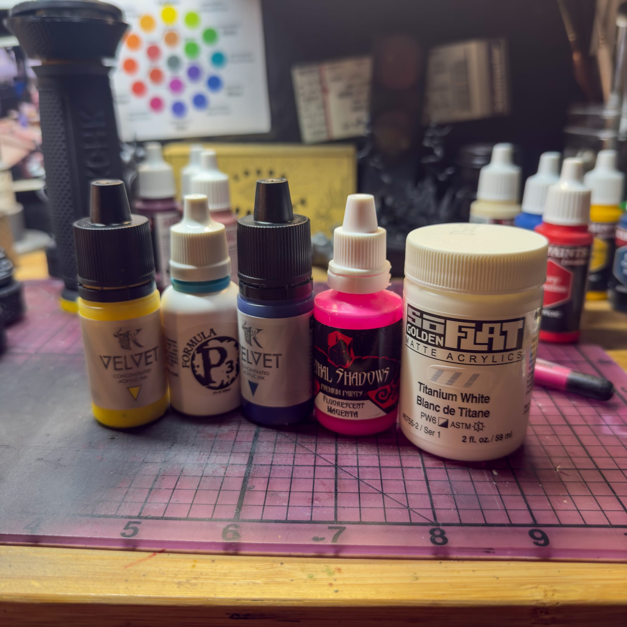
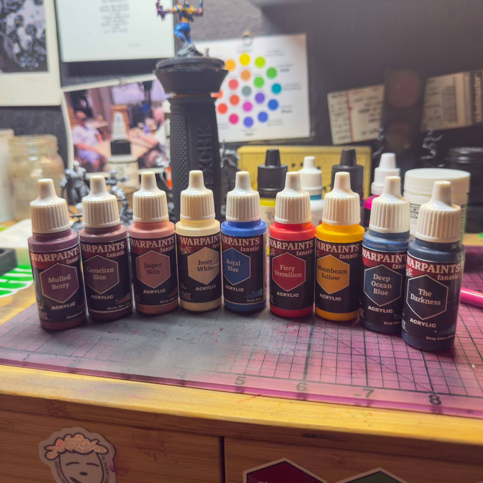
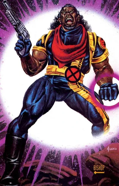
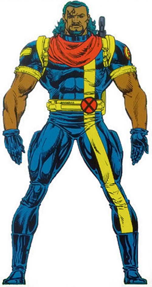
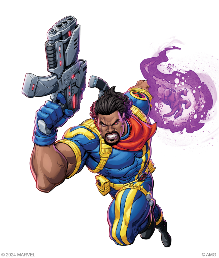
For the colors, I wanted to go for the box art, which depicts Bishop in his 90s best mixture of primaries, so I reached into my Army Painter collection and grabbed the best examples I had of the primaries.
Royal Blue, Fiery Vermillion, Moonbeam Yellow, and The Darkness will make up the majority of the model, while Carnelian Skin, Jasper Skin, and Mulled Berry will make up the skintones.
My additional paints to help with highlights and effects will be added to these basic paints. Kimera’s Cold Yellow, Smoke and Phthalo Blue, p3’s Red Ink, Lethal Shadows Fluorescent Magenta, and some Golden Titanium White will all be helpful.
Unlike previous Marvel Crisis Protocol paint jobs, I’m going to go for full saturation all over the model, and I’ll show you how to make some crispy highlights without going into the ‘Eavy Metal style of Warhammer (no shade, but just not for me), how to paint in the shadows, and create a bright focus.
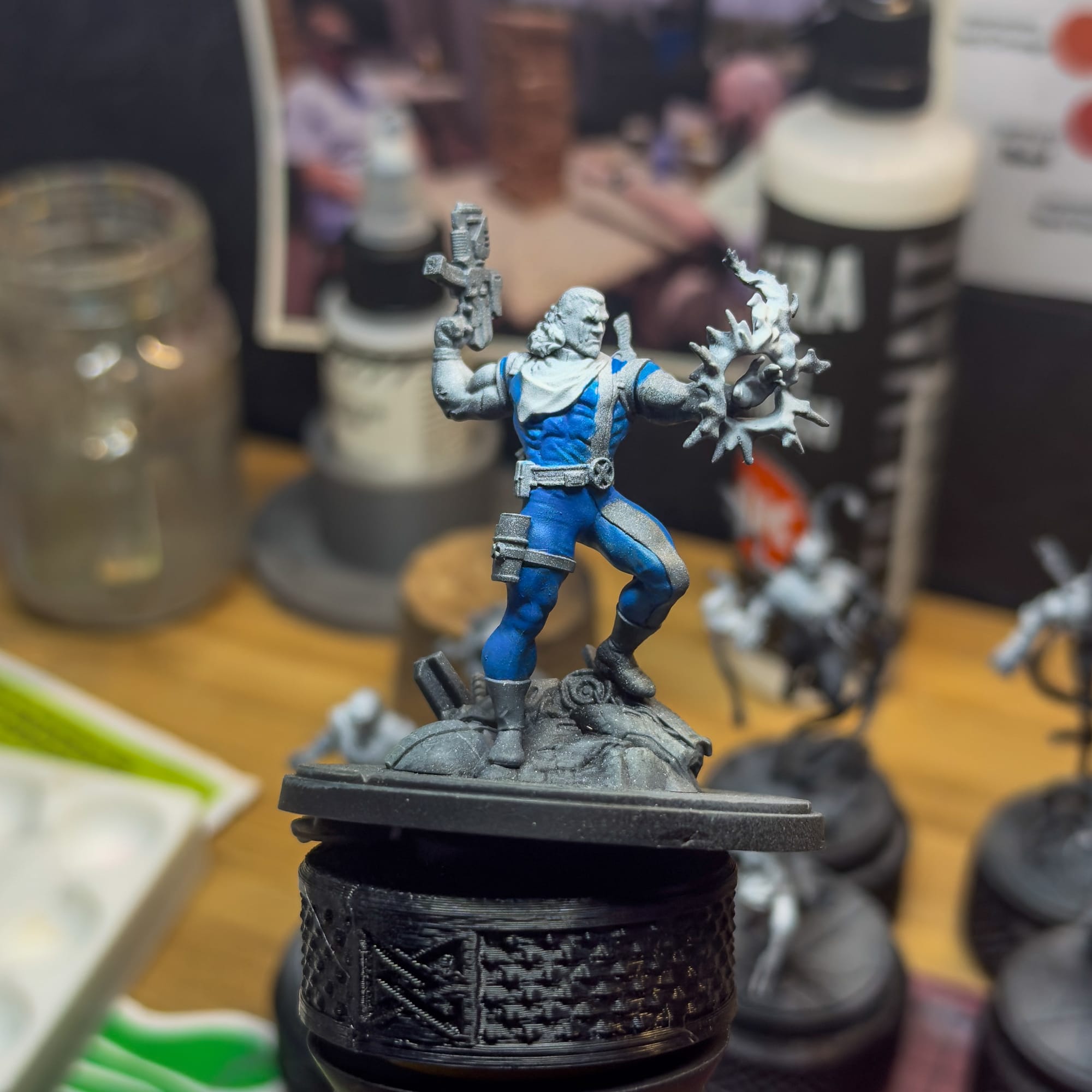
Prior to this, I primed the model in Black, and then used an airbrush in two stages: One I loaded a 50/50 mix of black and white to create an overall gray tone, then I used pure white ink to create the area where I want the eye to focus most.
Let’s get started.
Your future ends now!
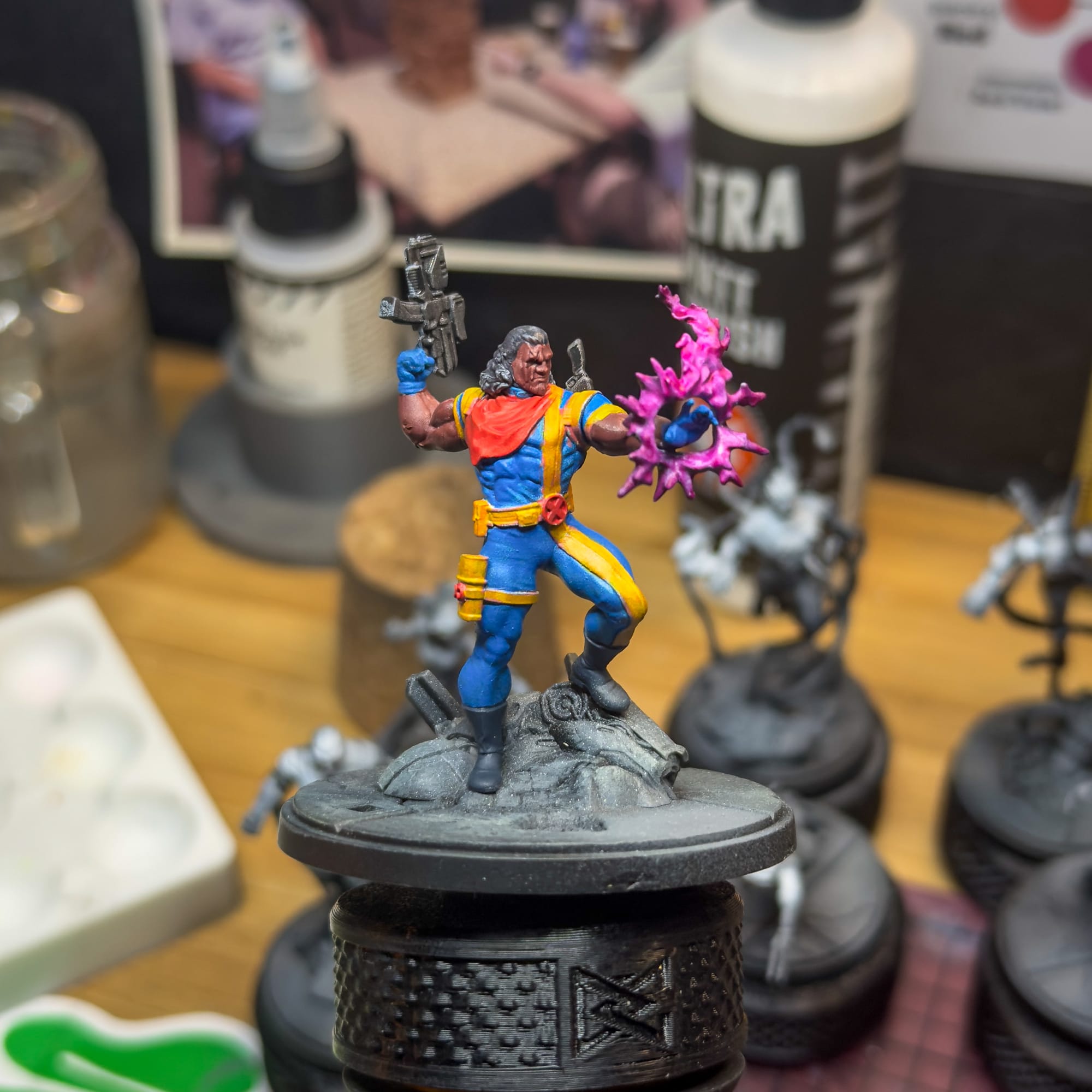
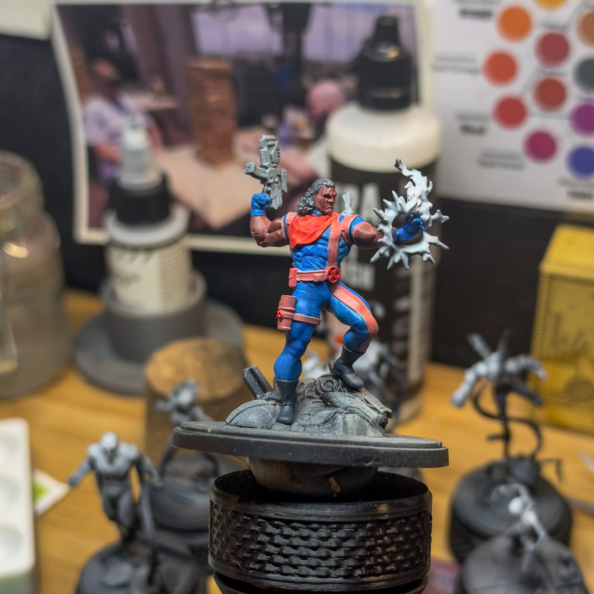
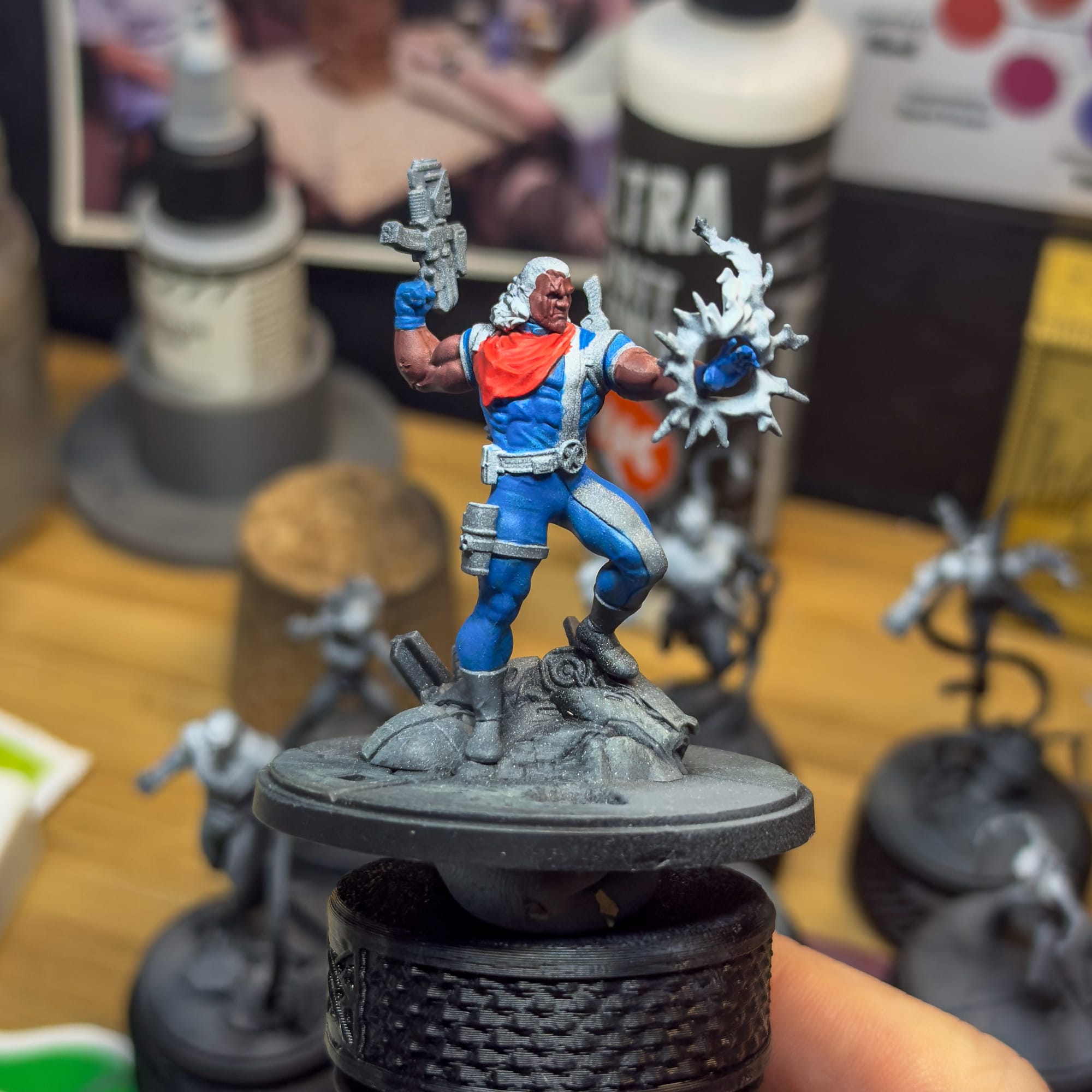
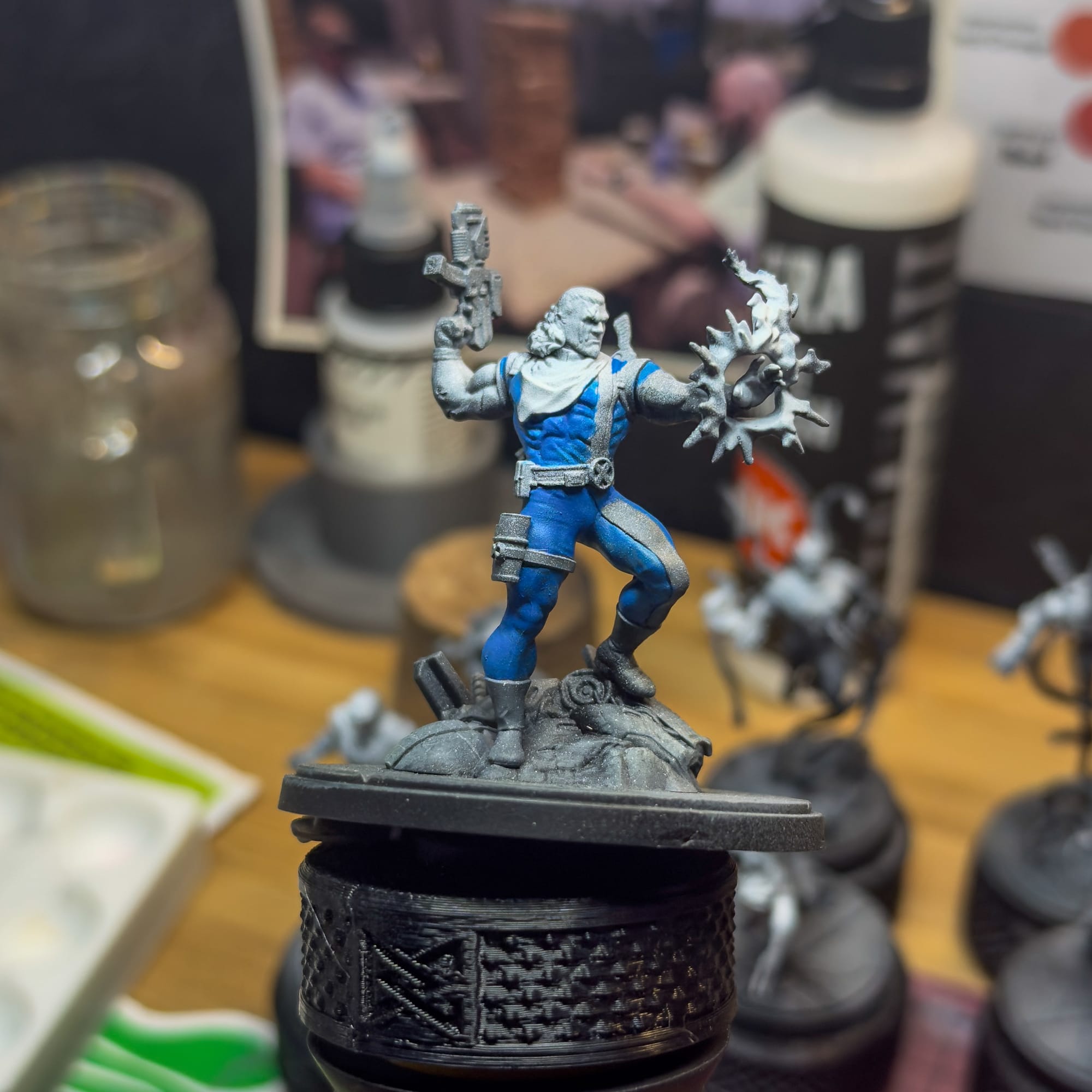
Some painters focus on a single part of the model, bring it all the way to nearly finished, then move on to the next section. I used to paint this way, but it always felt a little awkward. And it would make me leave more difficult sections until the end, which can betray me in my goals.
By painting the entire model, I can get a better sense of what happens to light when it hits the paint, and have more control over where I’ll end up.
The goal then is to basecoat the entire model. I started with Royal Blue all over, then I switched to Fiery Vermillion for the X emblems and the handkerchief, then I mixed a little bit of Ivory with the Vermillion to hit all of the yellow, followed by Moonbeam Yellow.
All of this took 2 coats of paint, minus the Yellow. By using pink, you can actually paint yellow far more easily because pink has more body to it. In painting terms, Body refers to the structural strength of a paint. Yellows tend to not have a lot of body, so you usually need multiple coats of paint…go look up most Imperial Fist schemes and you’ll see what I mean.
For the skin, I used Carnellian Skin as the basecoat, and I used The Darkness for both the hair and shoes. The weapons got a coat of Smoke.
One of the things I learned in my Masterclass was the importance of cleaning up as you go along, so clean up the model now. Also, there’s a dark line on the chest and leg yellow part of the costume, don’t worry about that now.
For the X logos, I used a smaller brush to paint the red, specifically an Army Painter 5/0. I’ll also be using a Kimera 3/0 in the next section.
“Getting nostalgic for the future…”

Now it’s time to create a focus point on the model.
Naturally, there’s two. The top region of the model, which includes the chest, the kerchief, and his face. Secondly, there’s the energy. These two areas will get more focus and paint than other areas, but that doesn’t mean I leave most of the model in shadow, similar to how I’ve painted other Marvel Crisis Protocol models in the past.
To the Royal Blue, I add in a little bit of Ivory White and a touch of yellow. This way I start to build a bright greenish white tone, which will firstly go on the heavily detailed chest, the exposed parts of the right shoulder, and a touch on the upper left thigh.
Underneath that, I mixed the blue with some of The Darkness and Kimera Blue to create a shadow tone, which I will paint into the recesses. This helps outline the brighter area, and helps guide the eye.
For the yellows, I’ll add some ivory and Kimera Yellow to the yellow and just slowly bring it to a brighter tone, ensuring I do the same method with the blues by adding a pinch of The Darkness to the yellow and using that for shadows. The brightest points of the yellow will be on the right shoulder, and the right kneecap.
In both of those situations, the reason why I use the ink is to maintain that bright pigmentation. Too much ivory and I’ll lose the “punch” of those colors.
The reds will get a touch of yellow initially to build the mid tone, then ivory to bring up to a final tone. I added in some of the skin tone, a Mulled Berry, to create my shadow without losing the reds.
Work these various mixes until you’re happy, and go slow. Let each layer dry, as the paint will go on darker than you think, then dry lighter.
“I can absorb your bio-energy”
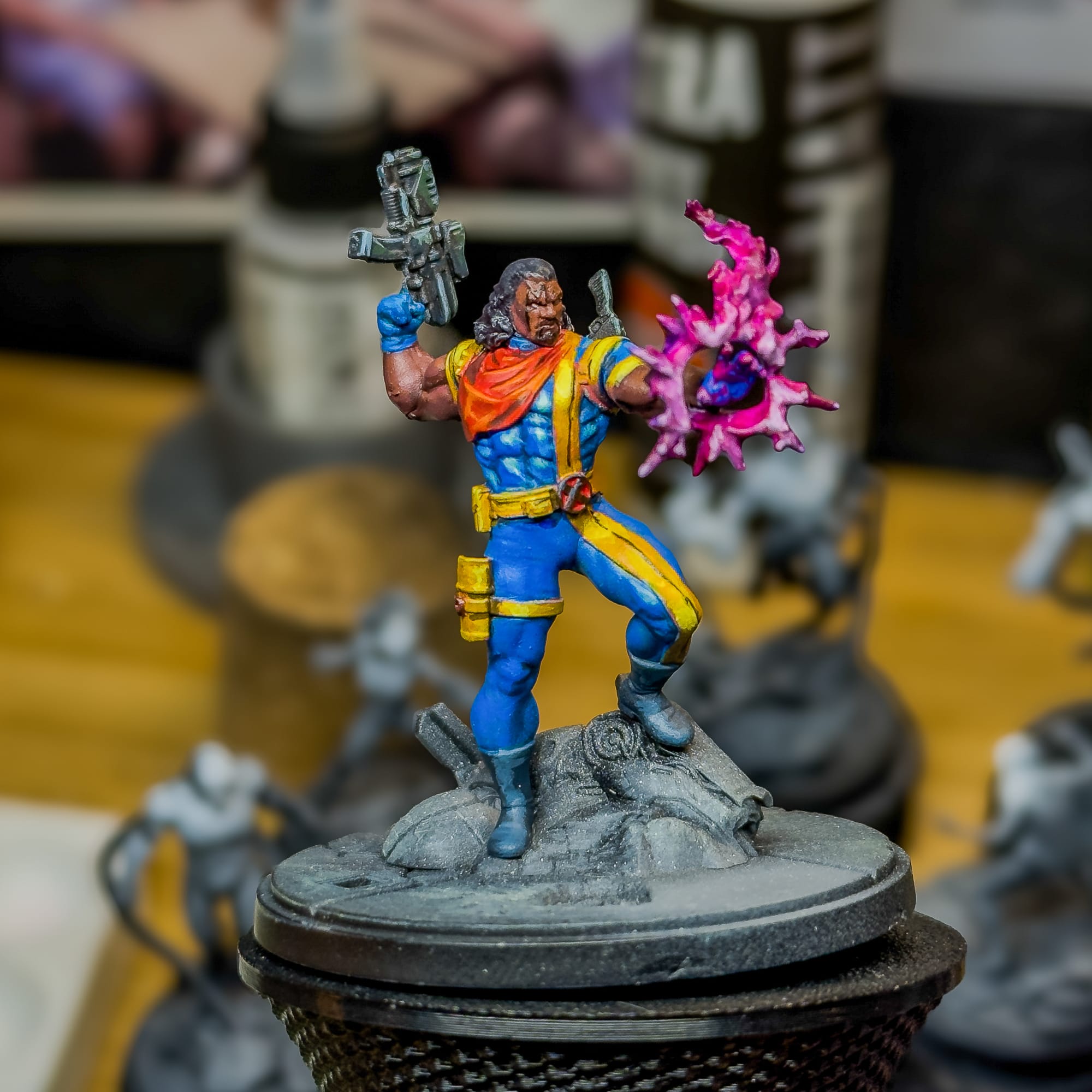
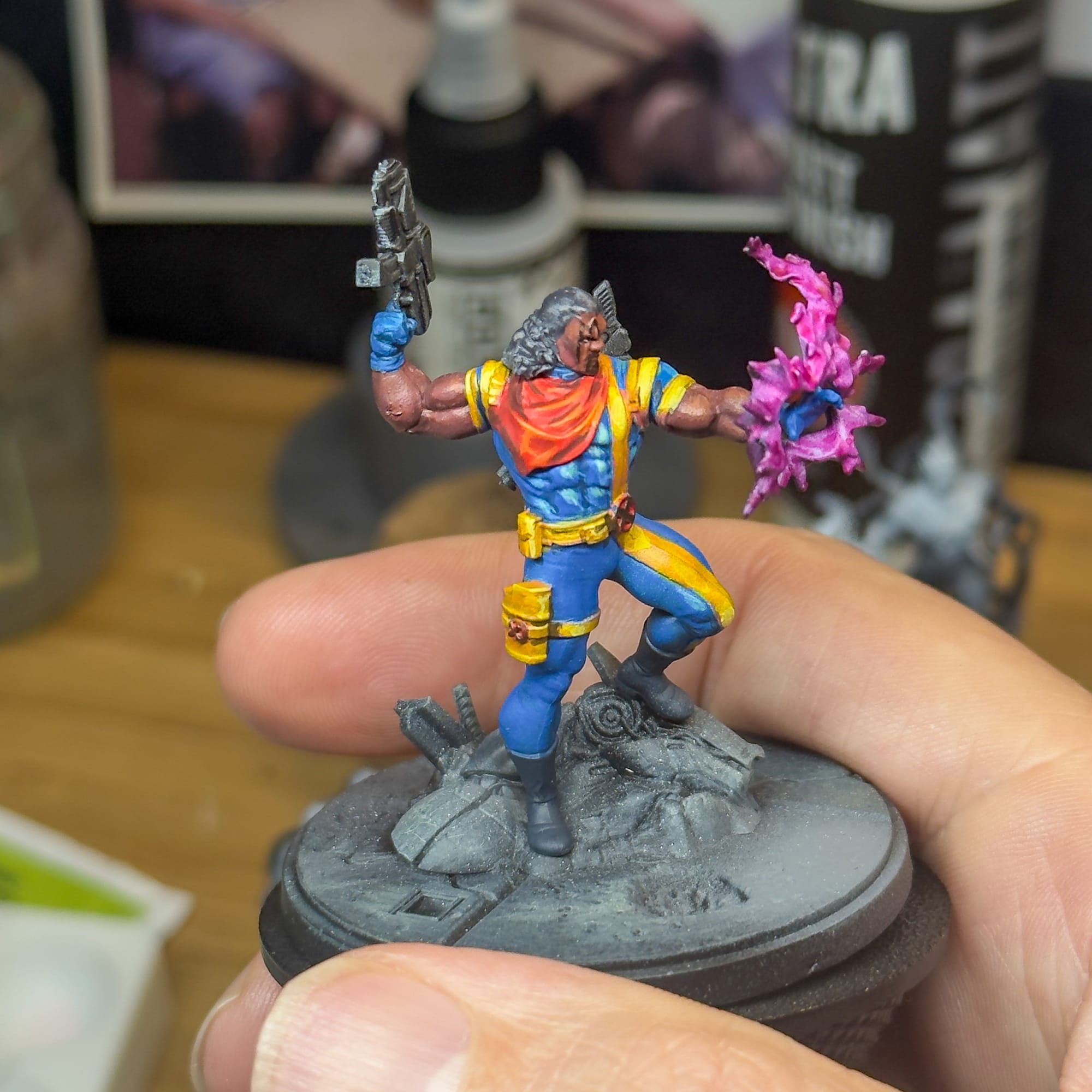
The rest of the model is pretty easy. For the skintones, I used Jasper Skin as my primary highlight, adding it to my Carnelian Skin mix. When you look at a model like this, it’s easy to just go and paint on the muscles, but try to avoid that. Instead, think of the shapes that make the arm and start there, painting the shape first, then applying shadows and highlights as needed. This is how you achieve a more realistic look vs. the “Muscle Island" style you see frequently online.
The areas that face light get no shadows. Go look at your own arm under a light…each individual muscle in your arm doesn’t get a hard shadow, so why would Bishop’s?
For the hair, I used Smoke from Kimera. It’s a brownish blackish tone, and since it’s an ink, it blended well with my existing priming job. I added some Darkness to the mix and added in small shadows throughout the hair.
The guns also got this treatment, but I used Deep Ocean Blue on them as well, to create that bluish “Gun Metal” look. A touch of Ivory to the mix really helped create some highlights, but I don’t want to go exceptionally hard on these, as I don’t really need eyes on the guns; I have a massive bio-energy piece to paint.
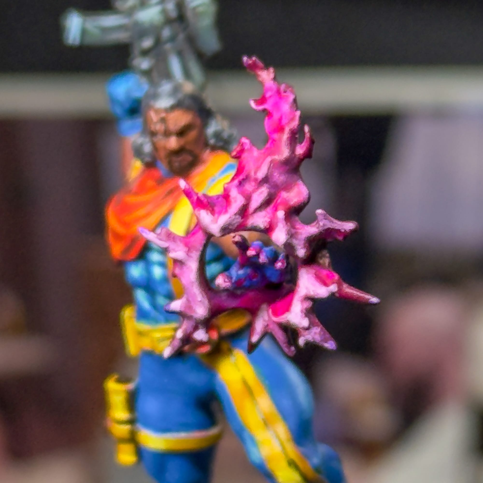
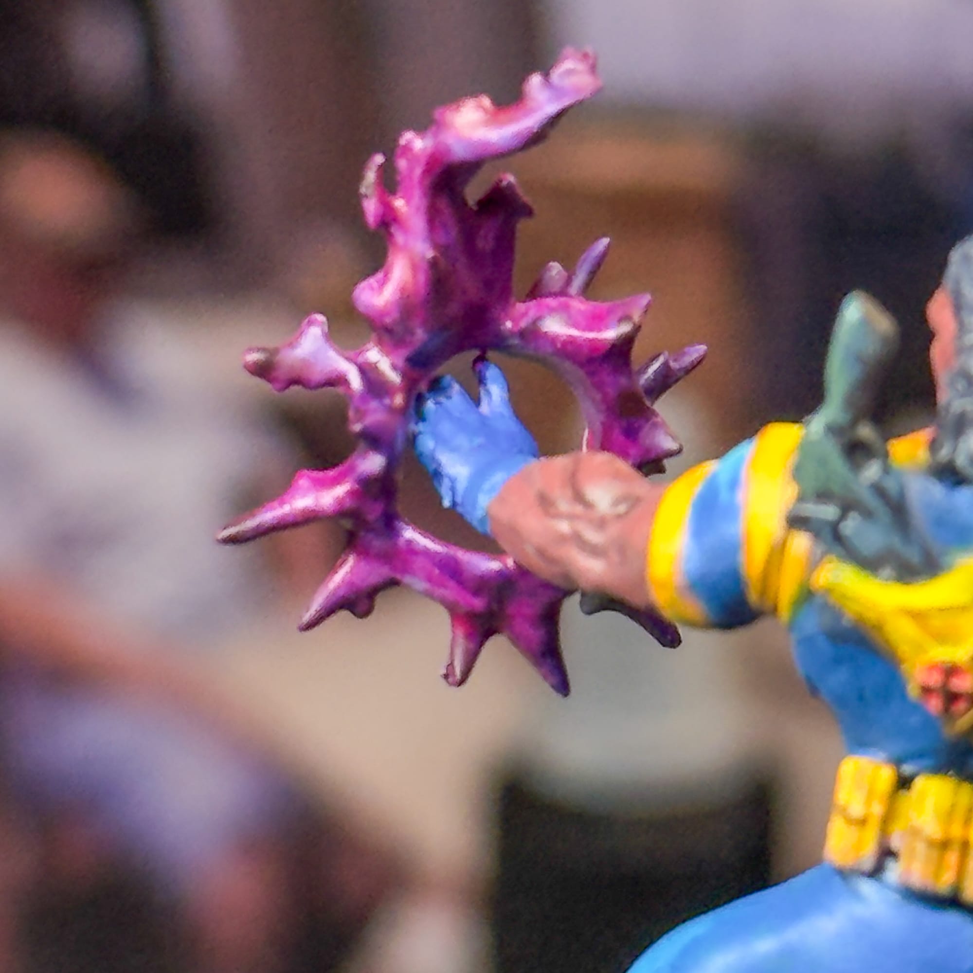
For the bio-energy, I first hit this with Kimera Magenta, as the translucent properties of ink will work well with my underpainting. Then, to reinforce the effect, I used a fluorescent acrylic paint from Lethal Shadows to add to this. I like how thick that paint is, so I’m able to thin it down, experiment with it, and add it to the sections that I really want to pop. On the backside of the effect, I used a little bit of Kimera Blue to help create a rich violet tone, which went into the backside and under some areas on the front.
On the front, to wrap up this effect, I take a little bit of Golden Titanium White and add it to the mix, heavily diluted. I then apply to specific areas that stand out, in small passes. This allows me to have expert control. I could have just done this with a less diluted / less layer mix, but I wanted to go a bit more in depth on this model for the tutorial. Do what you’re comfortable with.
For my final passes on the model, I focused on the little things. A tiny brush gave me the ability to handle Bishop's eyes, Tattoo, and the shadow that should exist inside the gun holster. A touch of ivory on the X logos gives off that they’re metallic. A touch of black at the end of each gun barrel, because I forgot to drill my guns.
I’ll leave the base for now, as I want to do a companion article with some of my other editors to see how we all paint bases.
“That's my mutant power.”
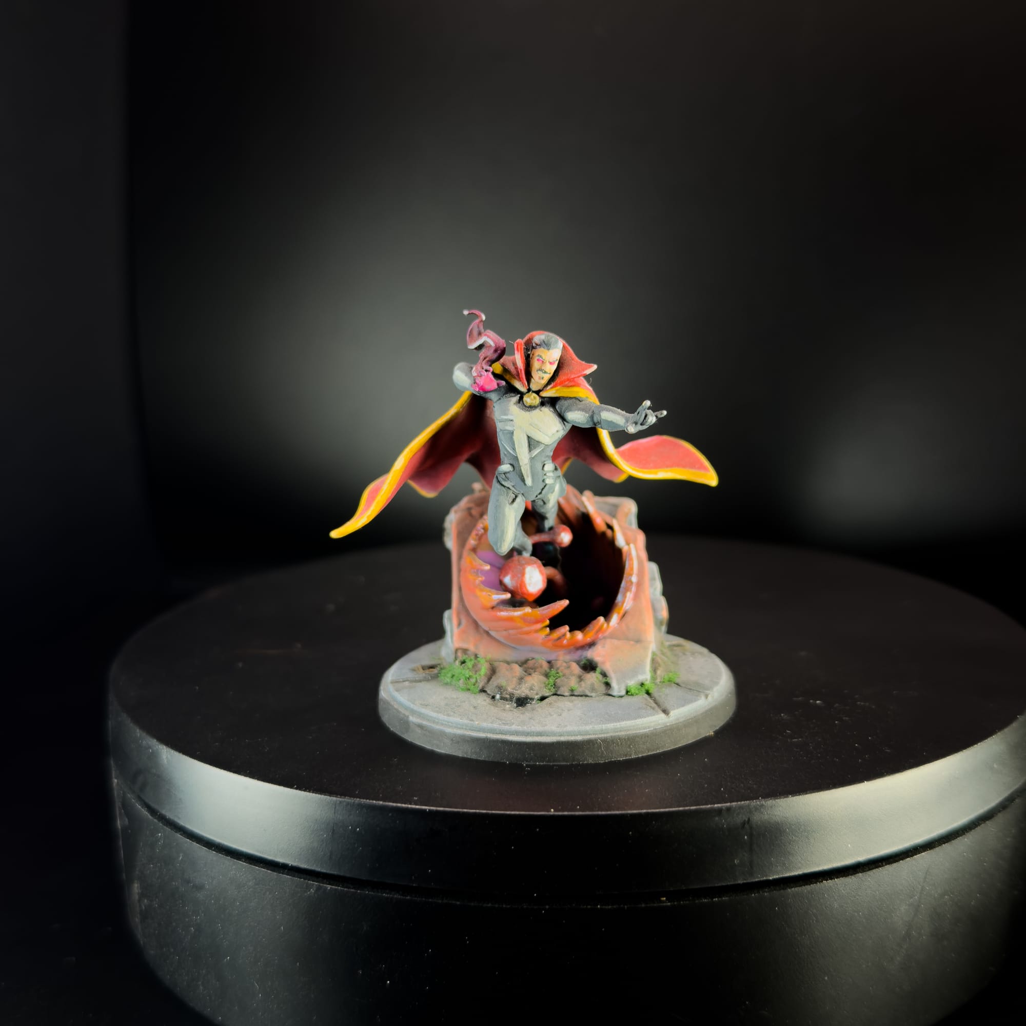
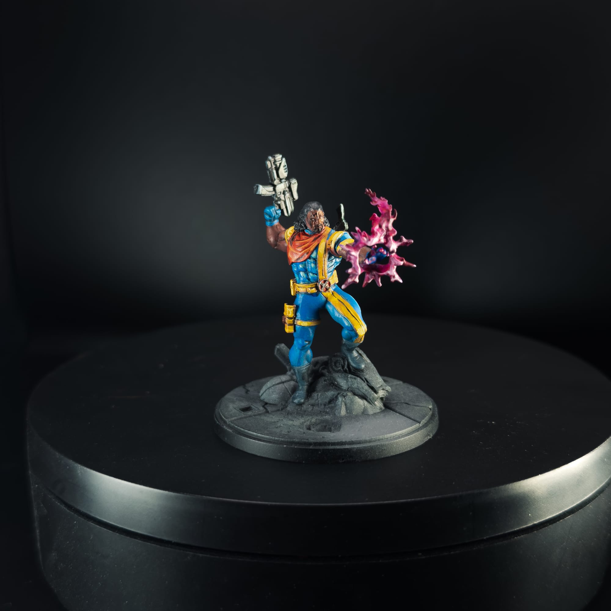
Always reflect on your work. On the left, my first MCP model.
You don’t have to paint Bishop to this level, but I encourage you to challenge yourself. This hobby is equal parts rolling dice and constantly losing to your friends (my consistent MCP experience) and having something awesome looking on the table. Also, these models serve as my evolution as an artist, and it’s great looking at my models over time and seeing just how I’ve progressed.
Take a look at my first MCP model vs Bishop, and you’ll see a lot of growth there. Understanding color, shadow, placement, vibrancy…these are all skills you learn and practice.
Good luck with your journey, and hope to see you in the next article.