It’s a little bit behind the scenes, but reviewing videogames means picking up a lot of skills and using a lot of tools. Photo and video editing, audio mixing, capture and livestreaming, and then there’s that whole playing the game and writing thing. To help with these sorts of activities, companies have been making what are called “hardware control surfaces”. You’ll see everything from massive decks in audio studios with various volume knobs, stream decks like the ones Elgato makes for livestreaming, and editing decks like the Speed Editors for DaVinci Resolve. Know what all those things get you? A very messy work surface. What if I told you that you could combine all of them into a single deck that not only does all of these things well, but also switches between them as needed? If I’ve got your attention, read on while we take a look at the Loupedeck CT.
Even if you’ve got a great workflow defined, getting familiar with a control surface can speed things up dramatically — especially if that surface has a jog wheel that lets you scrub through your video. That said, there’s a learning curve moving from using a keyboard to using a secondary surface, especially if you’ve been editing for a while and know all of the keyboard shortcuts to make it quick and easy. To get my seal of approval, it’d have to do more than be a keyboard replacement. Time to install the software and see what’s inside.
The Loupedeck CT is compact. Measuring 1.2” tall (mostly due to the height of the turn knobs), with a “height” (from top to bottom) of 6” and a width (left to right) of 6.3”, there’s no doubt that this device is built for travel. Weighing in at just under a pound at 12.9oz, it’s also very light. It comes in a small box that works well for transport, though a formed hard plastic protective shell would be even better, what’s on offer works well enough.
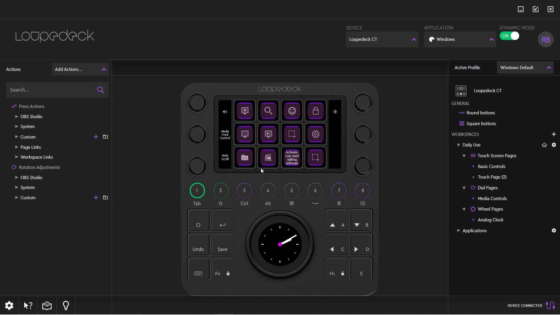
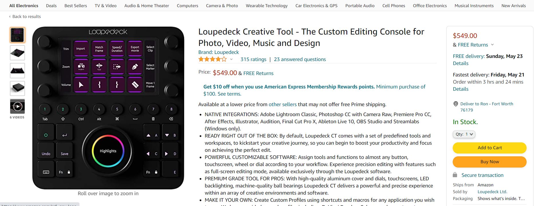
There are twelve individual screens to program, as well as six dials that can be turned and clicked. Below those are eight common use buttons, as well another twelve buttons split left and right, with a jog wheel in the center. In the center lies another touch screen to round things out. One of the biggest differentiators for the Loupedeck CT lies in the touchscreen in the center of the jog wheel, and the dozen individual screens that lie above it. Unlike the shockingly expensive Optimus Maximus keyboard, these buttons are touchscreens, capable of executing commands with the lightest touch. All of these touchscreens can change functions in a split second, and in the case of the larger 2” screen inside the jog wheel, it can even be subdivided into several functions. Alongside the six dials is a small vertical strip of screen that denotes what function you’ll be adjusting with them.
The six buttons adjacent to the wheel I mentioned above may not be touchscreens, but they have a number of common use functions like arrow keys, return, function left and right, CTRL, undo, backspace, tab, and more. These daily-use functions are good for most occasions, but if you have a workflow that demands something different, you can change them at will using the Loupedeck software. We’ll dig into customization in a minute, but let’s talk about the real differentiator for the Loupedeck — Dynamic Mode.
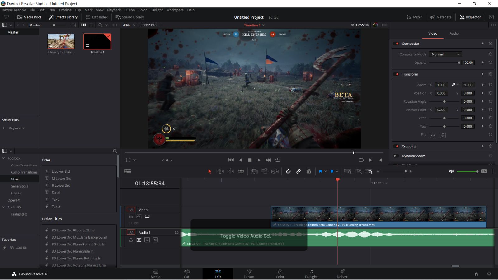
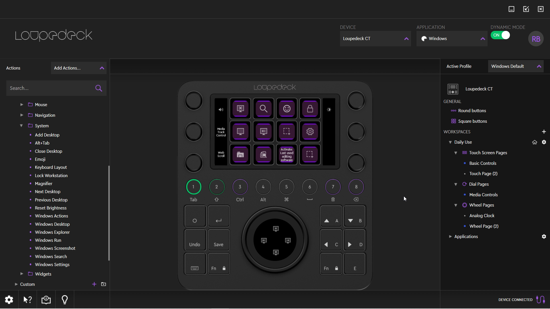
While poking around Windows the Loupedeck has a number of functions predefined. The touchscreen buttons are set to close desktop, magnifier, emoji, lock workstation, show desktop, previous and next desktop, add a new desktop tab, Windows explorer, search, activate last used editing software, and screen snip. Ok, so not all of those are that useful for my desktop work, but opening up DaVinci Resolve immediately brought up a new set of buttons without the need to manually toggle anything. In fact, it pulled up five pages of the most common ones, allowing media playback and clip manipulation, but also getting deeper into transitions, trimming, audio source toggles, color parades and waveform scopes, and much more. The radio buttons were set to let me zoom in and out, push/trim, and export all at the touch of a button. The jog wheel let me scrub back and forth in the video, add keyframes, and jump between them easily. I wanted to add the snipping utility, so popping into the Loupedeck software I did exactly that with just two clicks.
Popping into the Fusion and Color Grading tabs the Loupedeck CT once again changed settings automatically. I was able to quickly perform careful color adjustments, perform color extracts, and even introduced me to a shortcut that let me import my color grades from a clip other than the previous one. Yes, I know how to find it in menus, but being able to tap a single button on this control surface made green screen work a breeze.
While I’d rather put my hand into a woodchipper than use Adobe products, I did grab the free trial to put the Loupedeck CT through its paces. Similar to DaVinci Resolve, loading up individual Adobe products like Premiere Pro, Photoshop, Illustrator, and After Effects all have profiles pre-built into the device, allowing for ready access to color grading, animation and effects, and every transition under the sun. Photoshop gets particular attention with a lot of the tools you’ll use most like the dodge tool, eyedropper, lasso tool, and layer creation. It’s very easy to build out a multi-layer project with the controls at your fingertips.
One of my favorite customizations is a macro recording system that’s built directly into the Loupedeck software. Simple things like being able to use Windows+V to paste from a buffer instead of just the last copied object aren’t directly supported, but being able to record it as a macro makes it possible. By way of example, when doing greenscreen work I want to be able to quickly create a garbage matte so I can isolate a specific portion of my clip as the “live” portion, while omitting the rest. This is done by taking a copy of the layer, executing a few commands against it, selecting where you want the frame target to start and end, and then dropping that layer on top of the previous one. Being able to have the device perform an action, delay for three seconds for Resolve to process it, and then execute the next few actions back to back is as simple as searching in the Loupedeck software, and then dragging and dropping the action into the build panel. If that action isn’t available, you can also just record it as a macro and then add it. In this way, I can execute a handful of commands with a single button press without so much as a second thought. If you can operate Windows, you can handle this — it’s that simple.
I was surprised to see that the Loupedeck CT has a whopping 7GB of internal memory available. Heading into the configuration and toggling “Flash Drive”, the Loupedeck CT mounts a 7GB internal drive that can be used for…well, whatever you’d like. That said, it’s not the fastest internal drive. With some real-world copies, I saw around 6 MB/s copying to the device, and roughly 15 MB/s copying from it. These speeds meant that I was ok keeping my smaller templates on the device, but I wouldn’t be using it for saving media files to it for storage or raw files for manipulation. Beyond those smaller templates, I did find a great use for this internal storage — backups of the device’s configuration. Any customization can be saved to the device directly, meaning you can plug it into another computer and have it ready to go immediately. I tend to do work on both my laptop and my desktop, so this little bonus helped greatly.
Speaking of configuration, it’s worth noting that DaVinci users can download a profile for the Loupedeck CT to take advantage of the software, but there isn’t direct control surface support baked into Resolve. Conversely, there is direct support for the Loupedeck CT in the Adobe suite of software, enabling many more software hooks than you’ll have with DaVinci’s editor. It’s likely that Blackmagic doesn’t want to build in direct support given that they sell their own Speed Editor, but if I’m choosing between the two it’s going to be the Loupedeck — it works for everything, not just Resolve.
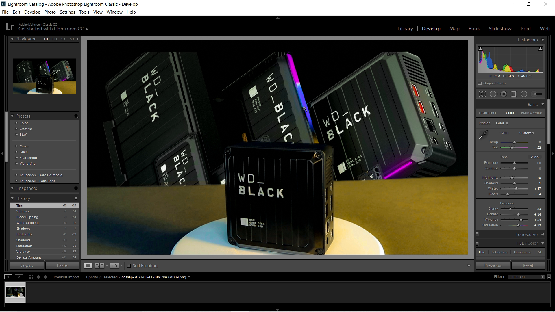
I’m not an Adobe fan, but I can’t deny that their software is as powerful as it is overpriced. The Loupedeck CT recognizes that most professional shops are using the Adobe suite of products, so it’s no surprise that the Loupedeck team has built a ton of functionality for Premiere Pro, Photoshop, Lightroom Classic, After Effects, and Illustrator. Firing up those products, the Loupedeck CT immediately switched functions, changing all of the buttons and screens in prep for the individual workflows for each piece of software. Let’s start with Lightroom Classic.
Lightroom Classic is Adobe’s attempt to strike the balance between usability and more complex software like Capture One Pro. As such, many of the functions in Lightroom are handled with sliders and those map perfectly to the Loupedeck CT. It’s possible to color grade, adjust contrast, temperature, shadows, and much more. Sure, you could do all of this with a mouse and keyboard, but you can do it far faster with this control surface. If you need to use Lightroom Classic to grade photos, this can be a game changer.
While I can hold my own in software like LIghtroom, I’m no expert on After Effects and Premiere Pro. That said, I’ve built a few hundreds of gameplay videos that you’ve seen on our channel before a recent move to Resolve, so I suppose I’ve got at least some experience. Let’s just call me a Hobbyist+ in terms of my skills. That out of the way, for the things I do in those two pieces of software, the Loupedeck CT is a HUGE improvement. Simply being able to scroll through an individual track, drop a keyframe, switch to another track, select and drag, ripple cut and move, and so much more without the need to touch my mouse once was amazing. Being able to just zoom in and out on the timeline with a knob instead of fiddling with the slider is almost worth the price of admission. Scrubbing through said timeline with three speed options on the jog wheel and touchscreen is a breeze, letting you shift between keyframes or even scroll through a single frame at a time. I mostly use After Effects to drop the lower thirds titles into our videos, so I’m not performing animation, but being able to whip through that quickly and get to Premiere Pro to finish my work is a godsend.
Premiere Pro gets an entirely different layout in the Loupedeck CT, as you’d expect, and it carries with it a ton of fresh capabilities. Selecting a slip, trimming it, popping down to another track, dragging it, running the razer through a specific track while ignoring the others, grouping them, and more is all possible without ever touching the mouse and keyboard. Again, more knowledgeable hands will be able to wring more use out of the device and the macro system, but after a few weeks of use, I can see the appeal.
Moving to OBS we see the largest comparator in the standard Stream Deck. ElGato’s device carries 15 pressable buttons, whereas the Loupedeck CT has 12, but there are a ton of additional options in the Loupedeck with the knobs, buttons, and the jog wheel. As the software supports creating macros, you can execute several functions at the same time, allowing you to send a tweet, fire up your camera, switch to a different microphone, and turn on your light ring with a single “Go Live” button you might create. Similarly, you can also set your scenes and transitions, emotes, and more. What I like about the Loupedeck CT over the Stream Deck is the ability to quickly change pages to access different functions I’ve mapped. Since the touch screen can be swiped to change pages, it’s superior to nearly anything else on the market for streaming.
Heading into DaVinci Resolve, we get into where I’m doing most of my work these days. Starting in pre-production, I was able to scrub through my media clips and then import them into the media pool. If you only want to use a little portion of a piece, you can drop your in and out markers, and then import just a portion of a video for editing. Being able to change the jog wheel to scroll vertically through tracks, or with a button toggle, scroll the play head left and right without having to use the mouse wheel cut time off my editing work. I also mapped a small knob to allow me to pop between defined keyframes, giving me precision movement within my longer edits. Adding speed ramping was equally easy, as was trimming and adding effects.
As Black Magic has their own editing control surface for DaVinci, they don’t provide API-level controls to the Loupedeck, declaring that you cannot color grade with the device. Well, with a bit of remapping, I was able to recreate some of those functions, but the drag wheels are just not going to work at the time of writing. Being able to use the jog wheel and knobs to make adjustments just feels more natural than dragging the software wheel with a mouse, but that’s just not an option here.
It was a complete surprise to me just how much I ended up using the Loupedeck CT in Google Docs. Yeah, I’m as baffled as you! I took about 15 minutes to build out some of the functions I do every time I write, and mapped them to the screen. Getting used to reaching for the Loupedeck CT’s control knobs instead of my mouse to scroll was just a muscle memory adjustment.
I will have to take a moment here and call it like I see it — the default icons and text are just not sexy. Thankfully, it’s very easy to swap these out for better (or official) icons for all of your various functions. I want my system to automatically send out a tweet, and I want that icon to be a lil’ blue bird. I’d like the Twitch logo instead of the word “Twitch”. I understand why they can’t include these things for copyright reasons, but that doesn’t stop me from doing it.
Looking at other workflow devices, there are icons you can buy to change the looks, and some even offer remapping functionality to a single button press by integrating macros or sequential execution. The Loupedeck CT on the other hand does…well, whatever you want it to do. Through the software it’s possible to change the functionality of every single button and screen on this device. The six smaller knobs can be pressed in, so even those buttons can be changed to something specific to your workflow. Better still, since they are linked to individual software profiles, you can have an entirely different layout and function that dynamically switches when you load up whatever is next in your process. And it’s here that we run face first into the largest hurdle with this device.
No bones about it, this device is the most flexible control surface at a consumer price that I’ve seen. That powerful flexibility comes at a cost — the software, being as drag and drop as it is, can be complex. Sure, the simplest functions are easily accessible, but making something like a keyboard combination happen (e.g. Windows+V for pasting from the clipboard list) can be somewhat problematic. Like any software, there’s a learning curve, but here’s the good news — I managed to get my hands on an older version. Boy oh boy was that an awful experience. The recent updates to this software is a revolutionary improvement, and it shows you’ve got a team that listens to their customer feedback and improves their products accordingly. That tells me that I can count on further updates to streamline and make the whole process simpler. To be fair, it’s nothing overwhelming, but it does mean you’ll have to get into the nuts and bolts of it, or watch YouTube videos of those who already have, to get the most out of it. At a price of $549, you don’t want to leave functionality on the table with this one.
So who is the Loupedeck CT for? Well, if you are a videographer or photographer interested in being able to color grade and compose faster, then this device is a must-have. It has the tightest integration with Adobe products, but it also works nicely on DaVinci Resolve. Maybe you are doing video work and you need to control several cameras and microphones? Being able to orchestrate using the macro power to create single functions to turn on camera 2, mute camera 2’s microphone, and then enable the camera and microphone for camera 1, all with a single button press. If you are a streamer, there are cheaper surfaces to do that with simpler software to back it. That said, if you plan on editing that video footage, or if you’d like something that works nearly everywhere, then the Loupedeck CT is the best choice.

