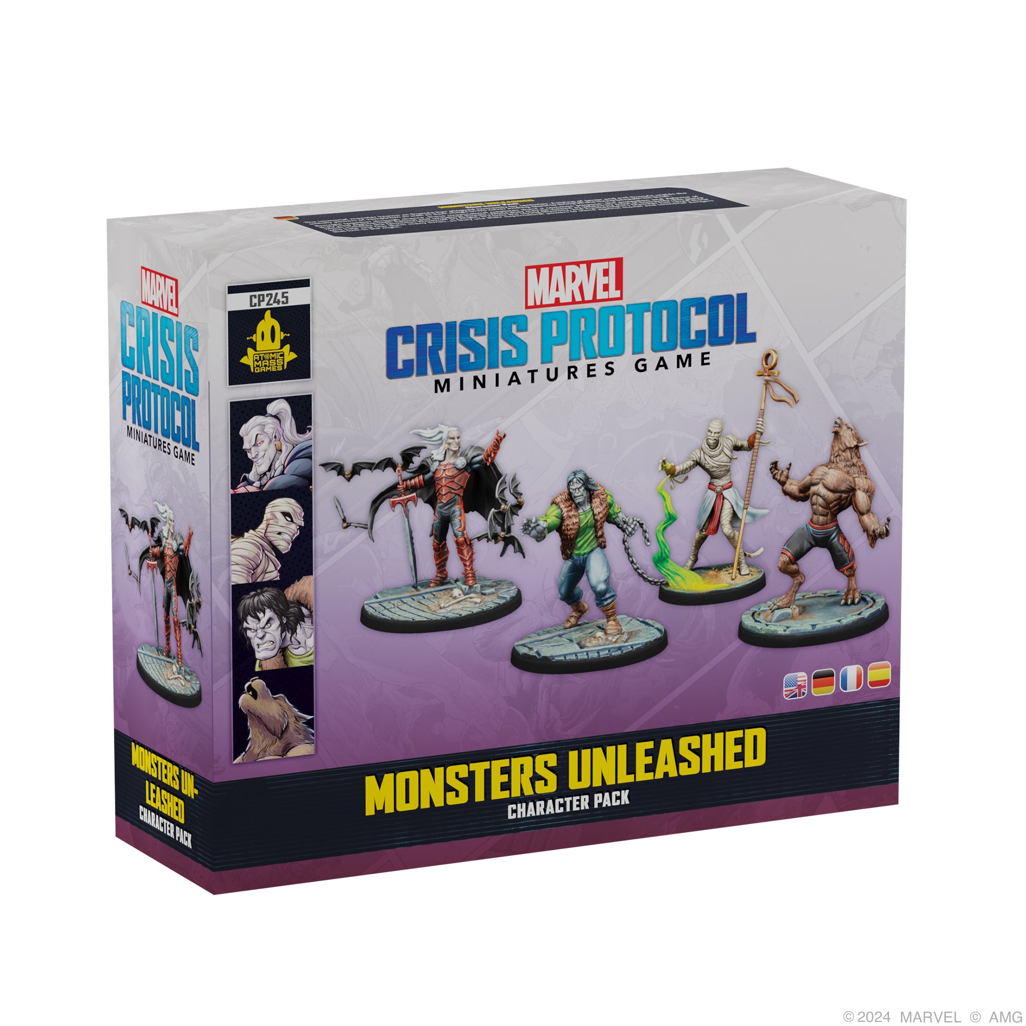
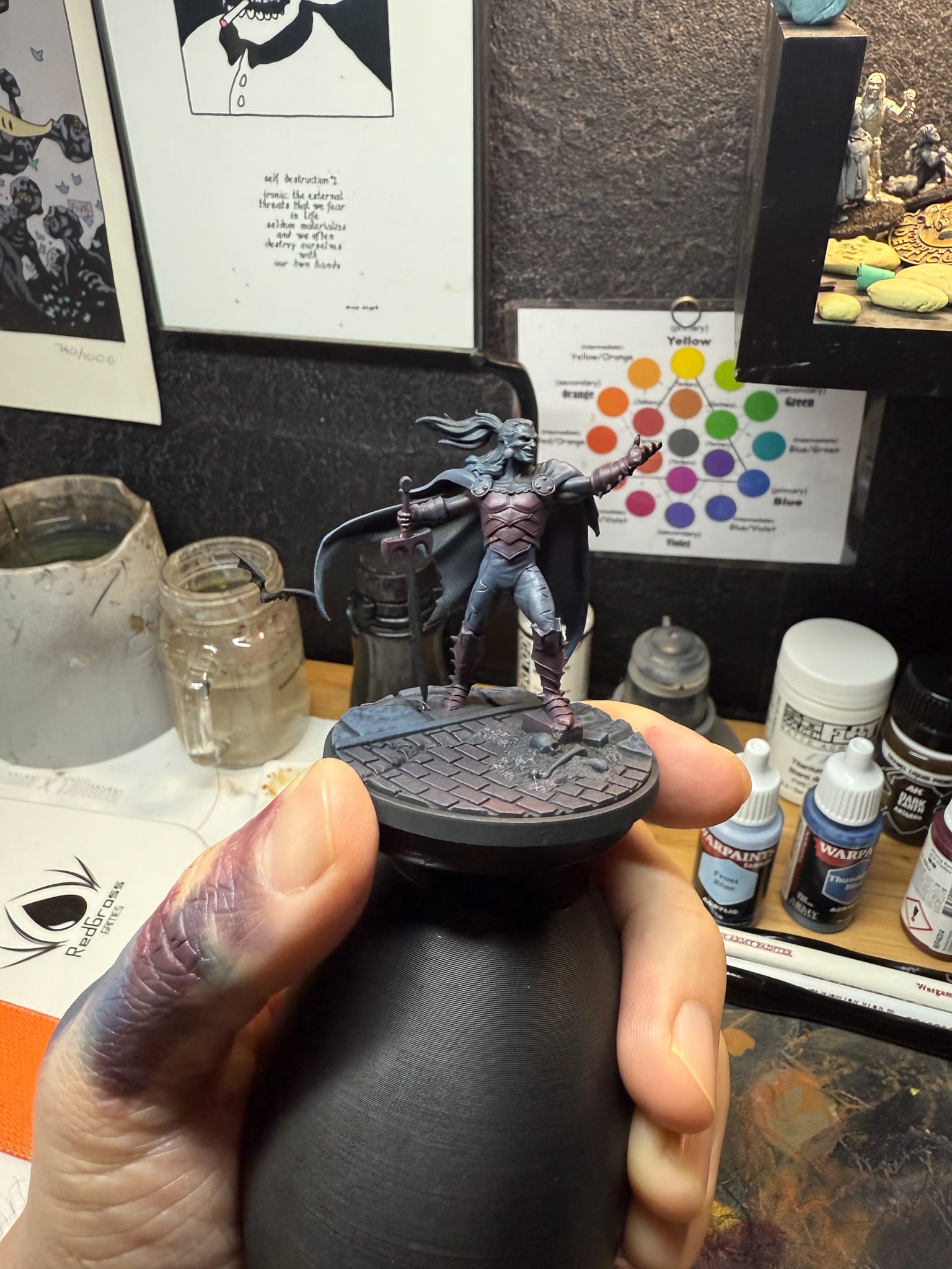
Vampires always hold a special place for me in stories. I always loved Christopher Lee as Dracula, the stylings of Bram Stoker’s Dracula, D from Vampire Hunter D, the sneering attitude of Castlevania’s Dracula…the allure and stylings of our favorite vampire always stood out for me. When I received the Monsters Unleashed Box earlier this year and reviewed it, of course he stands out as a leader character, kinda overpowered, and the sculpt reflected that. Fantastic looking armor, billowing cape, and of course a commanding pose.…I knew this was going to be a fun project, and I wanted to do something different. So for this paint tutorial, we’re going to veer away from box art and instead focus on mood through the paint job. This would be more of a paint job if you wanted to go down the path of making something more of a display piece, but you can easily use this on the table. Let’s dig in.
Priming & Philosophy
For this project, I used a different method for painting. Normally when I paint, I tend to lay out a medium-level base tone which sits in the middle of my intended color palette, from that point I move up and down through tones. You can see this on projects like Frankenstein’s monster, and Abomination. However, for a piece that I consider to be more of a display piece, I’ll start with my darkest colors for each section and work my way up to my brightest from there. This is a technique called Chiaroscuro, which allows for strong contrast on parts of the model, and does a great job of creating a major focal point, which for us is going to the upper 3rd of the model, and the upper right especially.
For my paints, unless otherwise noted, I used Army Painter Fanatics for the majority of this project.
Shadows

On some models, starting dark is a quick way to build shadows.
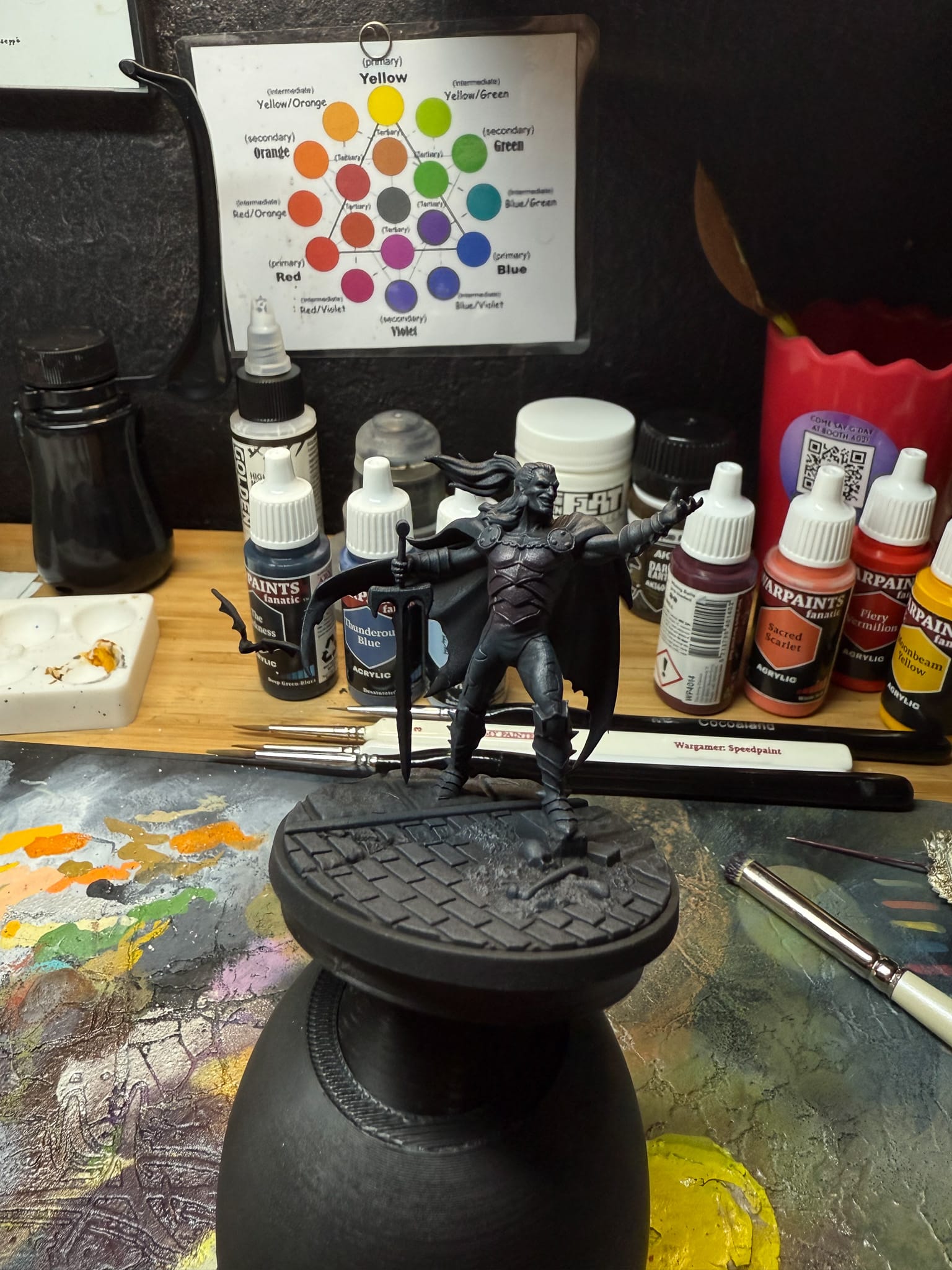
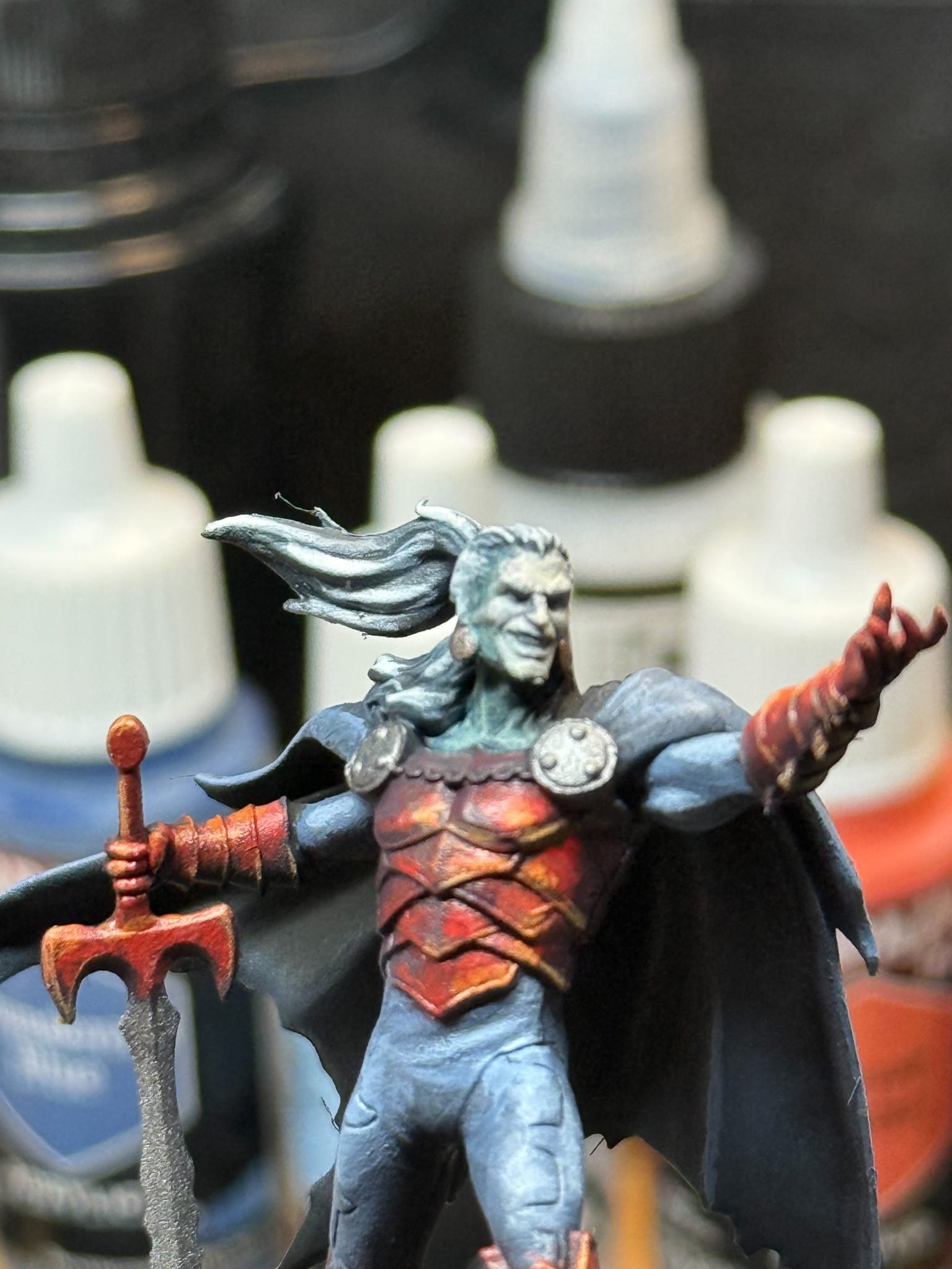
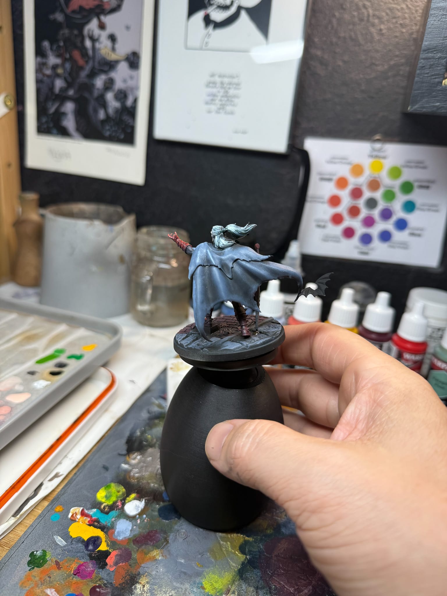
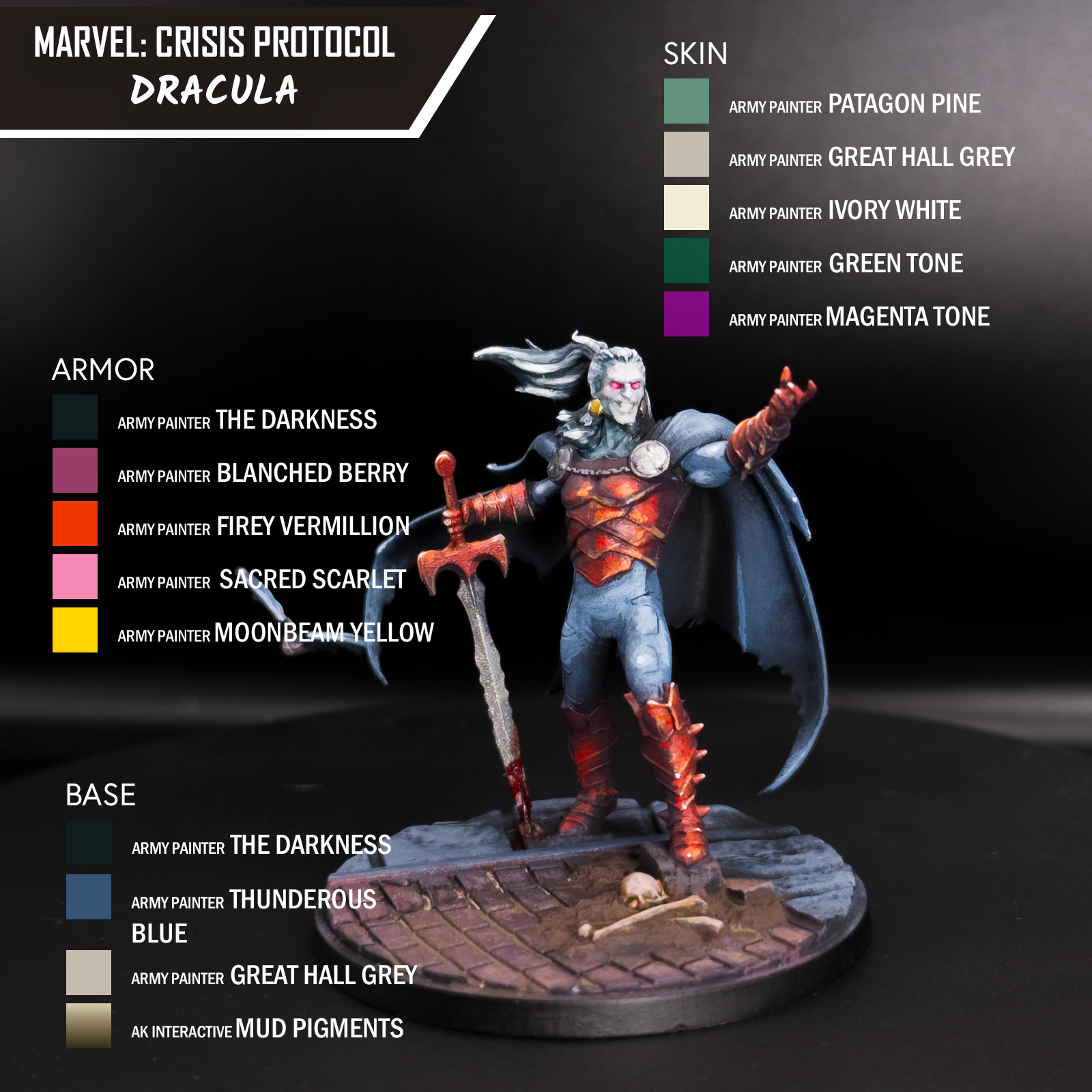
I primed in black, and then drybrushed in The Darkness, which is a dark green blue color. I wanted every part of the model to be able to point back to this solid shadow tone, so I also incorporated it into every part of the model. For the armor, I drybrushed Blanched Berry in a few passes, focusing more on the upper right of the model. When I drybrush, I used a smaller brush and focused on a downward stroke, this way I hit the armor but not the underlying shadow. This contrast will come up later.
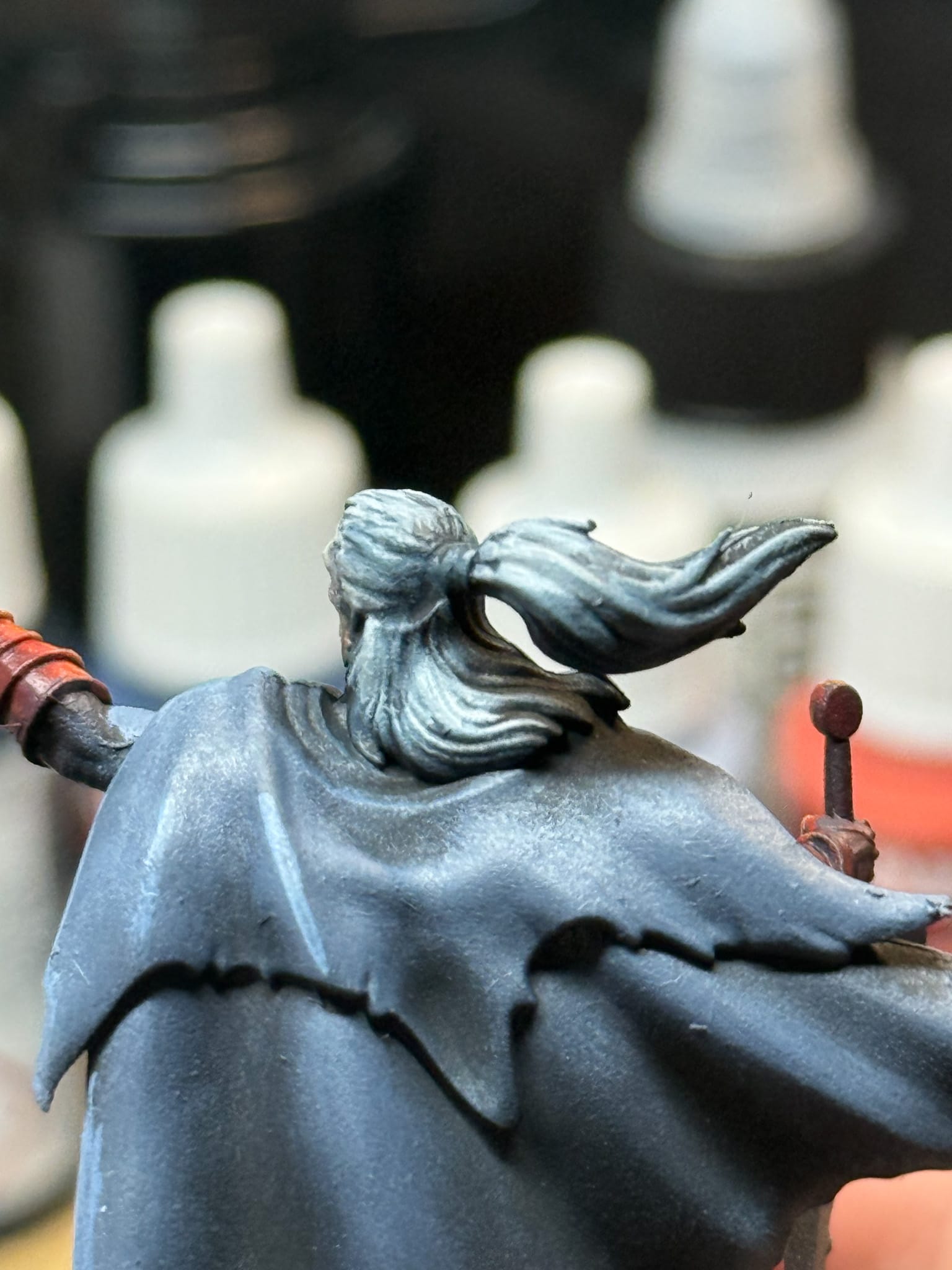
For the skin, I layered in Patagon Pine, which is a mid-tone desaturated green, but I’ll be covering the majority of it up later with other tones. And the hair was Ironclad Grey, a bluish black that plays well with The Darkness.
Base Tones
By slowly building highlights you have more control over the final model
Moving into more mid tones, for the armor, I mixed a little bit of Fiery Vermilion into the Blanched Berry and once again only hit specific areas of the armor where I would want light to hit. I repeated this same philosophy for the gauntlets and the boots, along with the front side of the sword. Once again, I’m aiming for the idea that a light source is really only lighting up Dracula from one part, vs. every part of the model.
On the skin with a wet palette, I mixed in Great Hall Grey, a warm light olive grey in with the pine and proceeded to cover the face. I did a few more passes with Great Hall Grey, and for the most part, the skin is done.
The hair took a pass of Brigade Grey, which is a light blueish grey, this was specifically layered on higher levels of the hair, being sure to avoid the shadow areas.
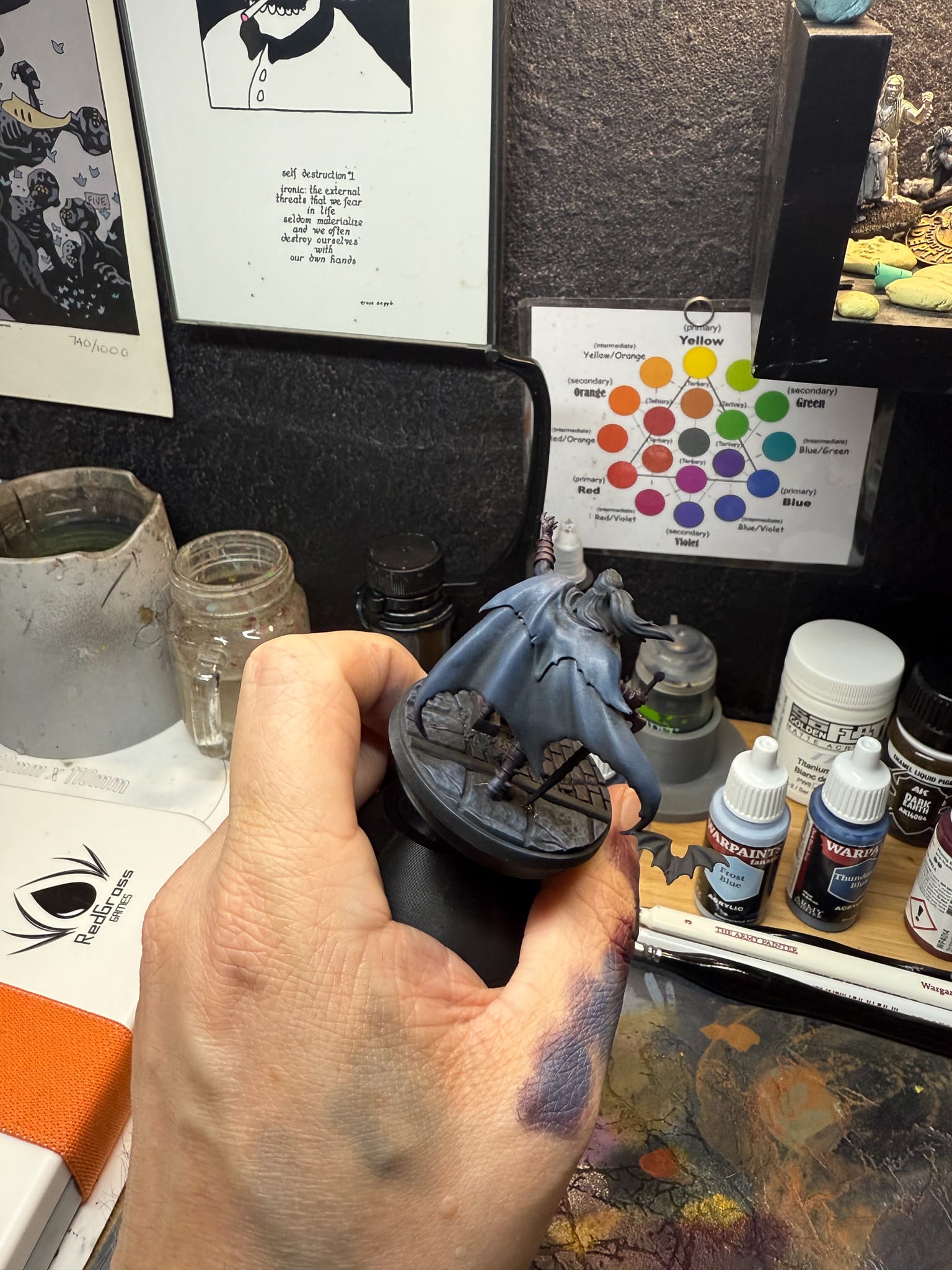
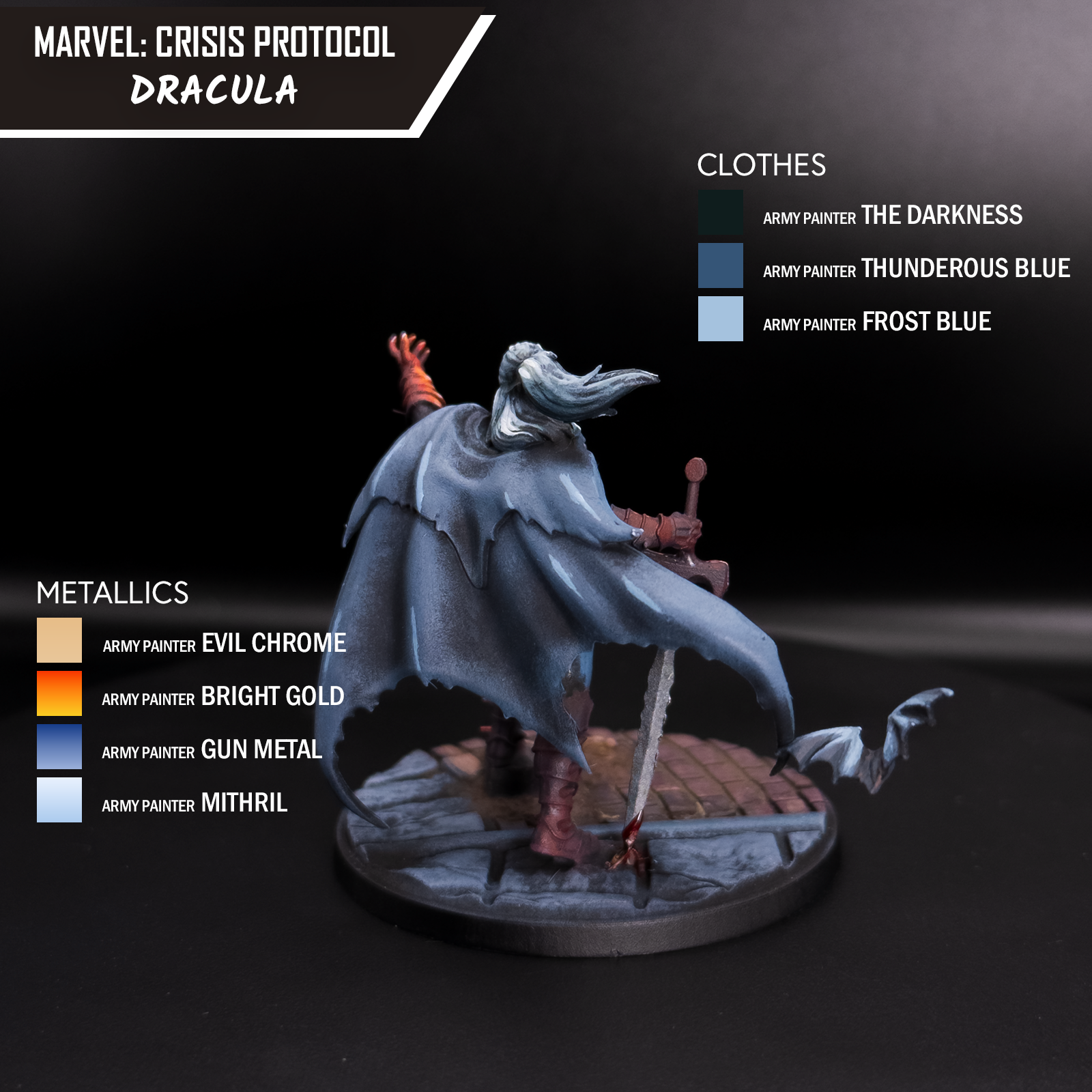
For the clothing and cape, tiny bits of Thunderous Blue mix into The Darkness, and I focused on just the high parts of the cape and the clothing. The thigh, biceps, shoulders, and the interior of the cape that sees light are the areas I paid attention to. Also, our little bat friend attached to the cape got a little bit of this too.
Highlights
Highlight red with orange & yellow, and highlight undead skin with desaturated tones.
Now for this section, you want to be calm, focused. Let things dry, take time. If you rush these parts, you’ll regret it.
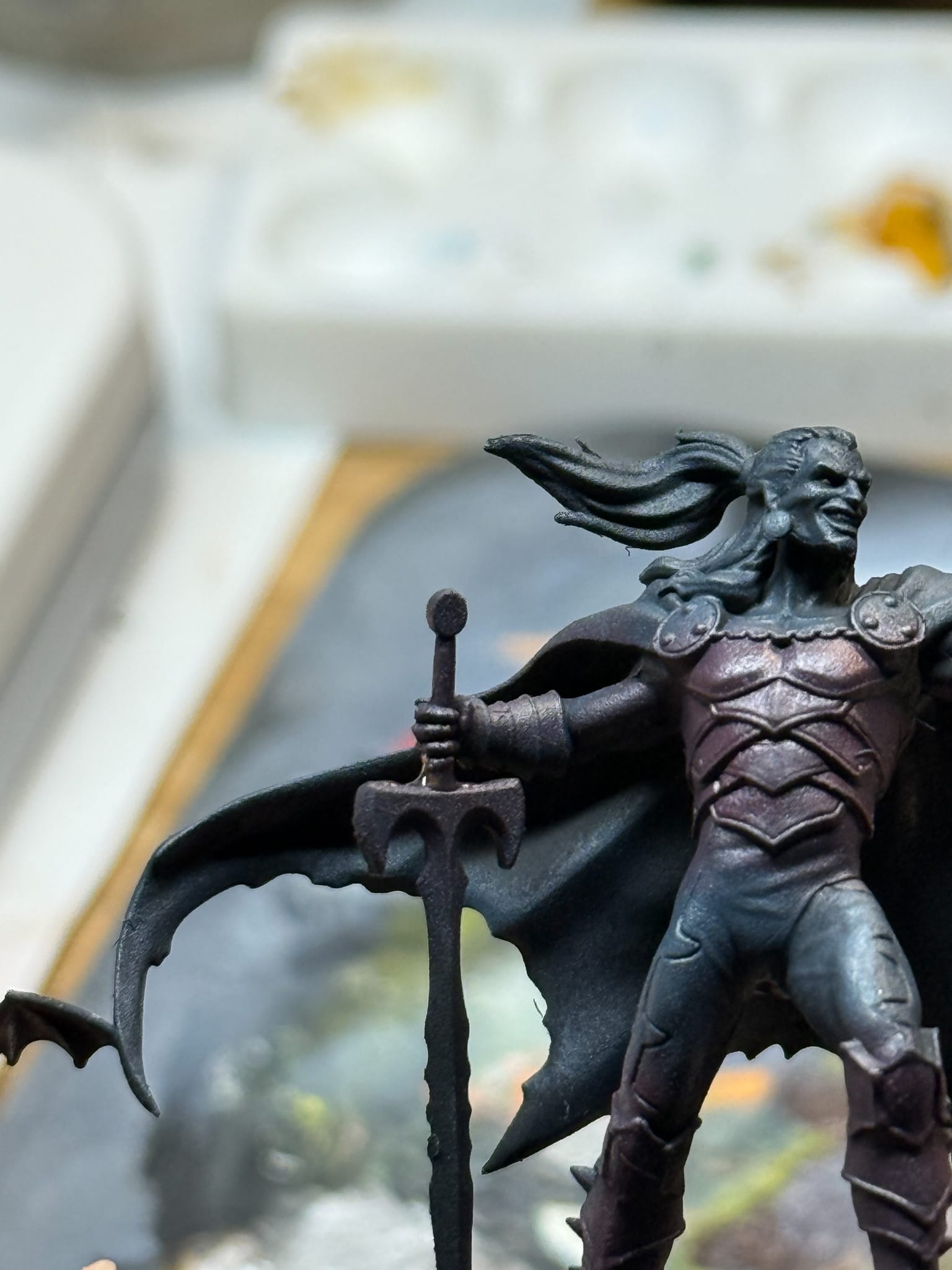
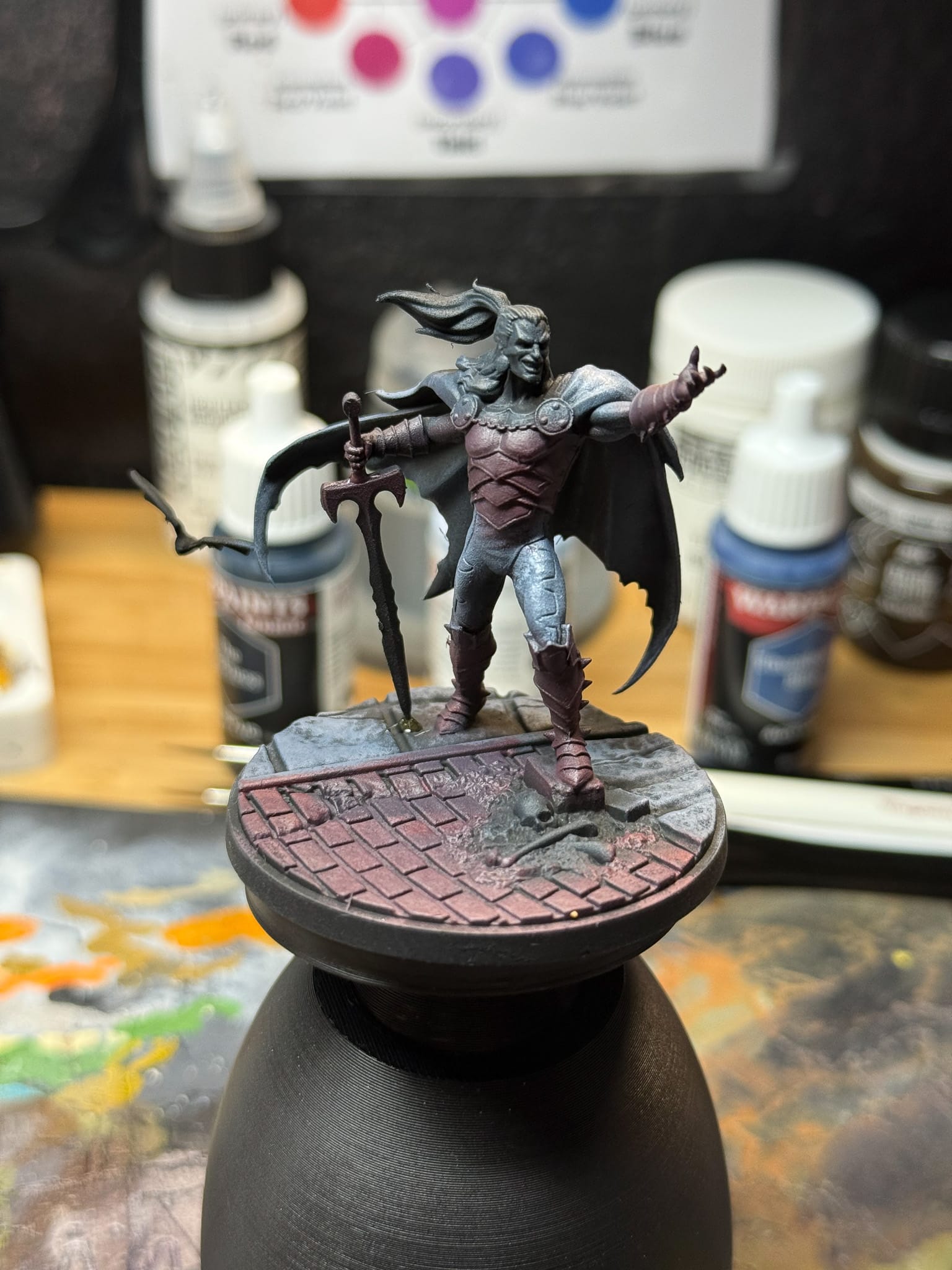
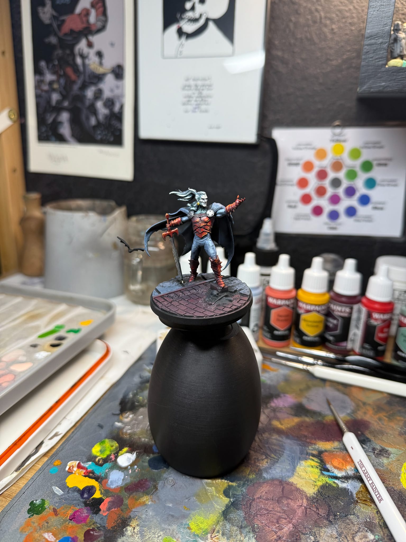
For the armor, I first put in some Sacred Scarlet, which is a desaturated almost peachy tone, which only exists as a platform for our next color, a mix of Vermillion and Moonbeam Yellow to rest on. The reason why I did this is because using a desaturated tone on its own adds white to a section, but a highlight should stand out. The best way to accomplish this with reds is to add a secondary or complimentary color. Yellow works well, but paint this in incrementally. You can easily get orange, and that’s not entirely what we want. So, moving slowly, I’m able to control the amount of contrast I create, layering this on the gauntlets, boots, edges of the sword, armor plates, and with my brightest highlight, hitting the tips and edges of the armor.
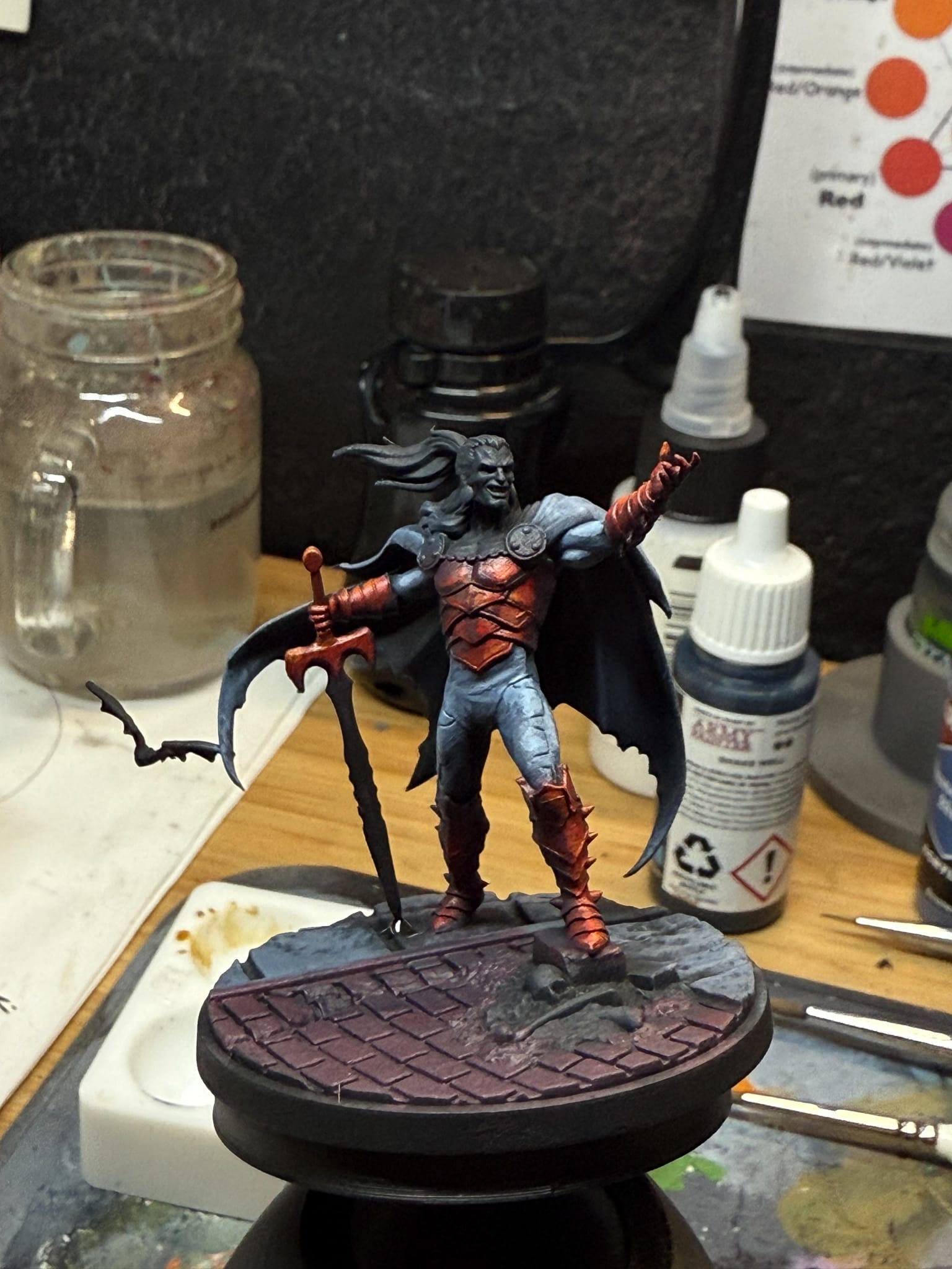
For the clothing and cape, Frost Blue is added to Thunderous. This is a dramatic jump up the desaturated blue chain so take your time with the layers. This color is used on the musculature, some of the edges of the cape, and the raised areas as well. While writing this, I noticed I made a slight technical error on the model, as I made Dracula's pants all this one tone, when the box art clearly shows some red on his pants. Oh well, as Bob Ross said, happy accident.
The skin gets Ivory White mixed into the Great Hall Grey. I really love Ivory White because of the slight off-white tone it has, it can brighten without desaturating. While I’m there, I’ll dot the eyes and paint the teeth.
Lastly, the hair got more Brigade Grey, with a hint of Ivory White, once again, hitting the tops of the hair, or plates that stand out visually. I’ll repeat this in my next step.
Selective Washes
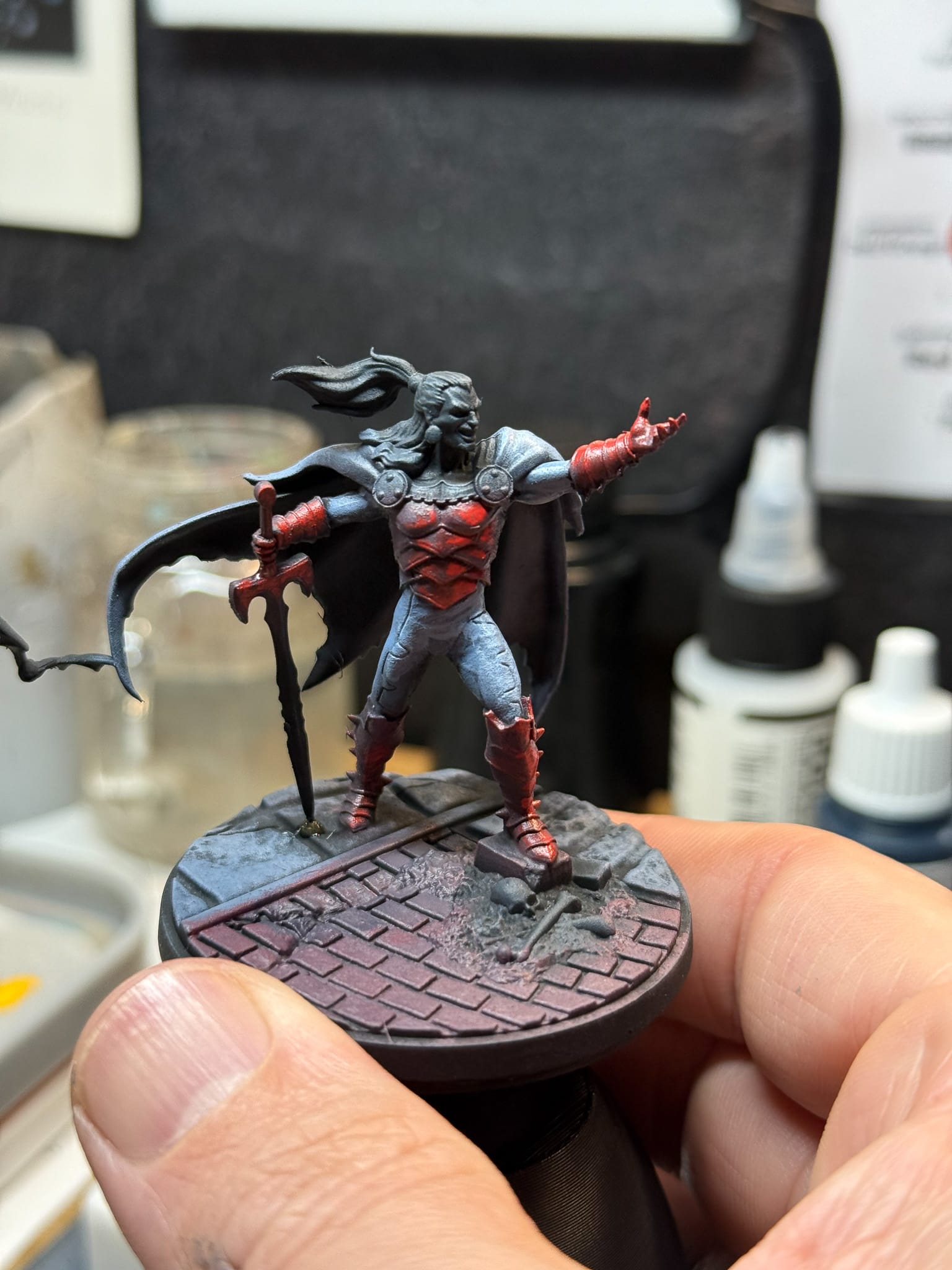
In this stage of my painting journey, I don’t rely on washes as much as I used to outside of basing or terrain. On projects like this, I use them for specific reasons. Dracula is an undead, so there should be a mix of tones on his face. Green, Blue, and Magenta wash all help with this. Focusing on the recesses of the skin and hair, these tones will help accentuate the highlights, which for some I come back in and repaint. When dry, they add tonal variation to the skin. I only wish Dracula was showing off more skin so I could do more of this but you can practice on some GW or Reaper vamps.
I will also use the blue wash on the sword and the metallic part that isn’t facing light, which brings us to our next section.
Metallics
A hint of metallic paint can really elevate a tabletop quality model.
For our silvers, Gun Metal is a fantastic bluish dark metal, which I’ll use on all metal except for Drac’s earrings. The earrings get Evil Chrome. Once these are dry, I highlight with Mithril and Bright Gold. These help create a tonal difference, and with the parts of the metals in shadow, I used Blue Tone to accentuate that.
Basing & Effects
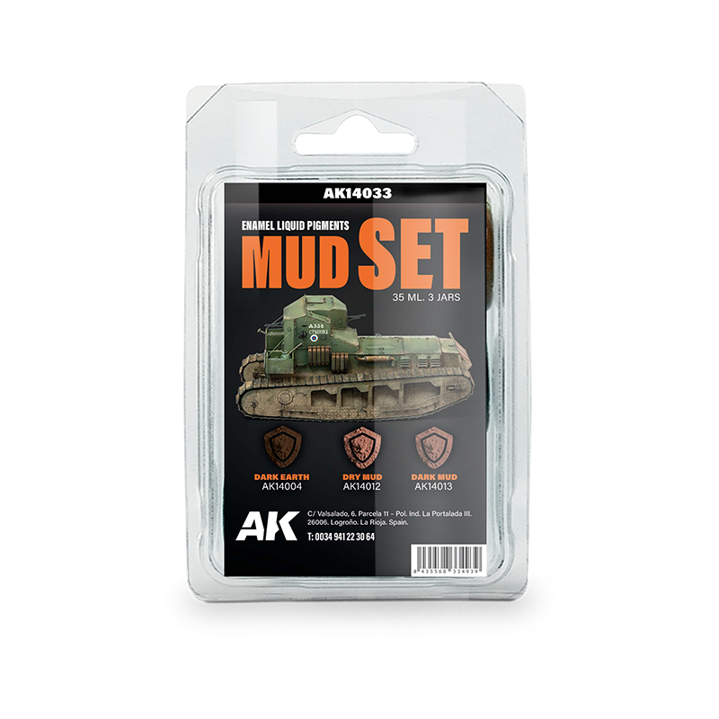
AK interactive makes incredible enamel special effects.
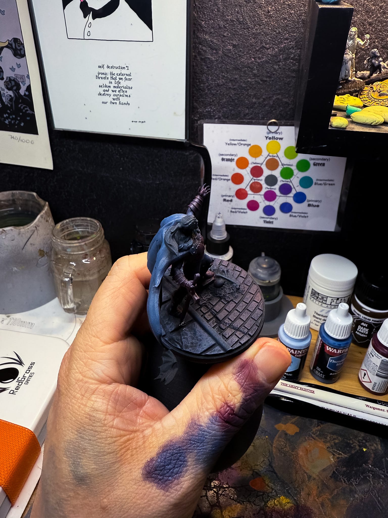
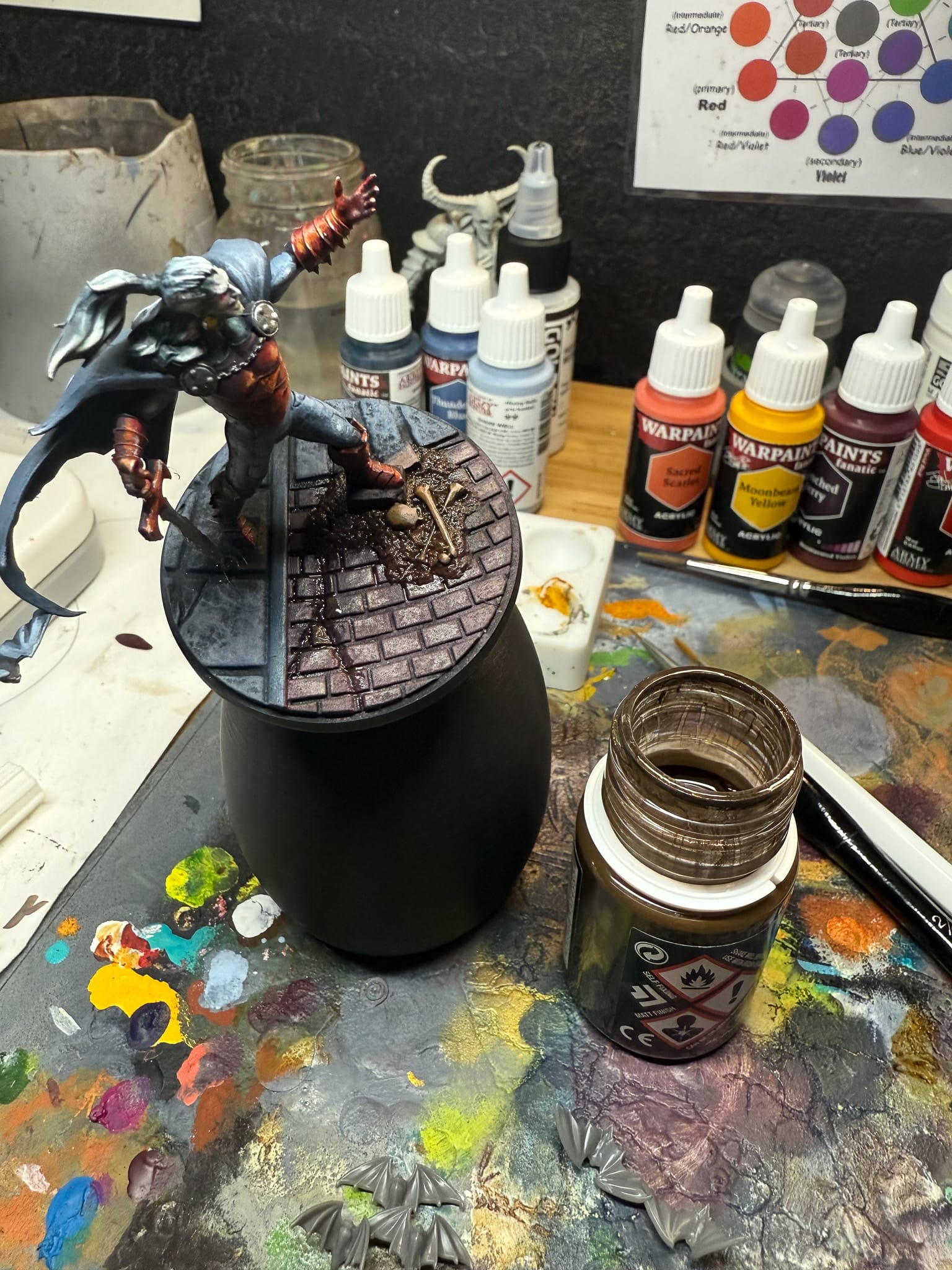
Now that Dracula is more or less done, we can move into the base. Using a lot of the techniques and tones we’ve established on the model, Darkness, Great Hall Grey, Thundering Blue help take center stage on the stone parts, while Blanched Berry and Sacred Scarlett help create my tones for the bricks.
The dirt and bones are created with Tree Ancient, Great Hall, and Ivory White, which then get a healthy dose of Citadel Seraphim Sepia, which gives me that wonderful old bone look. One more pass with my highlight mix and the bones are done.
Taking AK Interactive’s Dark Mud , Dry Mud, and Dark Earth pigments, I layer these enamel paints into the dirt and cracks. When this paint dries, it self fixes and leaves behind the pigment, accurately giving me dust in various layers.
On the sword, I actually broke it in the first drybrushing step in the beginning of this article, so I fixed the sword to the base with some liquid resin, which left a giant resin bubble. So I hit that bubble with some True Blood, which dries gloss, to give the appearance of fresh blood on the blade and hide my repair.
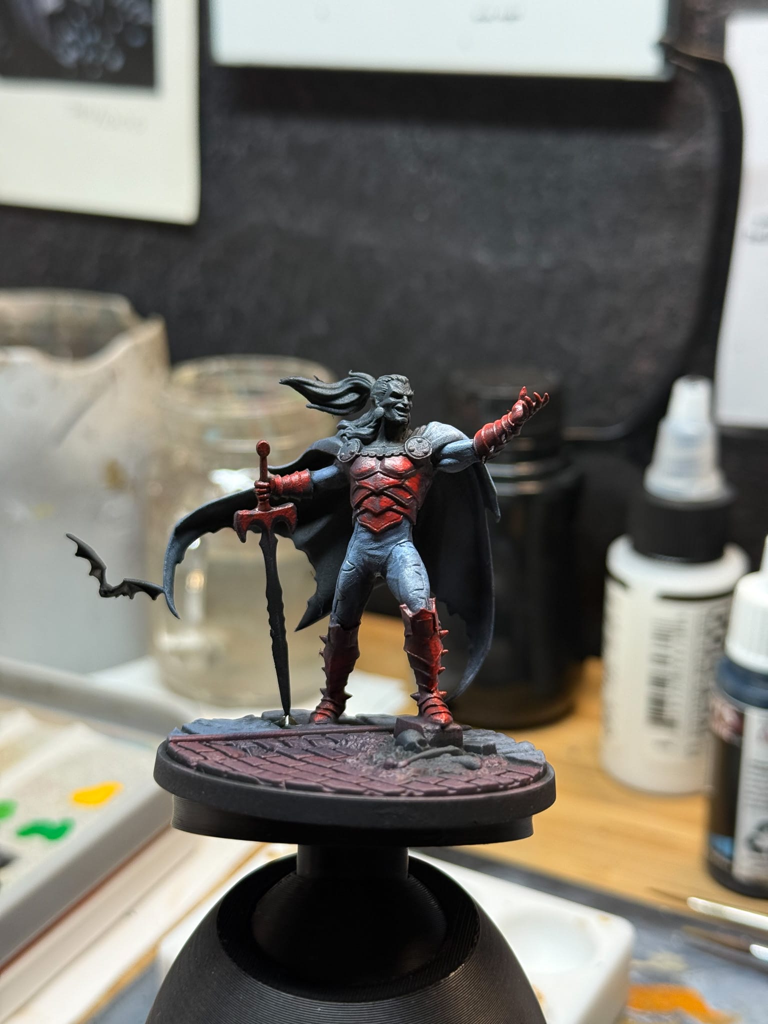
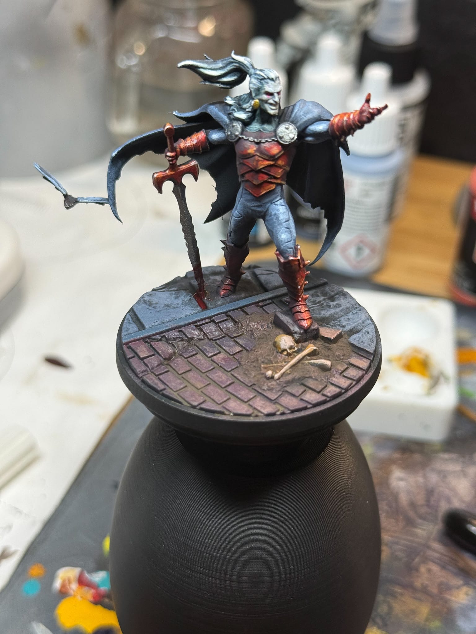
Lastly, I hit the eyes with Power Node Glow, which is a fun fluorescent pink that has ink-like properties, ensuring that the whites of Dracula’s eyes stand out and further helps draw attention to his face.
Finals
Total paint and assembly time: A few days. If I had a weekend where all I could do is paint, I’d have nailed this over a weekend.
If I want to push this further into display territory, here’s what I would do. More edge highlights, NMM for the metallics, additional tones in the skin, more tonal variation on the bricks, dirt on the cape…maybe I will in a further article. But for now, Dracula is ready for the table, with a healthy pass of Ultra Matte Varnish.
Have you painted Dracula yet? Let us know! Follow Gaming Trend for more Learn to Paint and Marvel Crisis Protocol articles. We’d love to see how you painted up your models so share your work with us in the comments or find us on Instagram!