Paradox Interactive and The Chinese Room just released the third developer diary for Vampire: The Masquerade – Bloodlines 2. In this latest entry, Ben Matthews, Associate Art Director on Bloodlines 2, dives in the art perspective and the neo-noir aesthetic of Bloodlines 2. You can read the full diary entry here, or read below for a snippet from it:
Hello, I’m Ben Matthews. My job is Associate Art Director on Bloodlines 2.
A couple of weeks ago Sarah talked about the narrative themes of Neo-Noir and how it fits into our game and now I’m here to give you the artist’s perspective.
What is Neo-Noir?
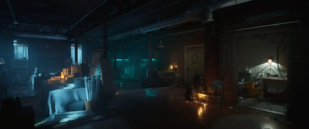
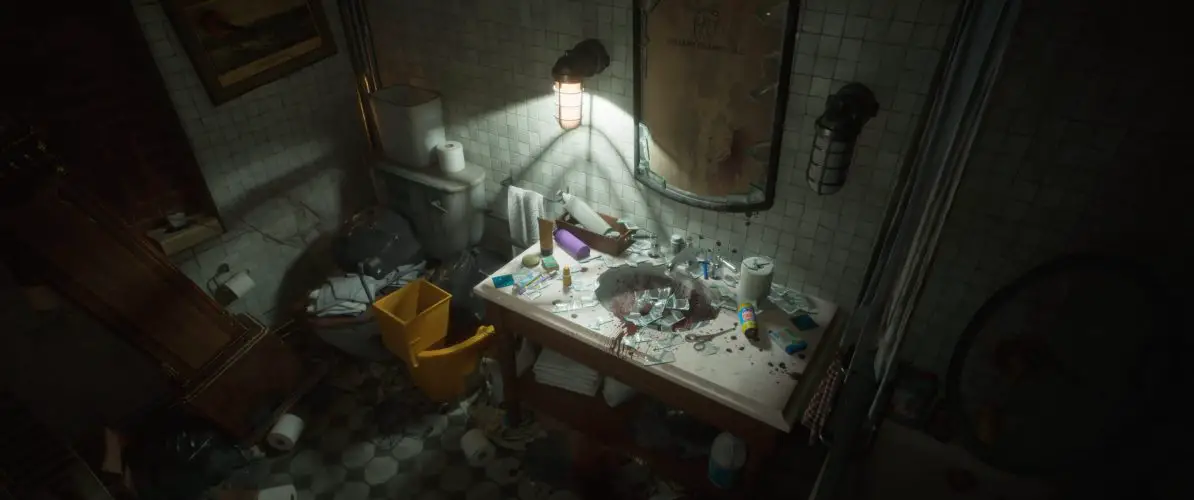
Neo-Noir is a revival movement of Film Noir from the mid 20th century. Artists focus on modern day cities, painting them in bright neon lights and deep shadows. It’s very moody and evokes places that harbour sinister characters. Think Blade Runner or John Wick. Subversive, Dark, and Threatening, are all Neo-Noir conventions we’re focusing on for our game. VtM is all of these tones and so naturally it worked hand in hand when it came to creating the seedy underbelly of our Seattle. From Locations to Characters our vision is about showing a side of Seattle at night that goes deeper than what you see on the surface. Whether it’s dark-cornered alleyways to roam or interiors that host Machiavellian politics behind closed doors. Neo-Noir puts atmosphere and contrast at the centre of its palette and that’s something that works perfectly with our Vampire fantasy and ultimately Bloodlines 2.
The World of Shadow VS the World of Light
As an Elder thrust into a modern and unfamiliar world we’re playing on all of the visual elements of Neo-Noir to paint a picture of Seattle through the eyes of our Vampire. Contrast is very important to this visual identity in lots of different ways. A classic of Neo-Noir is light and dark. We use this to split the world into two. Vampires inhabit the dark, it’s a place you need to use for safety but dark places feel more dead because of this. The darkness becomes the place where we feel the most secure, the most in tune with the world around us.
You need to be able to see where you’re going even in the dark so that’s why we’ve used a very cold colour pallet for these places. That lets us use warm colours to add life to the rest of the world that’s lit up. Humans live in the light and because you need to maintain the Masquerade, that makes the light more dangerous for you. Whether it’s delving into the depths of Seattle’s nightlife or stalking your prey for the next feed, leaving the darkness and entering the light, warm human world should be a calculated risk but one we ultimately need to take. Vampire senses are stronger than a mortal person’s so we have very a vibrant style juxtaposed between the dead Vampire world and the dangerous, energetic human world. All of these elements are accentuated in Neo-Noir’s unique use of colour and tone; the changes between light and dark have always been sudden and stark.
No Neo-Noir world would be complete without an eclectic mix of miscreants and personalities. The characters we meet throughout the game themselves have of course also taken a lot of influence from Neo-Noir aesthetics, each having their own visually striking home in Seattle creating a world of vibrancy and contrast.
Stay tuned to GamingTrend for all your gaming, tech, and entertainment news!


