Peter Pauper Press enters the world of RPG peripherals from an unusual angle, but brings with it some well-needed perspective. You can get supplemental dice, screens, et cetera from practically anywhere; RPG makers the world over know how much there is to gain by supporting their audience with these add-ons (other than Hasbro, who doesn't understand its product or audience). Peter Pauper Press, however, is a publisher first, making stationary, journals, and other book accessories. This experience has taught them some important things about the value of the material's quality and usability that often eludes traditional RPG publishers. With my discussion below of their Campaign Journal, DM screen, and Battle Mat, I've found more than a few places where that eye for the end user and experience with publication has created some uniquely impressive materials to assist at the gaming table.
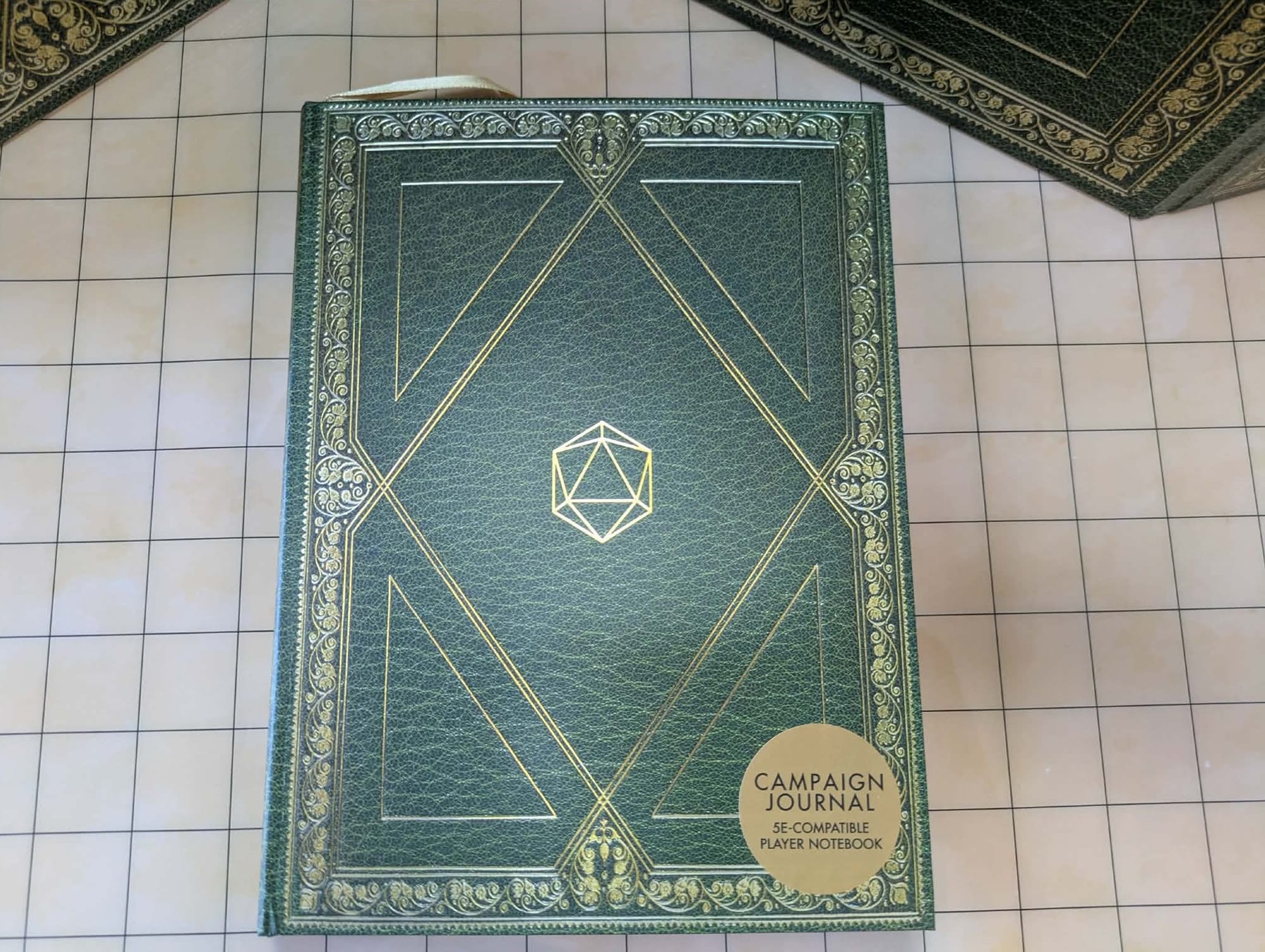
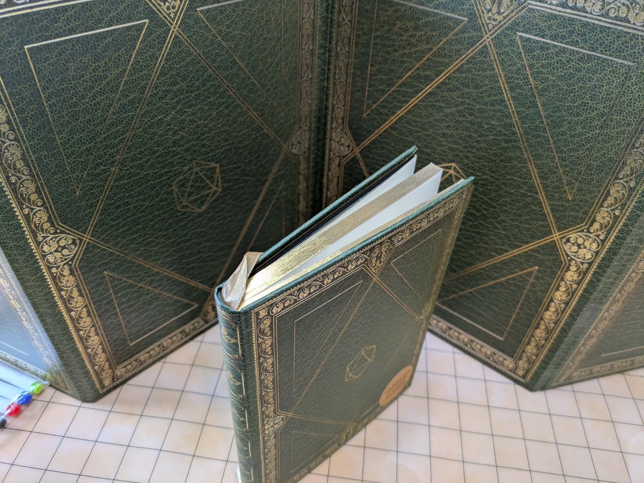
There are lots of little thoughts and considerations that elevate the materials from useful add-on to critical tool for your game. Beyond the general component quality, which I'll detail in each individual section, there's a cohesion of aesthetics that goes a long way. The journal and screen both feature gold and green designs melding the elaborate and the austere. These could easily be props for a LARP, with their simplistic yet fantastical designs. Clean lines with gold flair very much sell the feeling of an elven wizard's book: they're natural, injected with a bit of the divine, and glittering with hints of detail and color.
A quick note before I continue: you'll notice that this is listed as an "Impressions" piece rather than a traditional "Review." The differences are minor and subtle, but mostly come in terms of these materials not having a numerical score. I think that would be inappropriate here: I'm about to lay out, in detail, everything material about what these products are and why I think they're high quality. These materials are, at least as compared to a game book with hundreds of pages and thousands of words, relatively simple. A number at the end of the article will not give you any more information or insights that aren't contained in the words preceding that number. I just don't see what we have to gain by adding a score at the end. You can read my thoughts and look at the current price, and between those you should have everything you need to know.
I'll include the prices for each item at the end of their descriptions, which I should add are universally reasonable for pieces of such high quality.
Campaign Journal
This is a serious step up from the old notebook with a long-since torn off cover that I, and I suspect many of my ilk, are using now. We've discussed the cover with embossed designs, but there is still material to look over before opening the thing. Shimmering gold tips every page, and the inside back cover holds a small pocket for note pages, maps, or spell cards you may want to use. That's a little thing that belies a greater understanding: you usually have extraneous materials flying around the table while running these games and you'll need somewhere to keep them. Adding the pocket at the back is a small consideration, but a thoughtful one that probably added some expense to every book. It's great to see.
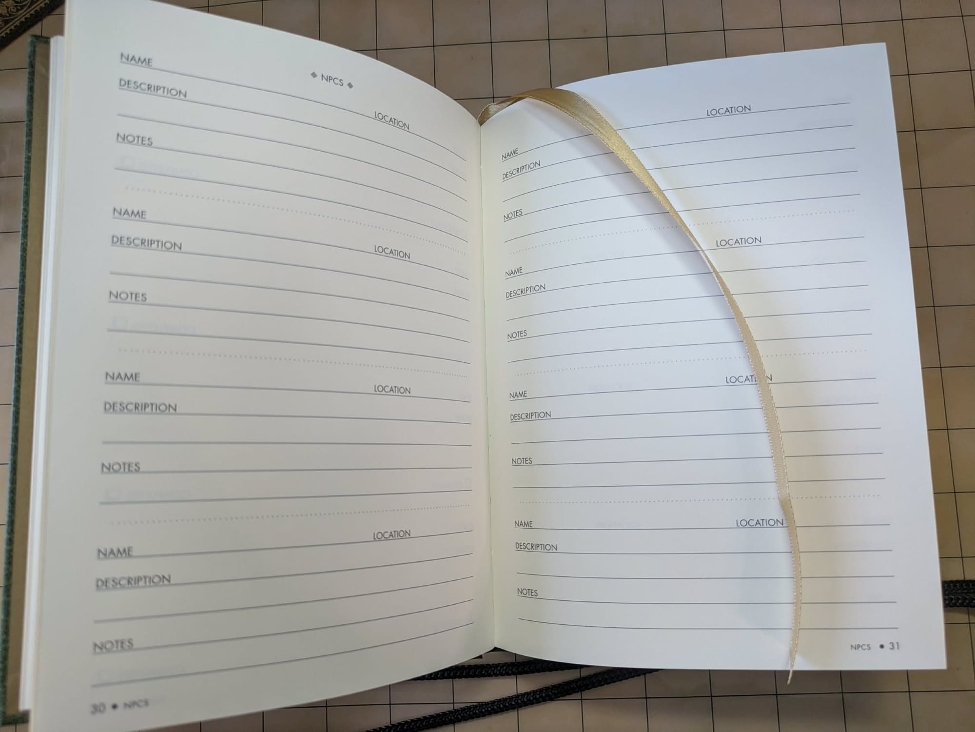
The journal itself contains 160 pages, with a gold ribbon to help keep your place. It starts with a table of contents, followed by an index for you to fill out yourself for future notes and page numbers. This is another GREAT thought that will teach DMs important rules about organization, while helping keep them on track over multiple weeks or months of play time. There are also many pages dedicated to characters: their statistics, notes, and spells. I say "characters" but I really mean that in the singular, because there's only room for one. I think this is intended for one person to keep all of their information in one place, but I would have preferred for less page space spent on one character, with some more room for tracking everyone at the table. I feel like the DM is the person most likely to want this kind of journal, and they will have multiple characters to track. That character sheet is also 5E specific, something that's both a benefit and a drawback. For D&D gamers, this is a near unqualified recommendation. For everyone else, you'll have a few (though not many, all told) irrelevant pages to dutifully ignore.
Beyond all that are some well-constructed pages for NPCs, factions, inventory, quests, maps, quotes, and a quick summary of important rules. Most of the page count is just the Notes section, but it bears repeating that these pages are full of small details that WILL help you during the game. Things like each page top containing a section for Title and Date to help you navigate. I'm writing as someone with a diagnosably terrible memory and organization. Over a lifetime I've learned to use tools to overcome these deficiencies: keeping good notes, using calendars, et cetera. The thoughtful inclusions PPP has all over its materials are exactly the kinds of tools I learned to rely on, and the things that will help you track progress in your game. If the campaign journal is this good, I'm going to seriously consider one of their normal journals for a young student the next time I need one.
The Campaign Journal is available for $14.99 at time of writing.
DM Screen
The screen's aforementioned aesthetics also bypass a consistent pet peeve of mine with modern game material - the instinct to be over-designed in the name of delivering something cool or thematic. Most screens are blasted with an action portrait. They make themselves a canvass of fantasy action that, to me, is not conducive to the game. Yes, it may be cool to see the big dragon fight motif, but that kind of busy, conceptually detailed painting brings down the intensity of the material by splashing the action over directing the eye anywhere. It's distracting, and brings down both the seriousness and imaginative potential of what's behind the screen by slathering purple Tieflings all over it. Compare against this official 5E screen. It least focuses the eye at the center and vaguely suggests the kind of framing you could find on a temple wall, but its colors and designs and character sizes that are all over the place. This is one of the better examples, but we have more typical problems with this Pathfinder screen or this Tomb of Annihilation screen. I'm not trying to ruin anyone's buzz here: I appreciate taking the opportunity to use such a large canvass proactively to show off your art and sell the mood of the adventure. I just prefer PPP's approach, bringing intensity with its austerity and clean designs. If I had my druthers they would create a Call of Cthulhu screen with art deco influences that play directly off of this kind of design sensibility.
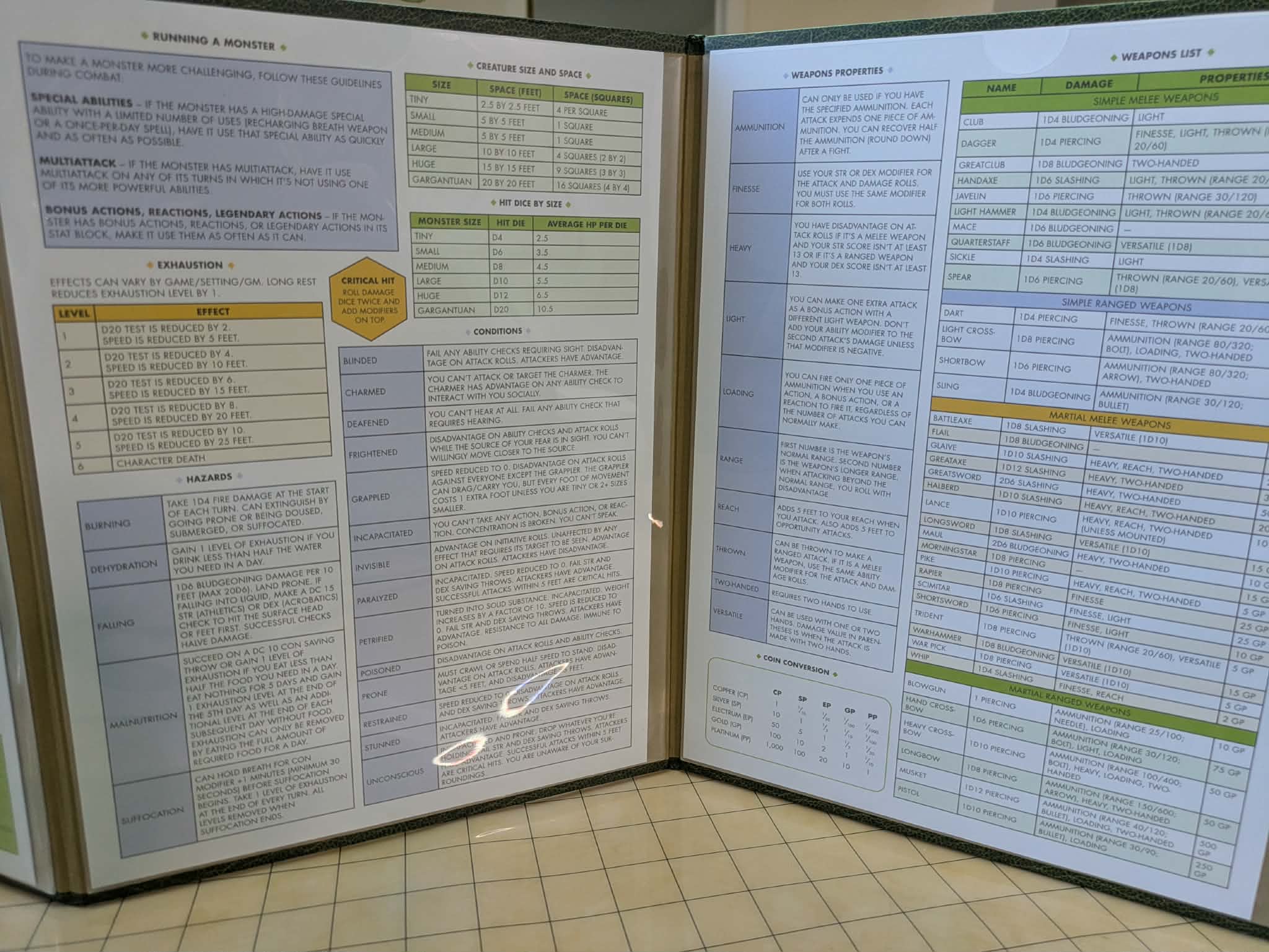
The internal materials are laminated and replaceable, instantly making this appropriate for any game you could want to run. The laminated pockets include small cutouts to make the pages easier to remove should you want to replace them. The default pages are again D&D focused. At a step above paper and a step below cardstock, their material is sturdy and quality without being something I would feel terrible about replacing with paper. The space is also used quite well. It's got a variety of colors and shapes for the information, making it easy to navigate even within the DM screen itself to find crucial rules for 5E. With these considerations, they can fit more information onto the pages than in most DM screens, because the information is clear and uncluttered in a way that will make it eminently usable.
The GM Screen is available for $24.99 at time of writing.
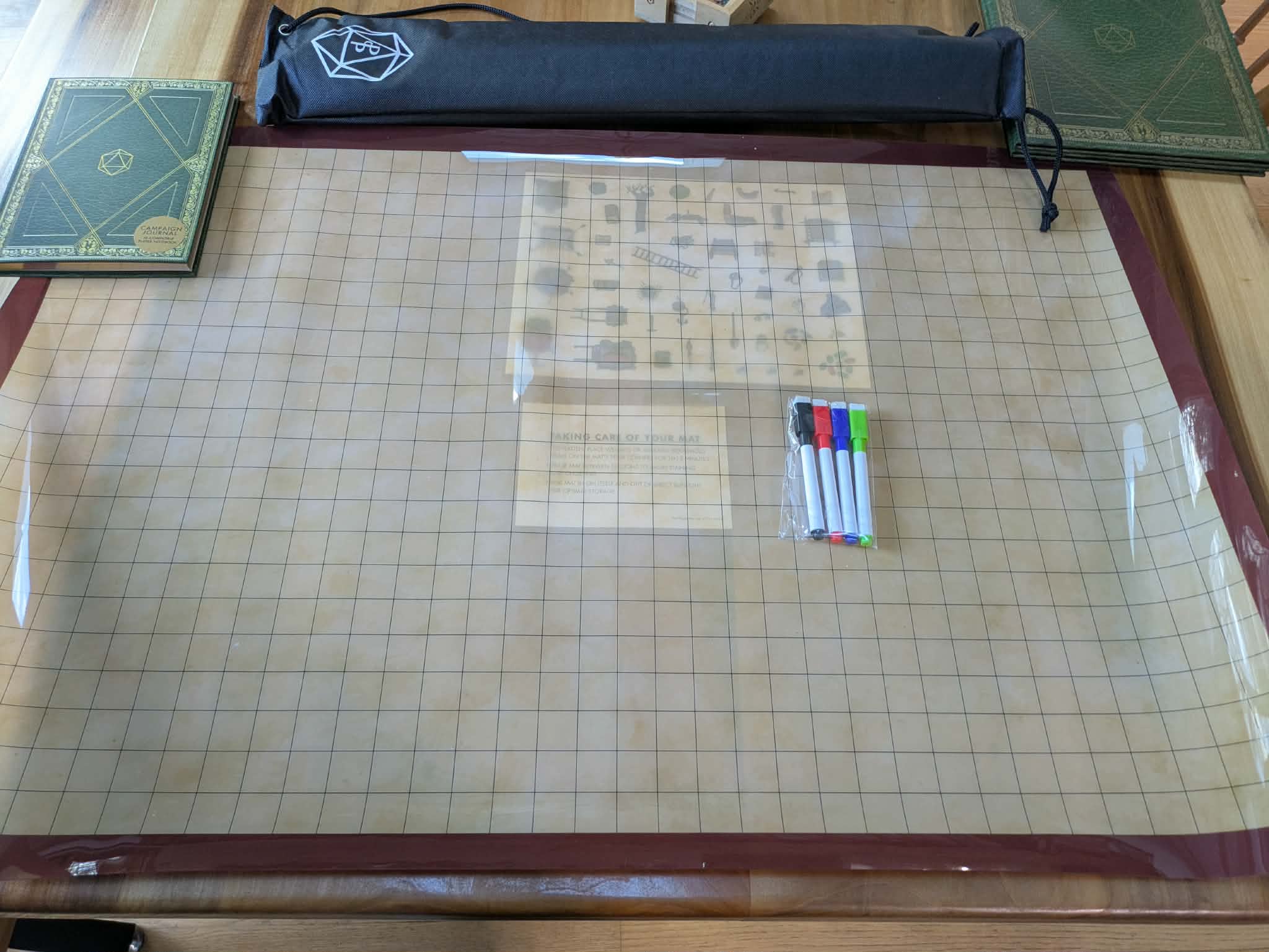
Battle Mat
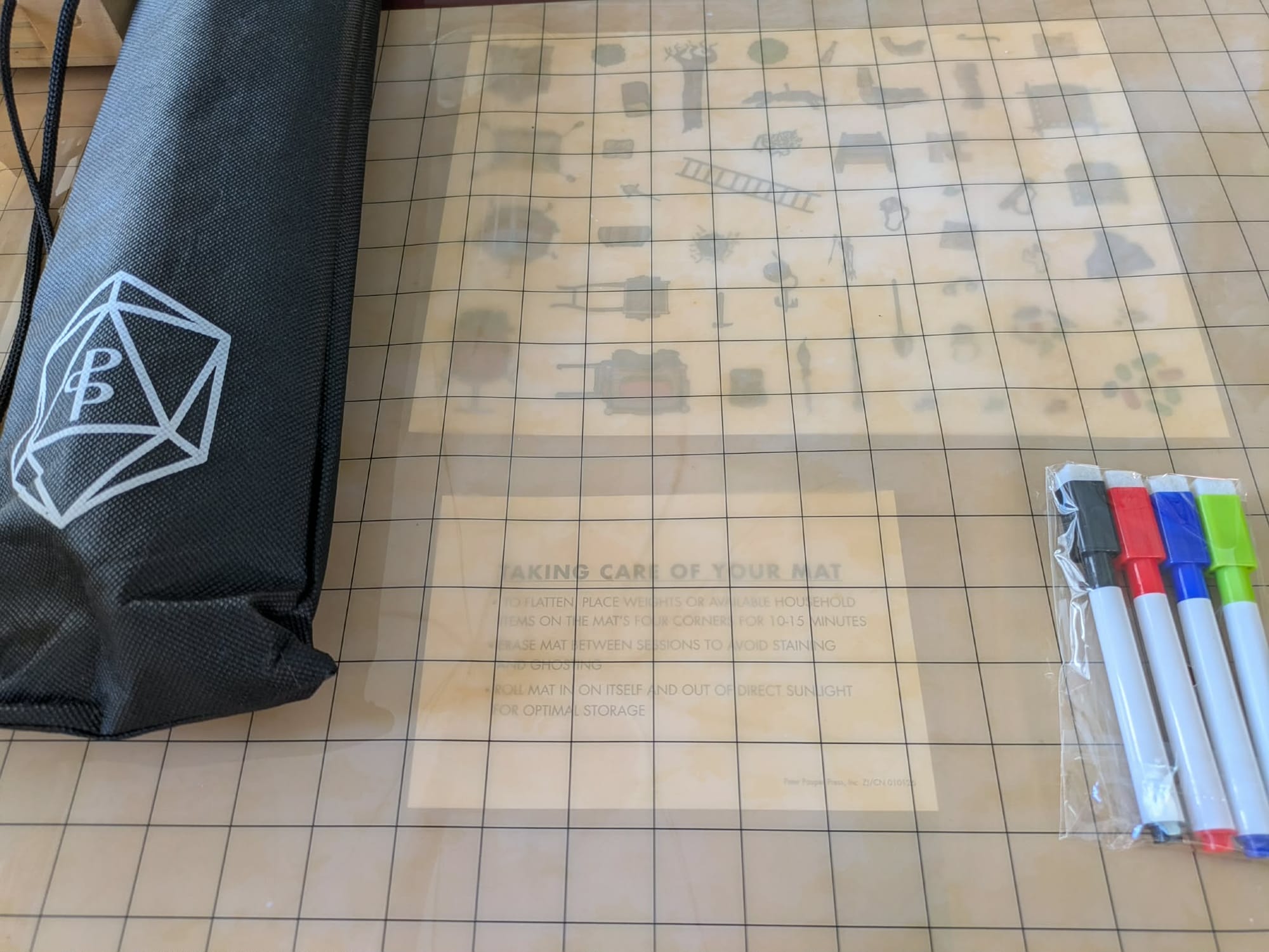
Once again the scene is awash in battle mats, and Peter Pauper Press manages to stand out. Before opening it up, you see that the mat comes with a nice carrying case. I say "nice" rather than "transcendent" because the material is a sort of polyester rather than cloth. It doesn't feel cheap but it's also not the main draw here. That said, the inclusion of such a case at all is wonderful. The PPP gaming logo is placed at the bottom, and it's a nice design I think they should use more often. Along with the carrying strap, this case will keep everything easy to travel with while making room for other odds and ends like dice.
Speaking of those additions, the battle mat comes with four colored dry erase markers, a small pack of reusable vinyl stickers, and some cleaning instructions. The stickers are a nice touch, though there are relatively few of them given the size of the mat. They're a small boost that you may not see intensive use of, but they make the important point of giving you a glimpse at how you could use these kinds of tools on your mat. I would otherwise probably not have considered them, but seeing how well they stick to the mat here, I may consider getting a larger pack.
All that belies the mat itself, which has some more nice touches to it, and one minor drawback. At 36 inches by 24, it's a good middling size: this will reliably fit on most tables you could conceivably need for it, but doesn't have the breadth of my reliable old Chessex mat, a glowering behemoth of a thing from my early days in GMing. It doesn't have the stains either, and with its laminated surface is likely to keep them off.
Nicer than any of that is the fact that it's translucent, making way for maps, projections, or art placed beneath it. This lets you apply a grid to something without compromising the material itself. A battle mat is a simple thing, usually. It's just a grid, right? All you need are black lines in formation. Yet I think PPP's approach adds some flair and inspiration to what you can do with it as a physical object. What fantasy inspiration do you have that could fit right under it and become an environment? What blueprints? I like the idea.
The Battle Mat is available for $29.99 at time of writing.
Conclusion
I can count myself impressed on multiple levels here. GamingTrend has covered premium materials from official gaming sources and unofficial, but one of my biggest surprises in recent memory might just be coming from a publishing house that usually isn't focused on games at all. The materials have reasonable costs which grant you access to a nice array of small, thoughtful details that improve their aesthetics and usability.
All of these materials are available on the Peter Pauper Press website now, and I'll be sure to keep an eye on them in the future.