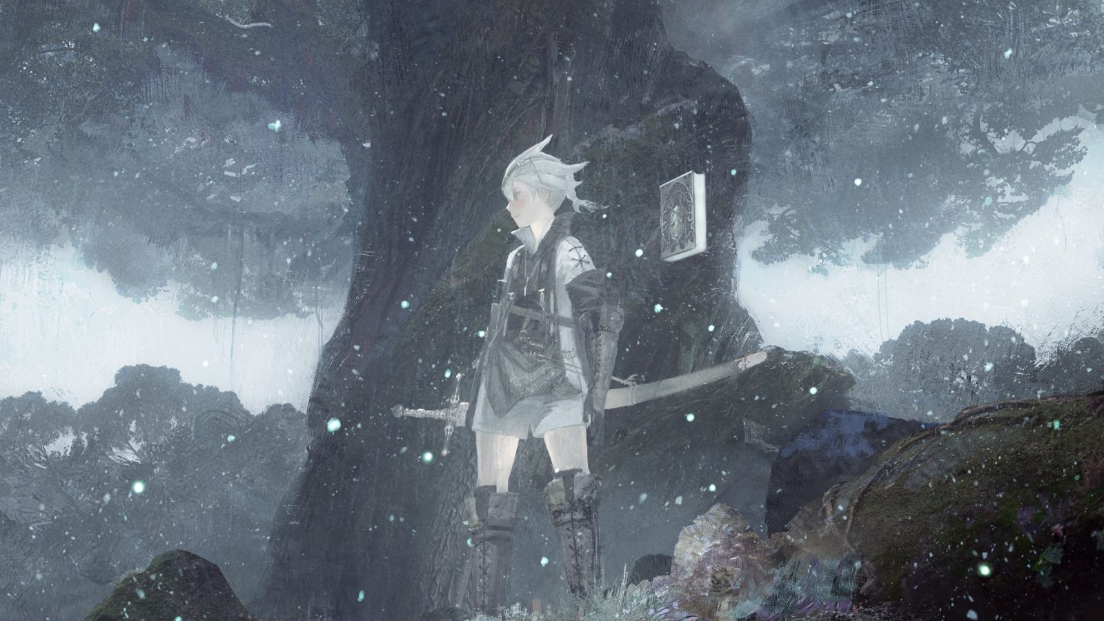
The NieR series is very near and dear to my heart, not only for its stories and gameplay but also the incredible art direction. Taking place on a long dead Earth, each game shows life persisting after humanity in different ways. If you just can’t get enough NieR (like me), we’ve got a nice artbook that can show you how those worlds came together: NieR Art Koda Kazuma Works.
NieR Art Koda Kazuma Works shows you concept and promotional art for all three games and even the various stage plays. The book starts with Automata, proceeds into Re[in]carnation, and ends with the recent remake of NieR Replicant. Automata is the largest section, with the remake close behind, which makes sense considering Automata’s popularity and Re[in]carnation’s status as a mobile game.
If you’ve read my previous reviews on art books, you’ll know I’m a bit of a stickler for layout; always appreciated thoughtful placement of the artwork so it doesn’t get lost between page folds while remaining large enough to make out details. Unfortunately, this book is a bit of a disappointment in that regard, pretty much all the artwork is spread across two pages which obscures parts of the image due to the thick pages and hardcover. There’s also quite a lot of wasted space on each page, with very little artist commentary.

Even so, the art itself is still wonderful. Many of the pieces displayed were meant to establish the overall visual and mood of an area in the game. For example, the Abandoned Factory in Automata depicts 2B looking at the island the factory sits on from a distance, with an old bridge barely connecting the gap. The factory itself is an intimidating behemoth, shrouded in fog, contrasted by the forest and waterfalls just outside of it. While you never see a view like this in game, it feels perfectly representative of the area. Pieces like this, that give a new perspective to the haunting world of NieR, were my favorites in the book, but there are a lot of other great pieces like the promotional art and game covers.
I haven’t played much of Re[in]carnation, but the art for that game is especially evocative with a more magical feel to it. Each area has white banners flowing throughout, which nicely connects them while remaining distinct with other features like flowing sand or flying whales. It really makes me want to go back and try the game again, despite not enjoying playing games on my phone.

The artwork for Replicant is just as great as everything else, but it feels a bit odd that the original games were not included in this book. I can’t tell if Kazuma worked on the PS3 and 360 games from my research, but I’m personally disappointed by the lack of Papa NieR. Still, Brother NieR perfectly shows one of my favorite things about these pieces: the scale. A lot of the artwork was meant to help the 3D modelers, so the pieces include the characters to establish how big each element is supposed to be – you don’t want what was supposed to be a pebble to end up bigger than the player, after all. The way the characters are drawn just adds something magical to each piece, giving the beautiful areas a lonely and depressing feeling. It’s difficult to explain here, but there’s something so perfectly NieR about it.


