You might recall that I reviewed the Loupedeck CT – an ambitious and powerful control surface that immediately improved my workflow with programs like DaVinci Resolve, Lightroom, and the entire Adobe editing suite. Clearly aimed at the content creator, the Loupedeck CT is an impressive piece of hardware. The only big drawback was that the software was a little clunky, and it’s beyond overkill for the average streamer, despite having a wealth of options to help them with their flow and controls. Fast forward to today, and Loupedeck has delivered on their promise; vastly improving the software that lies at the heart of their products. Wanting to see how their streaming deck, the Loupedeck Live, compares, I picked one up and set to work.
You’d not be far off in saying that the Loupedeck Live is a slimmed version of the Loupedeck CT. Dropping the jog wheel and the 12 buttons adjacent to it, the Loupedeck Live is effectively the top half of that unit. For streamers it’s all you need, but the extra features are the key differentiators here.

The first thing you’ll notice when you pull the device out of the box is that it has a number of physical advantages over every other streaming deck on the market. There’s a touchscreen like all the rest, though the layout is slightly different. Instead of a 5X3 grid, this one is slightly slimmer at 4X3, but with two vertical buttons the full height of the screen. These side screens tell you what’s currently assigned to the dials, and you can swipe the vertical bars up and down to change to different dial pages. We’ll get into customization later, but suffice it to say you aren’t losing any buttons over the Live’s contemporaries, instead gaining some additional functionality. It’s also worth noting that the buttons here are part of a larger touchscreen, with small black borders surrounding each to keep them distinct. Other devices use hard plastic buttons that you can press instead, but that touchscreen is hiding another function. Swiping left or right changes the “page”, offering up an innumerable amount of additional buttons without having to dedicate one of your precious buttons to being a “back” or ‘switch pages” button, or worse, two of them so you can go back and forth – points to Loupedeck on this one.
Below the touchscreen lies one of the key differentiators that makes the Loupedeck Live stand out. Eight physical buttons lie at the bottom, and six analog dials flank the screen, three to each side. These buttons and dials, much like every other button on the device, do…well, whatever you want them to do. The round buttons and dials can be grouped into various workspaces, changing your entire layout quickly. If you aren’t using the automatic switching functionality that detects and adjusts on the fly, this will allow you to rapidly switch your workflows. The dials have detents so you’ll feel each click, and each of the dials acts as another button as you can click them in, adding six more buttons to your layout. To call the Loupedeck Live “feature rich” would be a gross understatement.
The power of the Loupedeck’s flexibility comes from its software. You might recall that I found the software for the Loupedeck CT to be rather clunky. The team has been hard at work on the software side, and it shows. What was once difficult is now a breeze. Before we dig into that, let’s talk about Profiles.

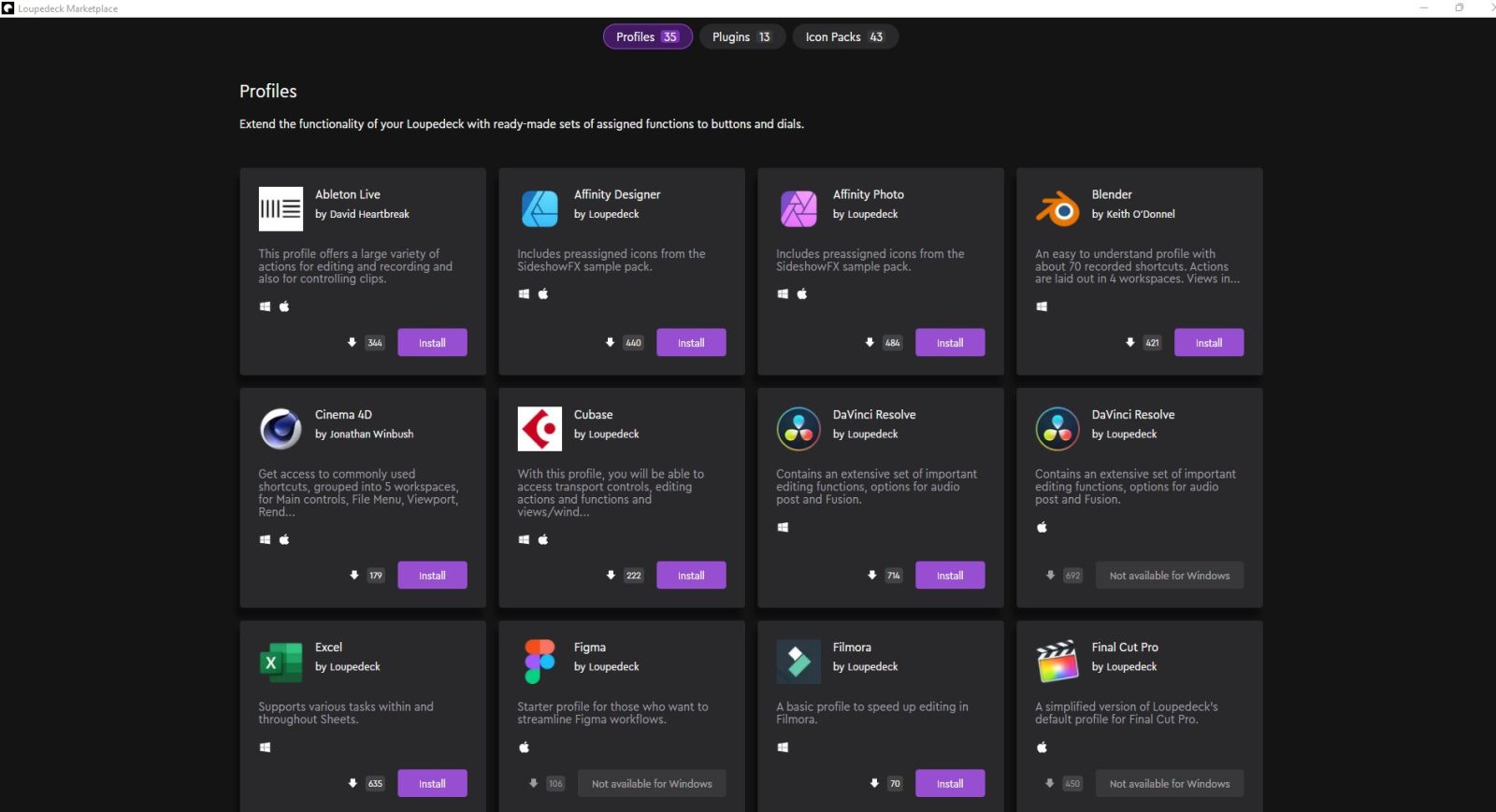
If you aren’t into creating your own profiles from scratch, or if you want a good starting template to customize, you’ll be happy to know that the Loupedeck ecosystem now has a marketplace. There are, at the time of writing, 35 free Profiles for you to download, pre-populating your Loupedeck Live with all the icons and functions you’ll need. If you do photo editing or color work with programs like CaptureOne, Affinity Designer, or Lightroom you’ll find a profile here to help you do that. Vegas Pro, Premiere Pro, Power Director, DaVinci Resolve, and other video editing suites have profiles as well. There are even prebuilt Profiles for Outlook and Excel. Almost all of the prebuilts require a little bit of tweaking, but not much.
Beyond the Profiles, there’s also a section for Plugins and Icon Packs. The last one is self-explanatory, and there are a TON of websites out there with free and paid icon packs that’ll work, but what are Plugins?
Plugins cover a wide range of third party applications to help augment your workflow. For example, Elgato Control will let you control your Elgato lighting, camera, and capture cards. MuteDeck gives you more granular control over your Zoom meetings — something we’ve all become a little more familiar with these days. There are a handful of voice control and volume adjustment options. If you stream you know the struggle of balancing your voice, the game’s output, and in-game chat all at the same time, so these can help you seize control of those easily enough.
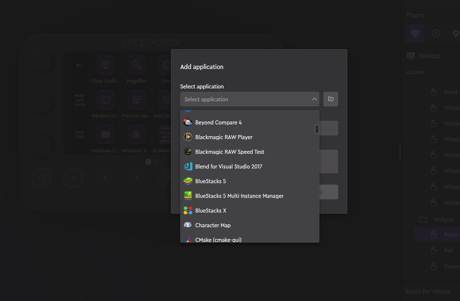
When customizing your own Profiles, just about anything you can think of is represented. If you’d like to make your knobs adjust the brightness of your monitor, that’s probably already mapped. If you’d like to instead make it (or another knob) change the selection size in your graphical editing program, that’s easy enough as well. If you use multiple desktops, you could scroll through them in both directions. You can either click the add function button, or drag and drop a function from the menus on right directly to the button you’d like, adjusting it if further inputs are required.
One of my personal favorites, and a complete surprise, is half a dozen icon sets from an author named iConCity. They have icons for Farming Simulator, Microsoft Flight Simulator 2020, a Productivity Suite, Sim Racer, Streamers Everydays, and Star Citizen Mining Icons. That last one came as a complete shock, but let me explain why if you are planning on mining it could be the coolest addition to your game.
![]()
Mining in Star Citizen means selecting a ship with a mining laser and collector on it, flying out to a space where there are asteroids to break up, and then cutting those up. To do so, you’ll pull close and then deploy the laser. From there you have a small minigame where you slowly amp up the power, making constant small adjustments to the laser to keep it within safe levels. Sustained power on a single point will eventually shatter the asteroid. As it breaks up, you’ll switch to collection, pulling the larger bits of debris into your storage space. There’s something tactile about doing this with a radial button instead of fiddling with keys or your mouse scroll wheel that feels that much more immersive. Not for nothing, there is a paid pack you can pick up at the iConCity site that lets you import over 222 icons into the system for a full Star Citizen experience, but I’m not reviewing that. I’m happy to say that it works perfectly. Better still, it’s a step up from the physical buttons of the Live’s competitors as you can swipe to switch screens. As such, I have a pre-flight screen, a mining screen, a combat screen, and a landing sequence screen. I’ve not set it up yet, but Microsoft Flight Simulator 2020 would also benefit greatly from having virtual control surfaces, even if you have a Turtle Beach VelocityOne Flight controller (Our review).
If I have a suggestion for the Loupedeck team, they need higher adoption rates. Right now you can get a lot of prebuilt profiles for their competitors, but there are very few for the Loupedeck series of control surfaces. Were I a decision maker there, I’d put somebody on doing nothing but making quick profiles for the most hotly-anticipated games to make them easy to import.
Another aspect I like about the Loupedeck Live is that it is incredibly portable. The stand secures at the back of the device with two pegs, so it’s easy to remove and can be tossed in a bag with the device. Weighing in at less than a pound, the Loupedeck Live is lightweight and portable, making it easy to keep useful tools with me while on the go.
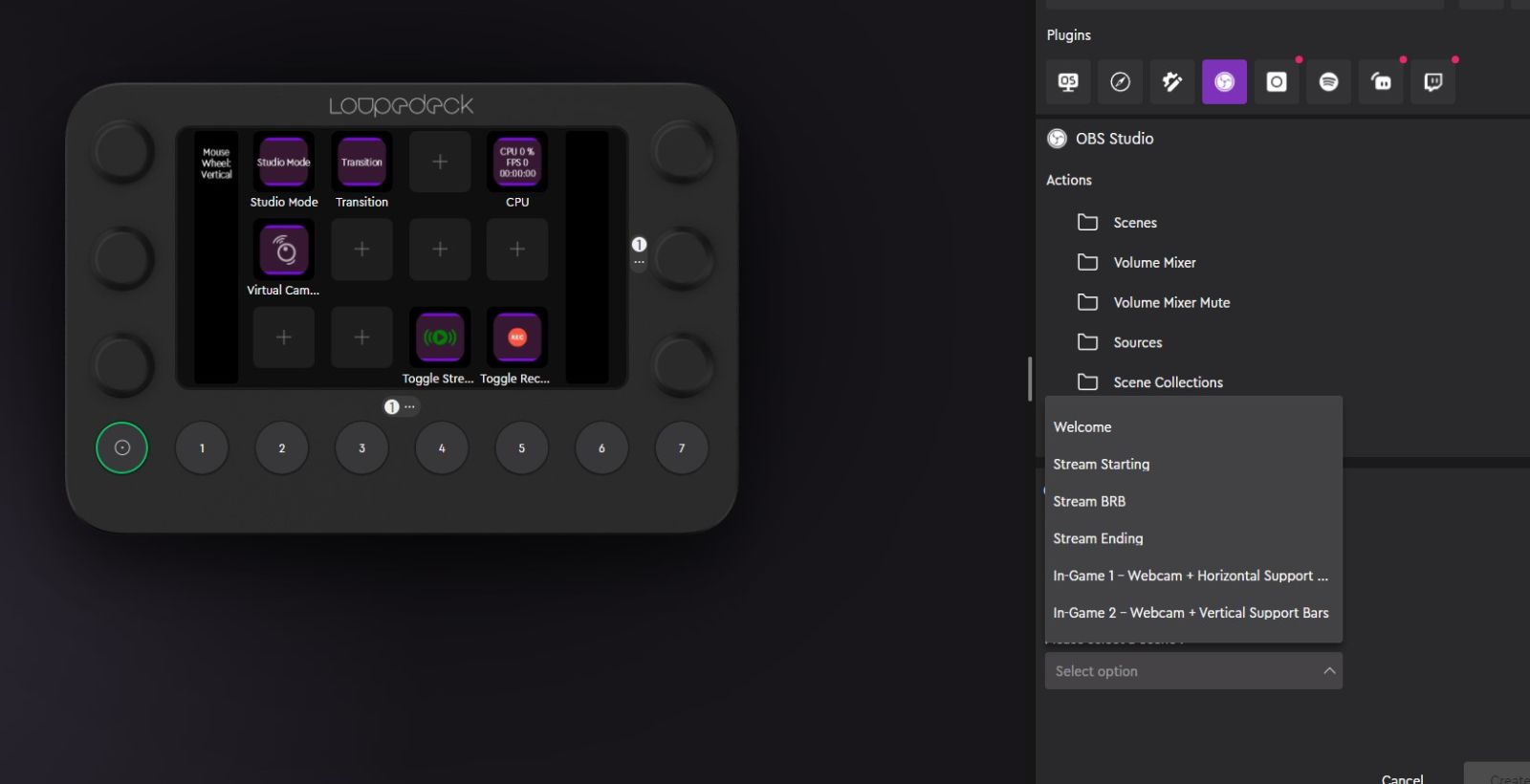
Switching gears to streaming, the Loupedeck is tightly integrated with OBS and Steamlabs. As soon as you run OBS, a secondary applet called the OBS Connector will link between the two of them. It pulls in your scene collection, transitions, and much more, making it easier to create your various panels. When I reviewed the Loupedeck CT it lacked all of these things, making it a painstaking process to use the device for streaming. With this new piece of middleware, it makes the Live the easiest way to set up for streaming I’ve ever used.

Similar integrations exist for the other programs I use, but they don’t carry that same piece of middleware. That said, it’s great for controlling layers in Affinity Designer or Photoshop. Similarly, the razor cut, ripple edits, and retime functionality in DaVinci Resolve is at your fingertips, though I can say I really miss the jog wheel. For me, the CT will always be the superior way to edit, but that’s not to say you couldn’t with the Live.
There is one massive advantage that the Loupedeck Live has over its bigger brother, the Loupedeck CT – price. The CT is a robust control surface, and it commands a commensurate price at $549. The Loupedeck Live, despite sporting nearly the same functionality, rolls in at an MSRP of $269 – comparable to the Elgato Stream Deck XL. The extra knobs (literally) and whistles have such a tactile impact on the overall package, that it’s easy to understand why they’ve priced it accordingly, but you’ll have to decide this for yourself and your workflow.
The Loupedeck Live is one of those products that has truly unlimited potential. There are templates aplenty, of course, but it’s a tinkerer’s paradise. The Live is highly programmable, accepting basic commands in serial, and changing as your applications switch on the fly. Snip tools, clipping masks, shifting active desktops, layer switching, and more are useful at your fingertips, but so are macros to tell your team to regroup, unleash a specific sequence in an MMO that launches a shield, readies a weapon, and launches an initial attack, or switching up from dual weapons to a single handed heavy. All of these things could be done by remembering a macro key on your keyboard, or likely several, but having a device where you can bundle all of it under one single keypress makes it so much easier. Better still – once you’ve got the hang of it, the sky’s truly the limit – you can create your own.


