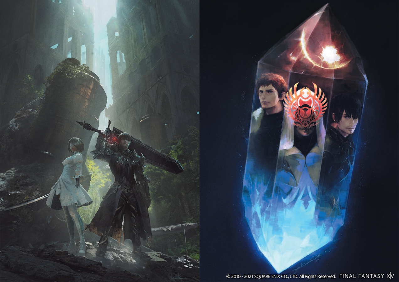
Shadowbringers might just be Final Fantasy XIV’s best expansion yet. Aside from the excellent story, the places, people, and things you see on the First have some incredible art direction. From the Crystarium and Lakeland to the Rak’tika Greatwood, everything looks wonderfully imaginative and colorful. A far cry from what came before while still remaining grounded in the established universe. With Heavensward’s art books, I was glad to get some insight into how that expansion came about, but sadly the Art of Reflection books for ShB don’t provide much outside of putting concept art on a page.
First up in the Art of Reflection Duology, Histories Forsaken, covers the base expansion and inklings of patches to come such as the Eden raid series. The Scions’ outfits were also redesigned for this expansion and the game added two new races, the Viera and Hrothgar, albeit limited to female and male respectively. I always enjoy seeing character designs, but the art here is pretty limited aside from the Hrothgar, who we get to see drawings from various angles. Essentially, what’s here is just the final design with maybe a few close ups of finer details. I’d like to see what led up to these choices either visually, if such art exists, or through some descriptions by the artists. There are two pages dedicated to the latter right at the end of the book, but these are more general messages as opposed to the specifics from Heavensward’s art books.

Aside from that specific gripe, a big highlight of Forsaken are the monster designs, particularly the Sin Eaters. The artists absolutely nailed their holy yet grotesque look that translated directly into the game. Sadly we don’t get to see too many of them, just Tesleen and a few other bosses, but what’s there is excellent much like the rest of the art.
Histories Unwritten follows in much the same vein as Forsaken, presenting the art with no additional context outside of the last two pages. It contains more art for the Eden series as well as the YoRHa Dark Apocalypse raids and all the patches. Oddly enough, one of my favorite pieces is the front cover, depicting Minfilia and Ryne as a sort of passing of the torch between them. Overall, this book does provide more detail in the form of close ups on weapons and certain pieces of gear, but again I feel there’s less care put into these than the Heavensward books.

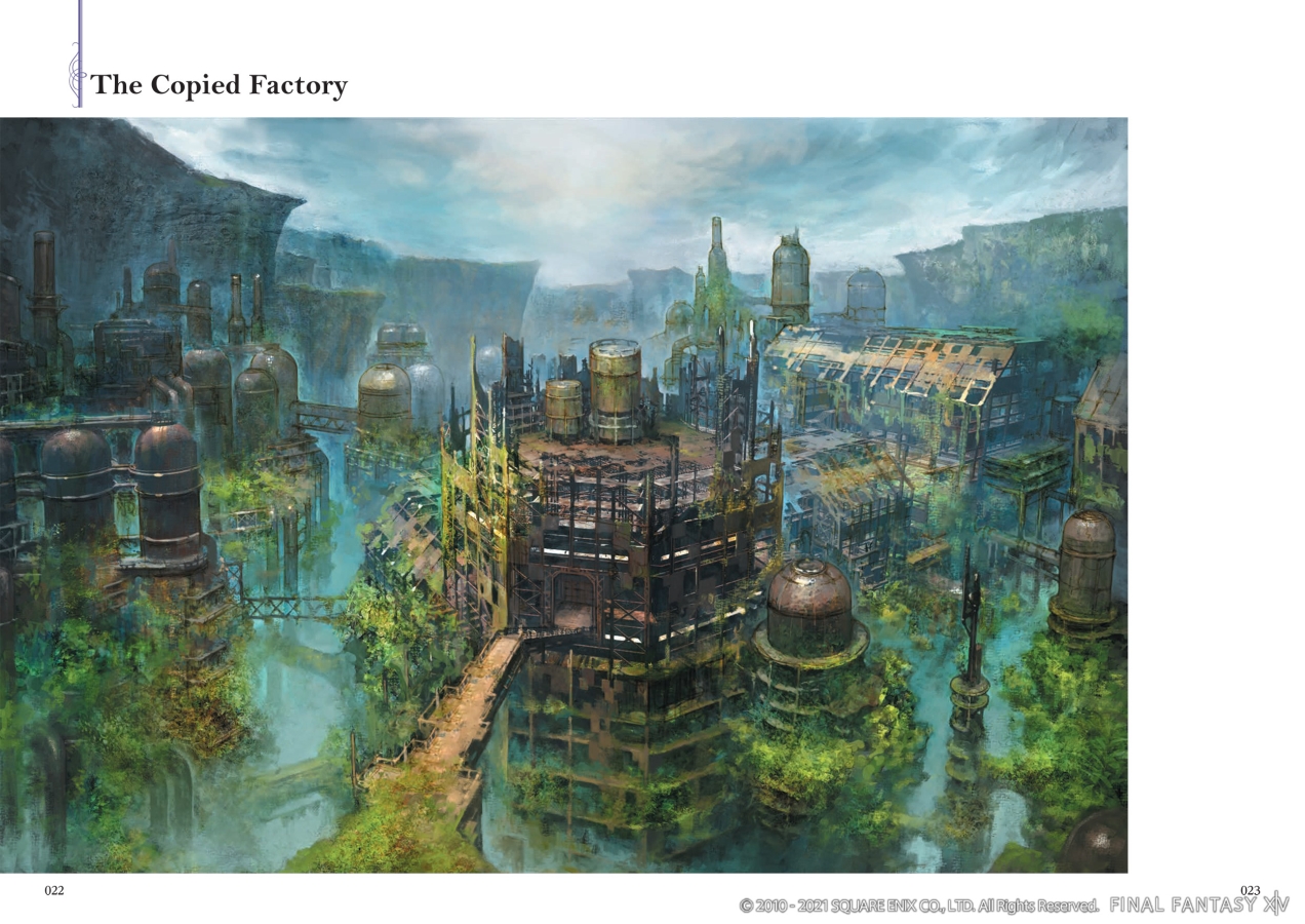
One big issue is the fact that some art spans over two pages. On the surface, that’s not a problem, but in practice the way the book is bound makes it difficult to see what’s in the middle without stretching it out and possibly damaging the spine. If they continue to go this route of simply displaying the art, they should stop doing the two-page spreads or include a PDF with physical copies so people can actually see what they paid for.


