In the recent releases for Marvel Crisis Protocol, we got to dive into the Spider-Verse and the heroics of Street Level Heroes, and there were two models that really caught my eye. Ronin, most famously known as the alias for Hawkeye, is in a dynamic pose with several options for weapons and heads, and Spider-Man Noir, a character from the Noir universe, inspired me to think about painting a model with some restrictions to my paint palette. For both of these, I went above my usual paint jobs to create some unique looks for the table.
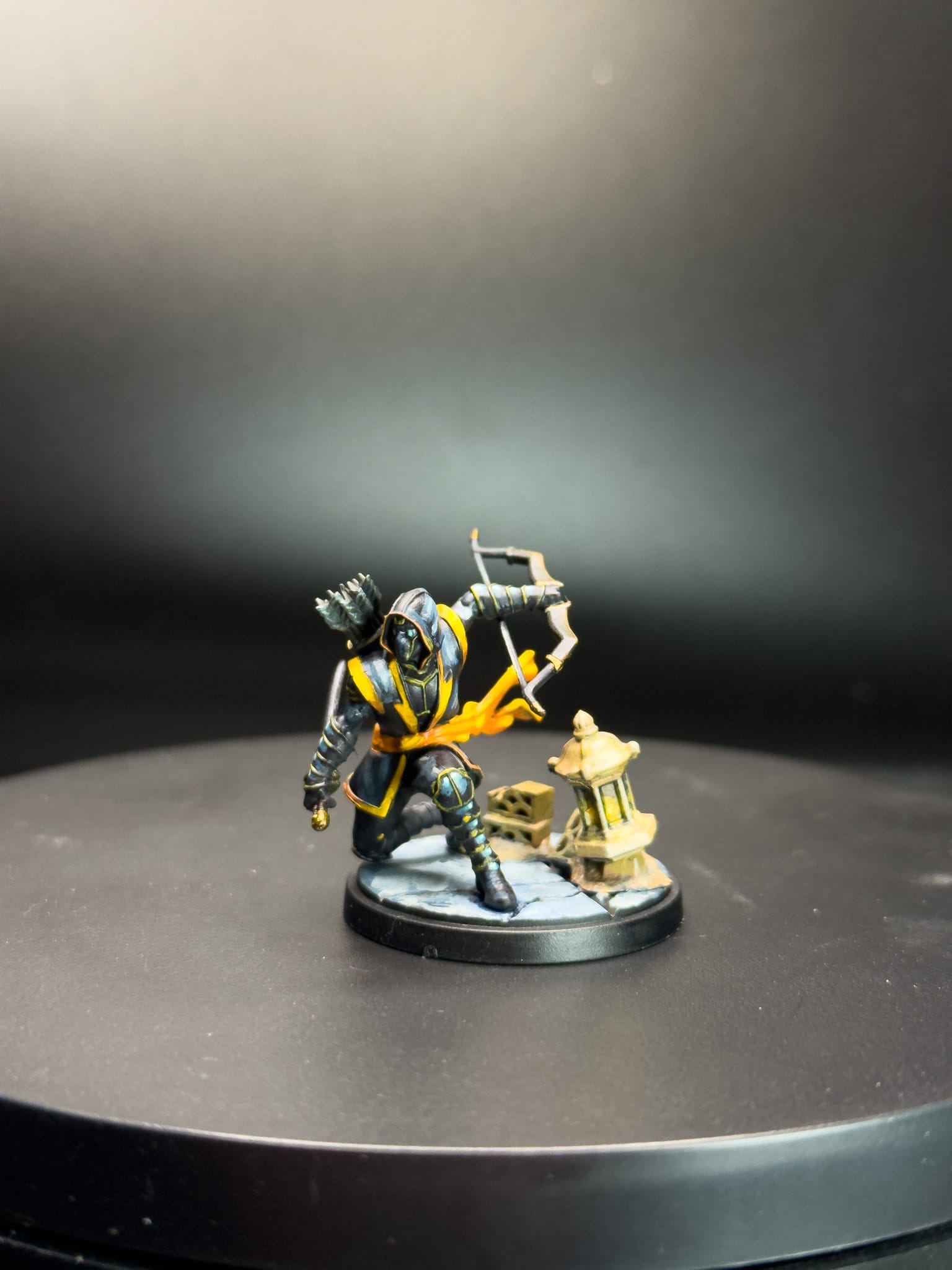
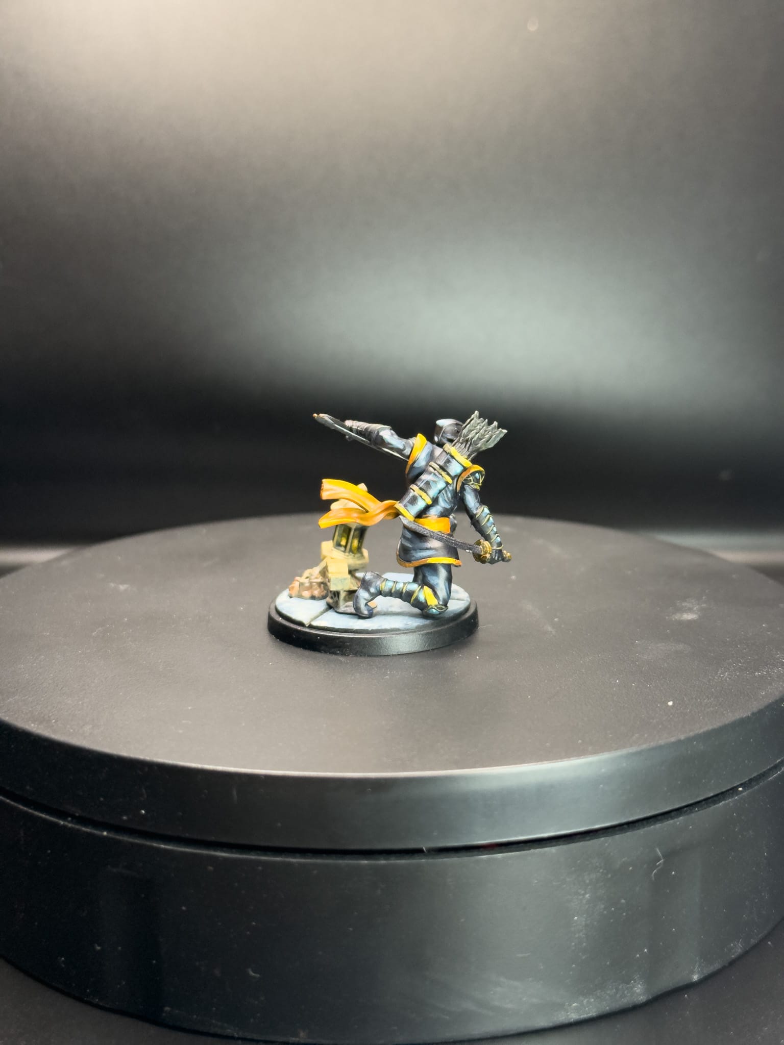
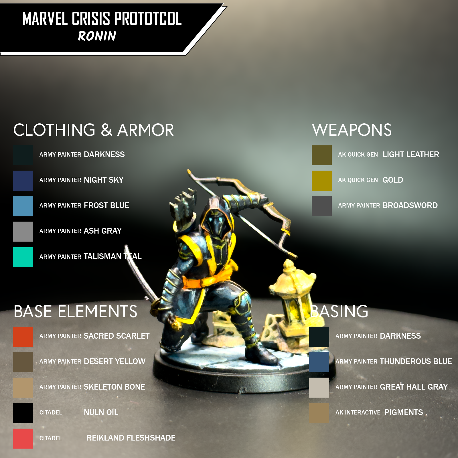
Ronin
When painting a model a single color, pay attention to the material. Cloth, leather, armor...they all reflect differently.
For Ronin, I used a variety of paints, as there is a assortment of textures to capture, from weapons to cloth to armor, including a quiver, bow, and even the basing has terracotta and a light source. When going for a "Tabletop +" kind of paint-job, it's important to consider each of these as their own unique paint project. As such, I'll call out different brands and why I chose them.
Starting with a black primer from Monument Hobbies, the model started off very matte. I then used AK Quick Gen Ultramarine Blue all over the model. What this accomplishes is two things: it reinforces the darkness of the piece, and ensures every part of the model is covered in paint before I go anywhere else. The AK Quick Gen line can function like an ink, which means rich saturation of color along with transparency.
I then started with the cloth, as it was a larger part of the model. On all of the black cloth, I used the following: Army Painter Darkness mixed with Night Sky for my base, then Frost Blue and Ash Gray for my mid tones, with more levels of Ash Gray mixed in for the highlight. This gives me an overall smooth transition from dark to light, with the biggest areas of focus being the parts where cloth would bunch up, the shoulders, and some hanging parts. The Box Art is an excellent guide for this, and ensures that all areas of the model get the same level of contrast and attention.
For the yellow cloth, I used the following: Reaper NMM Gold Shadow, Army Painter Resplendent Red, Moonbeam Yellow, and Inner Light. This mix gives me richness and depth in the yellows. The Red helps turn the yellow from just plain yellow into a Golden material, further emphasized in the shadows by the Reaper Gold Shadow, which is an excellent Golden Brown that leans more on the brown. I once again used the box art in order to add the highlights in proper places, like the top of the shoulders, the front embellishment on the chest, and of course the flowing sash, with Inner Light being my brightest highlight, a bright orange that is slightly desaturated.
For the armor, you want to consider that light will be shiny, so you want your highlights to pop. I used my previous black recipe, but I added Talisman Teal and Matt White in order to create the color differentiation that a metal or a leather would create. You can see this on the gauntlets, the knee pads, and the shin guards. I also replicated this on the quiver, as I would suspect it's either made out of a hard material or a reinforced leather.
The weapons needed to stay dark , because Ronin is a ninja after all, so the bow got a pass of AK Quick Gen Light Leather and Gold for the highlights.The bow string got a slight highlight of Skeleton Bone, as if the moonlight barely glanced off of it. The sword got the same colors, along with Army Painter Broadsword Silver.
The eyes got a touch of Talisman Teal. And for all of my final highlights, a touch of Matt White on the knees, eyes, and gauntlets...and he was done.
For the basing elements, I wanted them to reach as terracotta, which tends to have reds in it. Sacred Scarlet started as my base tone, and I worked up my mids into Desert Yellow by wet blending the two colors. Once dry, a mix of Desert Yellow and Skeleton Bone brought me to a final highlight, and then to unify all of it, I mixed Citadel Nuln Oil and Reikland Fleshshade to bring back a ruddy color to the areas touching the ground. The lantern on the basing got a mix of Reaper NMM Gold Shadow and Moonbeam Yellow, with just a dot of Inner Light on each window. I also used Inner Light on the ridges outside to give even more hint of light. And with all that, Ronin is done, and looking extra nice for the table!
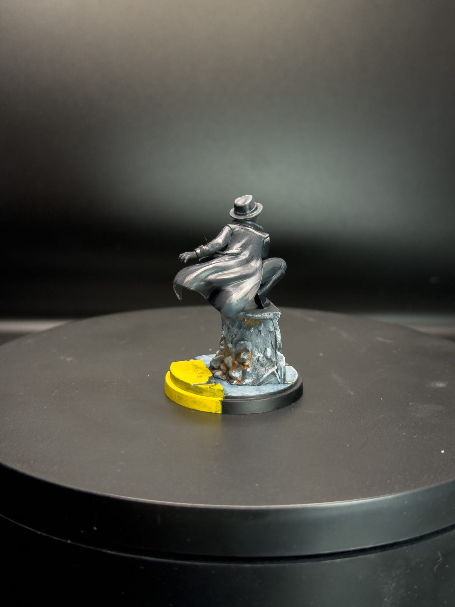
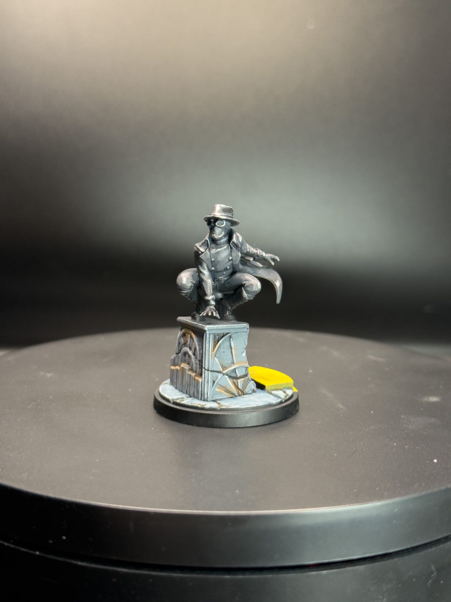
Spider-Man Noir
Challenging oneself to paint in a single palette is a fun exercise!
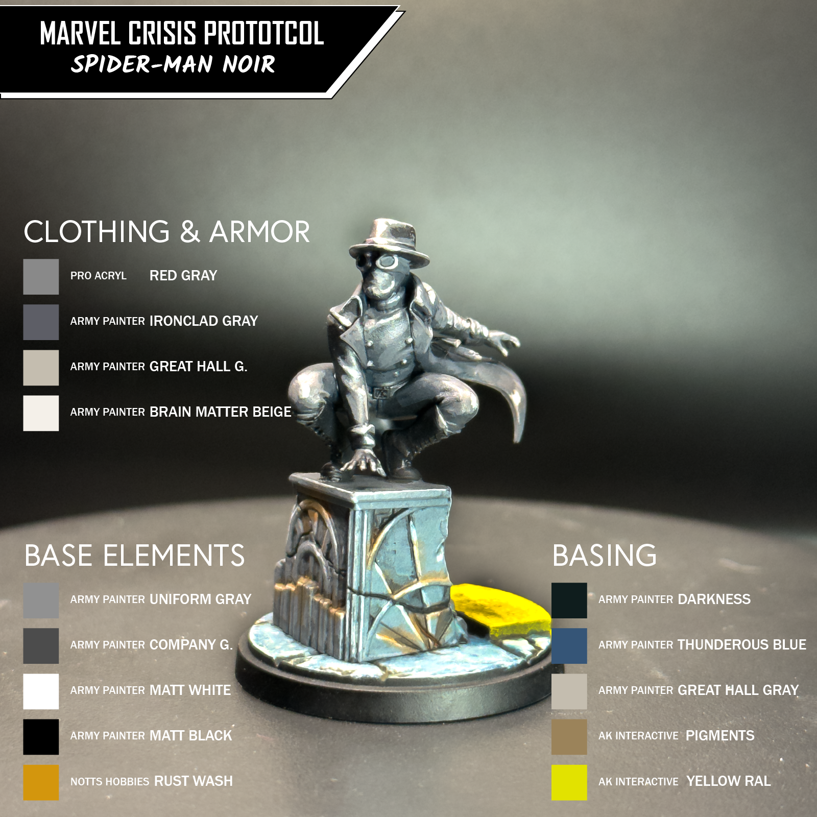
Most folks know Spider-Man Noir from Into the Spider-Verse, voiced by the excellent Nicolas Cage, but the character originally came from 2009, a member of the Noir Universe. As such, I wanted to pay homage to the design of the character and paint him with just Chromatic Grays, and then the base would be strictly Achromatic Grays.
Chromatic Grays are nuanced, colored grays, which provide depth to gray tones. They are subtle and interesting. I own a few, including Red Gray from Monument Hobbies, and the Army Painter Fanatic Line has them in both their Light Neutrals and standard Black and Whites.
I base coated him in the Red Gray, then in the shadows, I used a mix of Ironclad Gray and Red Gray, which brought in some blues into those recesses. For the inside of the cape, I left it primed black, which would be my darkest shadow, but for the areas where some light would hit, I used Ironclad. To build up my midtones, I started to mix in subtle amounts of Great Hall Gray, which is a mid-warm with yellow tones. This provides a nice contrast to work with. To smooth out the changes, I made glazes, which is when you thin down paint to an almost pure water consistency. This will essentially "stain" the place where you put down the glaze and help unify changes across the model. To wrap up my highlights, I used Brain Matter, which is a lighter beige. Once again, follow with glazes, but use the Brain Matter and try to end your strokes where the brightest highlight would be. This is because when you brush paint, the part where the brush lifts off is typically where the most paint is deposited.
I did this all over the model. Wherever you see a highlight, this was the technique employed. To wrap up the top half, I used Matt White to do some final specular highlights, which is where you want people to look at the most when the model is on the table!
For the base, I wanted to do the same thing with gray, but use Achromatic Grays instead. These are grays that are created with increasing amounts of white being added to black. I started with Uniform Gray all over the base, and used Company Gray to initially call out my midtone sections. Then, by adding parts of both Matt Black and Matt White to the mix, I created shadows and highlights. I noticed on the box art that a slight Rust color was employed throughout the model, so I used the Rust Oil wash from Notts Hobbies to add in those subtle colors, taking advantage of a dry brush to wick up excess oil.
And with that, Noir is complete!
Both models include a lot of opportunity to unique takes, and one should take advantage of it!
With both of these models, you can see that the right sculpt can inspire and get you to try something new or put in extra effort. If I wanted to push these models further, here's what I would do:
On Ronin, I would suggest ditching the quick metallic paints for a NMM (non metallic metal) approach, and leverage the lantern accessory to create cast lights on the model and the ground. I would redo all of the yellows to pull them way back into shadow and only make certain parts pop, to create the illusion of night.
On Noir, I would go full Chromatic on the entire model and create a cast light from behind, which would create a shadow on the ground. Or, I would go full comic book, and eliminate most mid-tones from the piece; think about Mike Mignola's artwork.
How have you painted Ronin and Spider-Man Noir? Let us know in the comments or on Instagram, and stick with Gaming Trend for more tutorials and Marvel Crisis Protocol News!