When you look at John Blanche Vol 1 and Vol 2, you see two sets of paints that work together with each other. In my review, I called out the appropriate tones, the way the two sets work together, how the yellow and reds were some of the best paints that Army Painter has put out, and even painted up some classic Necromunda looking models for the occasion.
I will start by saying that Vol 3 and Vol 4 are amazing additions to this lineup of John Blanche approved paints... in some ways, all you really need would be the four of these sets to have a very complete paint range.
For those who don't know, John Blanche is one of the most famous artists in the wargaming medium. His work defined the look and feel of Warhammer 40k, and is responsible for a lot of the stylings of the "grimdark" style of painting, which is defined by dark, gothic, bizarre, horrific visuals.
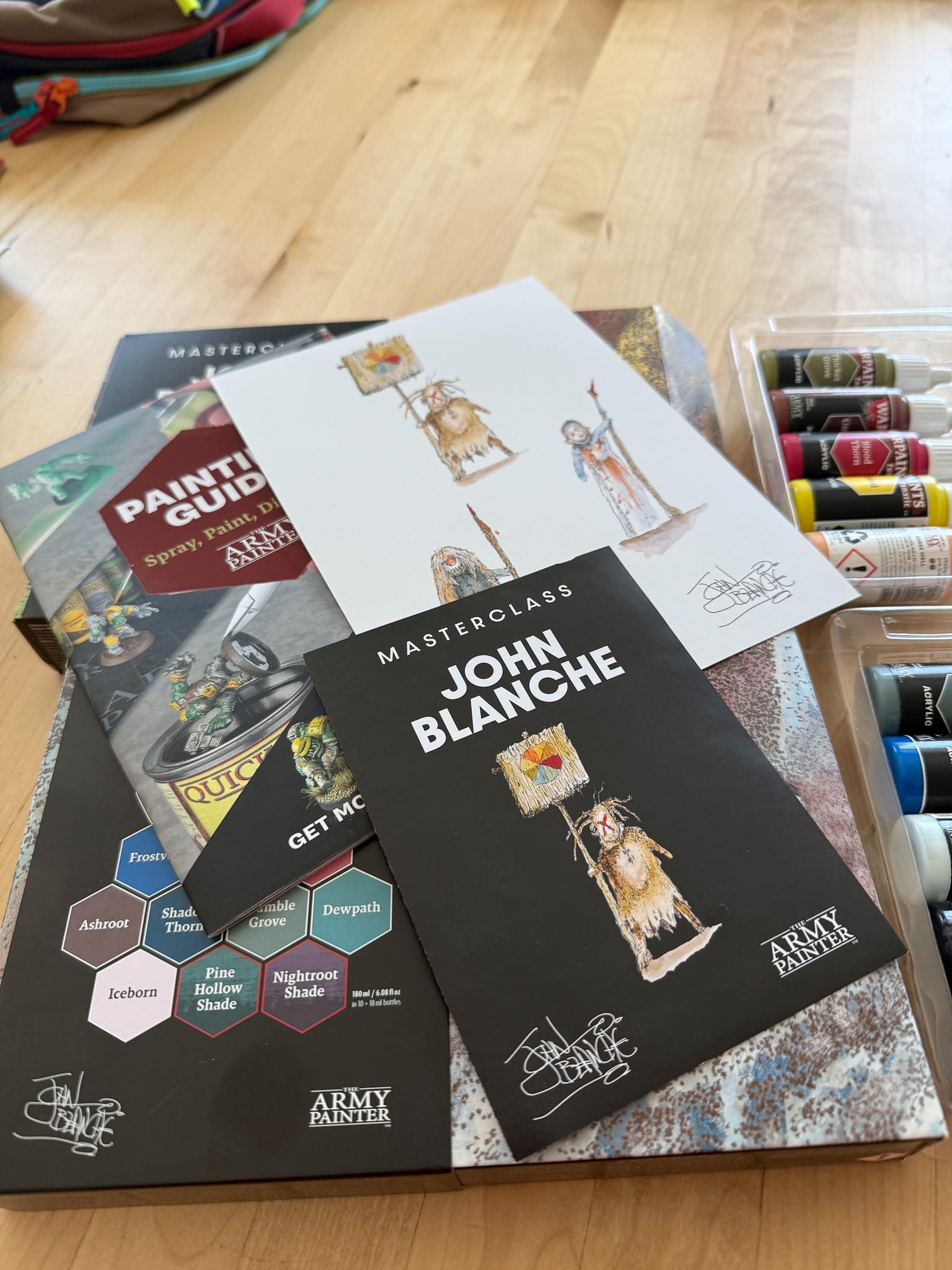
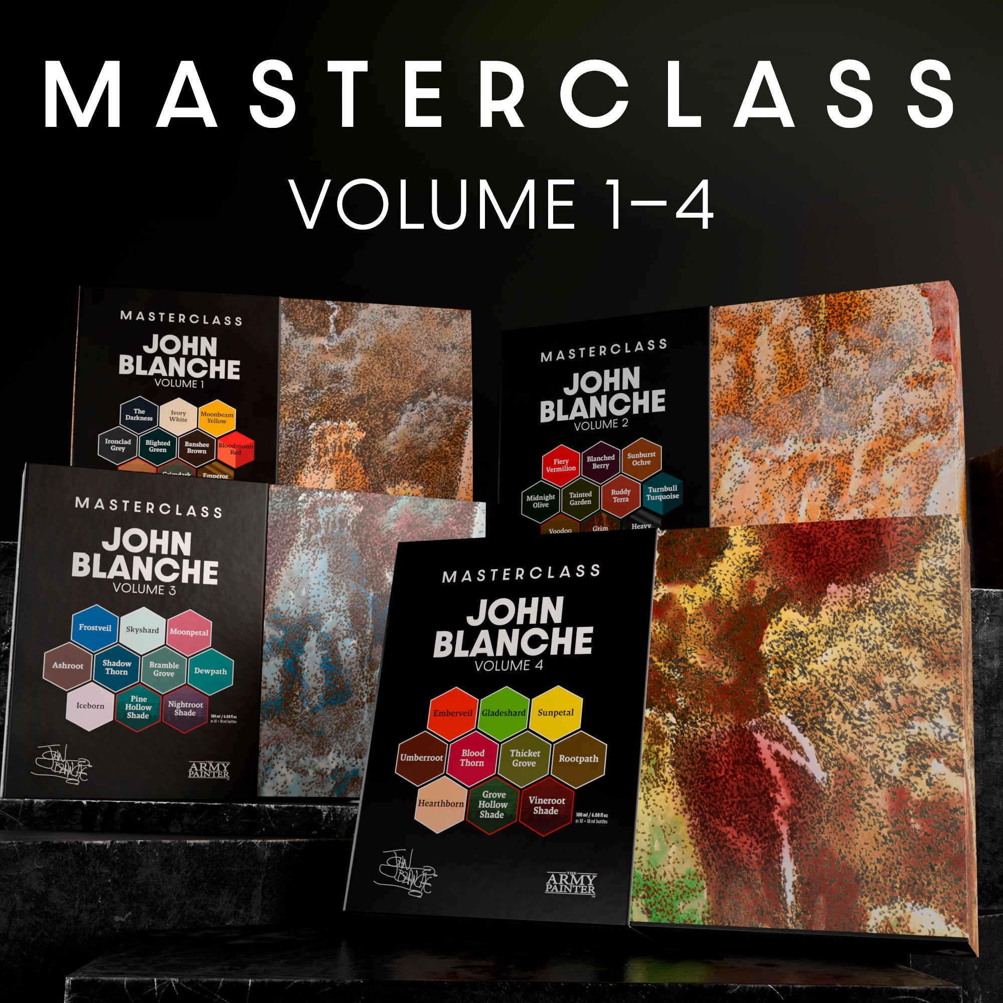
Both sets of paint come with unique colors and washes, along with an art print.
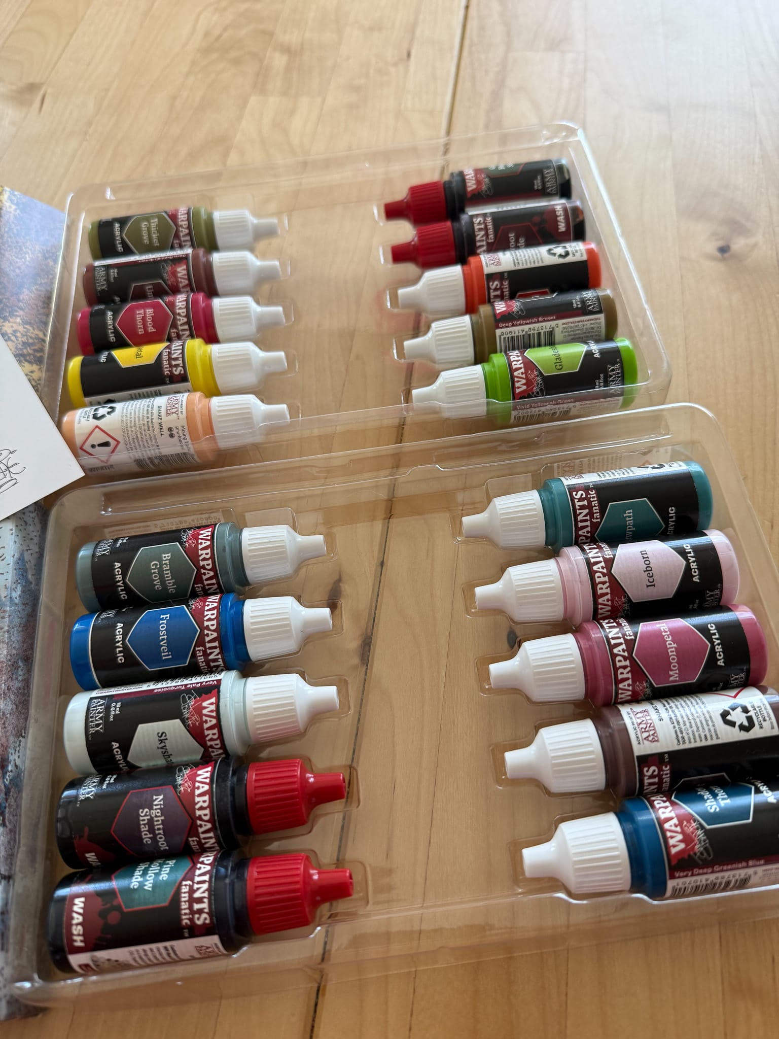
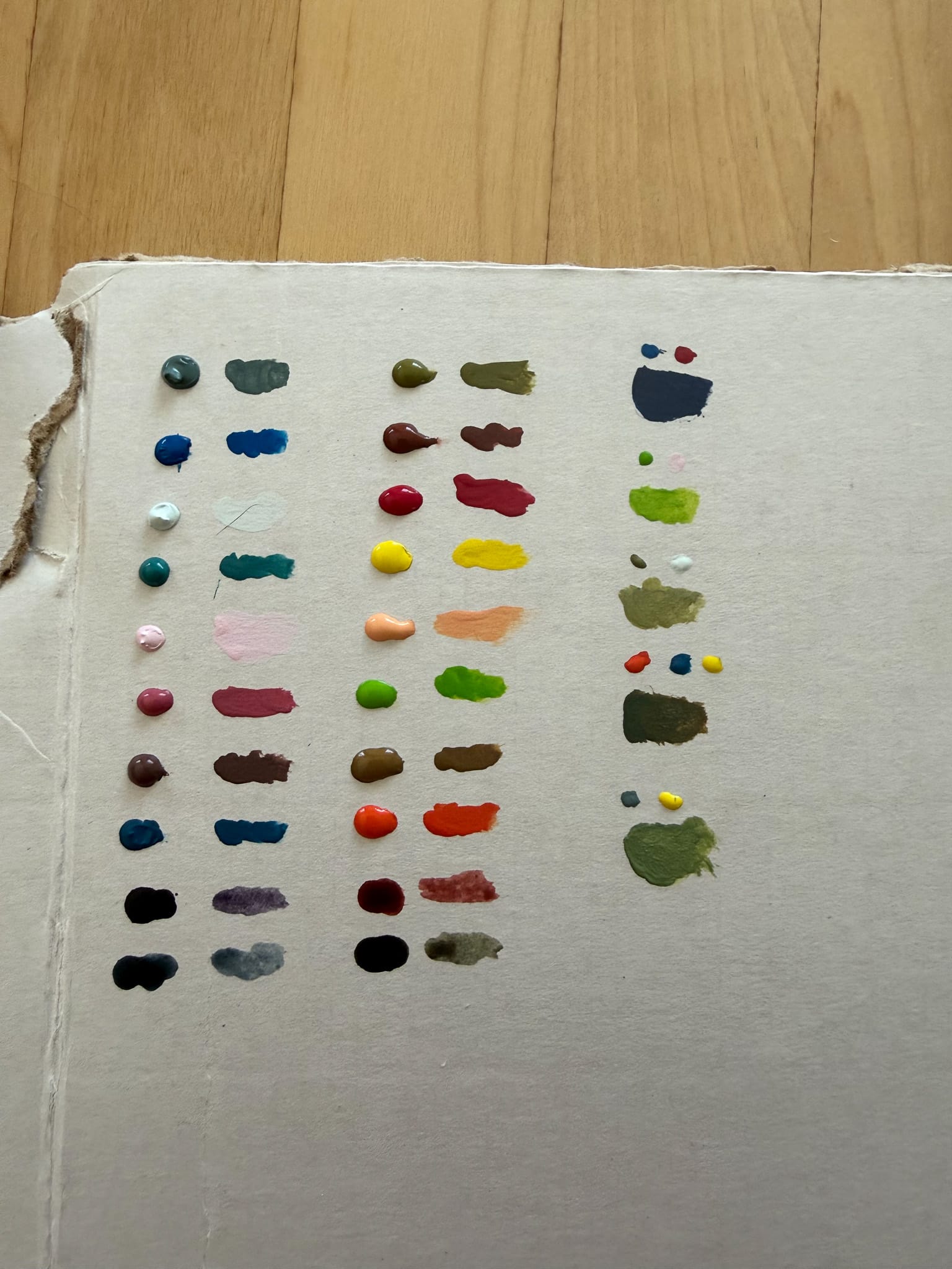
The traditional palette of colors is what is called a Zorn palette, which typically fits in ochres, yellows, reds, blacks, and ivory to achieve tones. While volumes 1 and 2 handled this palette beautifully, 3 and 4 dip into opposite ends of the spectrum to fill it out. Volume 3 is filled with 8 cold colors, and Volume 4 is mostly filled with 7 warm tones, along with one cool color that I'll get into a moment. Both boxes also include two unique washes per box, and like the previous volumes, a piece of artwork, a bi-fold guide for how the paints fit into the Fanatic Range, and the ubiquitous Army Painter painting guide, which is a great tool for those of us new to the hobby. My review copies didn't include this, but if you order these from Army Painter, you will also get a brush with each set, which is a nice deal.

Volume 3
As I mentioned, this set contains cool tones. The paints hit blues, desaturated greenish blues, and cool pinks, and the set also contains a grayish green, a blue green wash, and a purple wash. Think spectral, atomosphere, and undead. Corrosion. Frost.
Here's the names and their colors:
Bramble Grove - Greyish Blue Green
Dewpath - Turqouise
Skyshard - Pale Turqoiuse
Ashroot - Dark Brown
Iceborn - Light Purplish Pink
Moonpetal - Strong Purplish Pink
Frostveil - Strong Blue
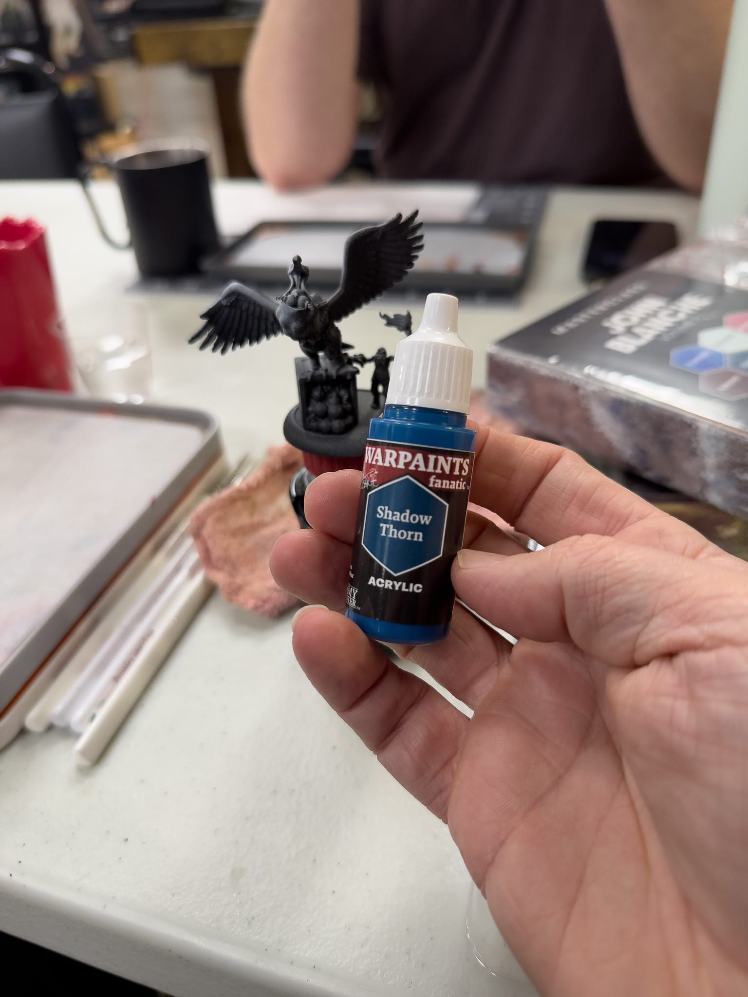
Shadow Thorn -Deep Greenish Blue
Pine Hollow Shade - Bluish Green Wash
Nightroot Shade - Dark Purple Wash
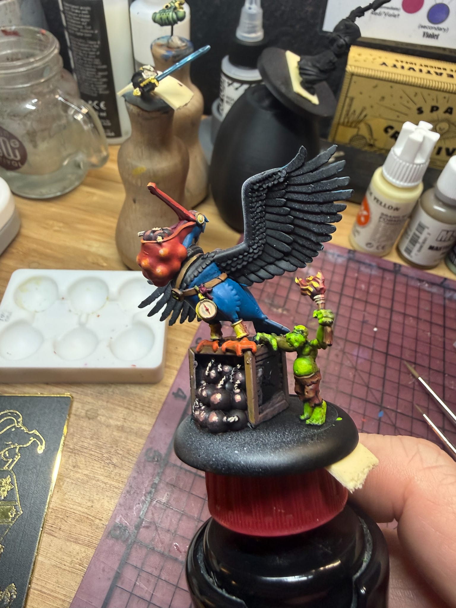
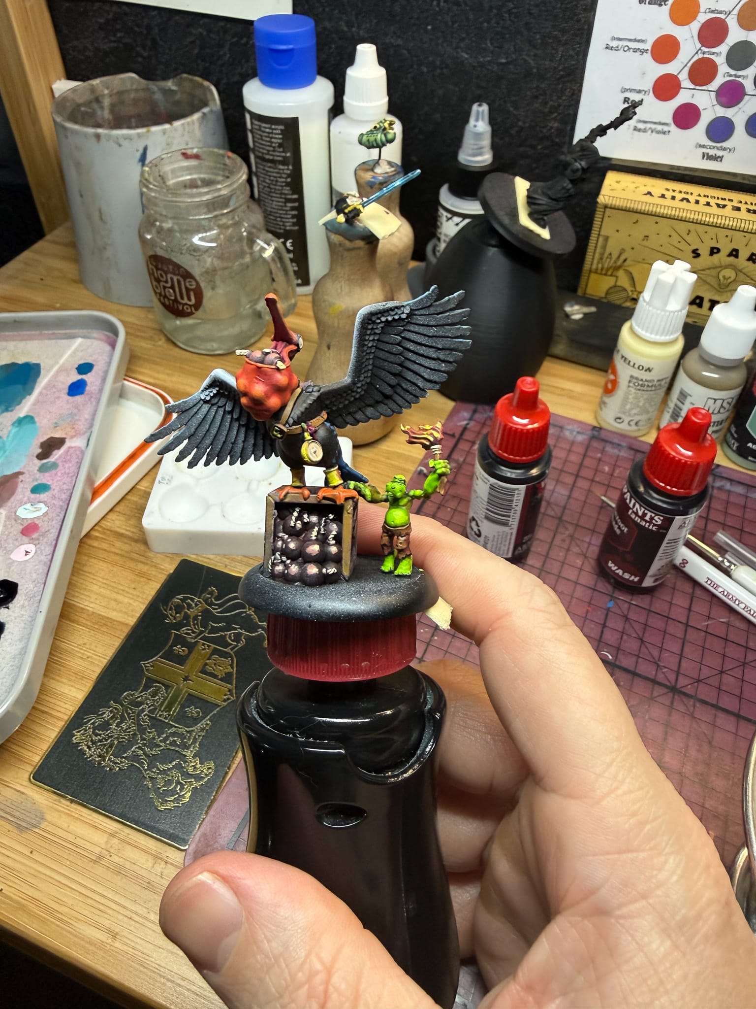
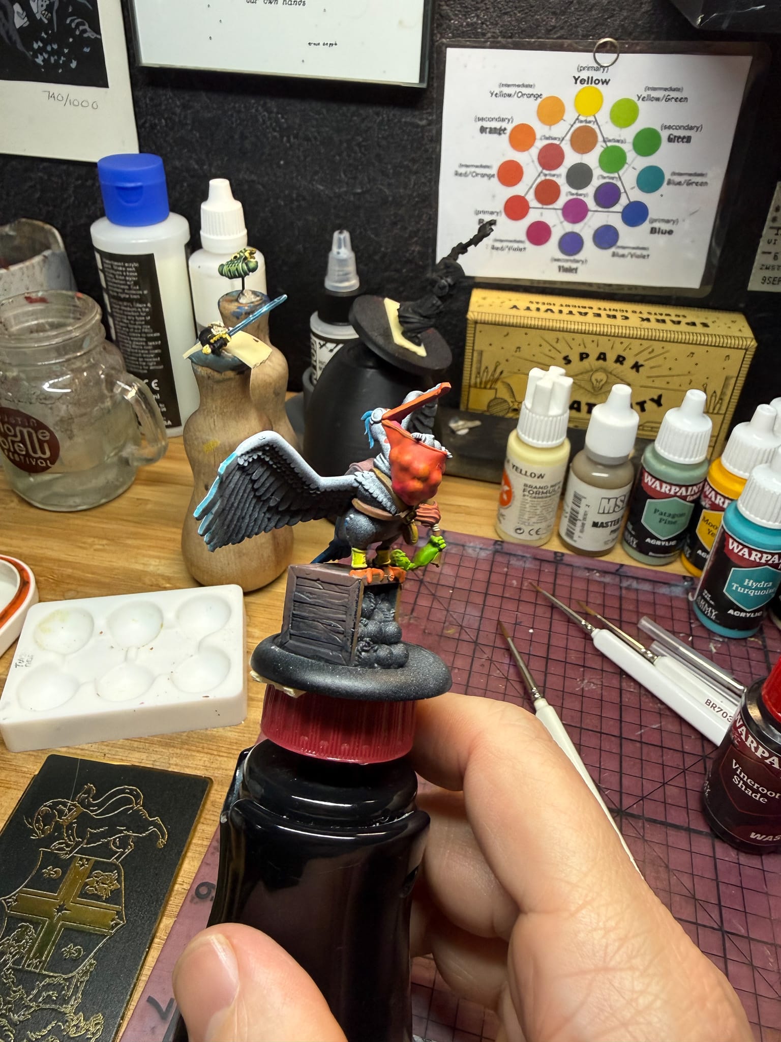
My subject: an excellent model from Warmachine's Shadows & Scum box set, which is such a fun model that I immediately saw an opportunity to test these paints and mix them.
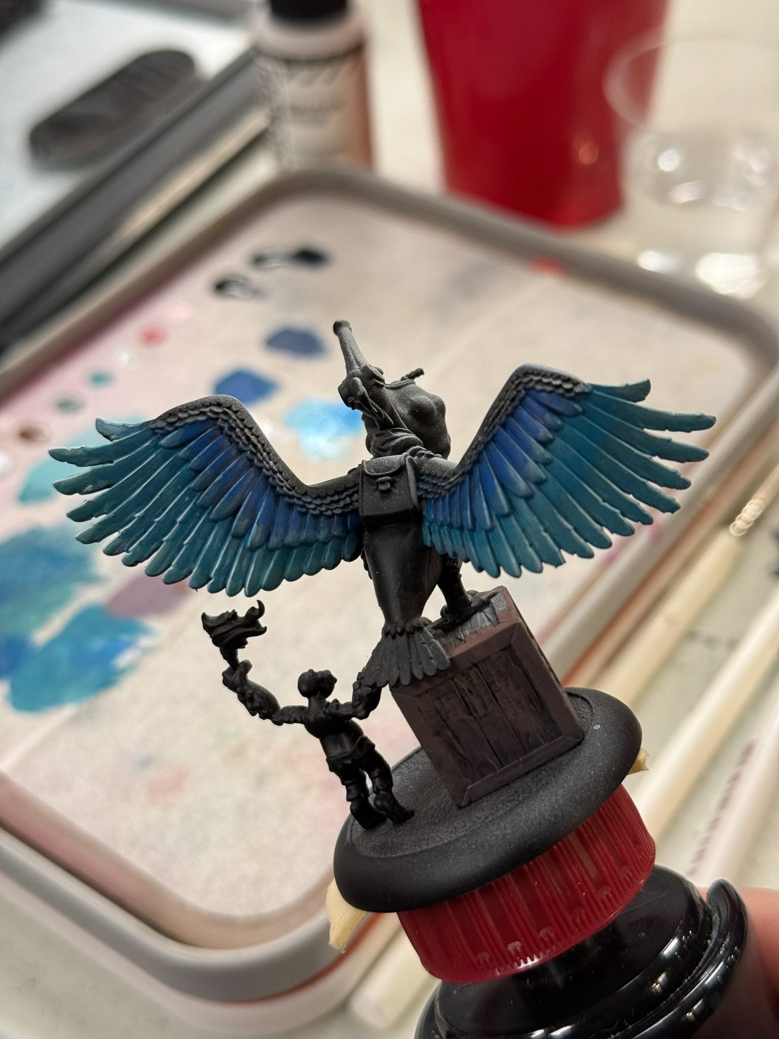
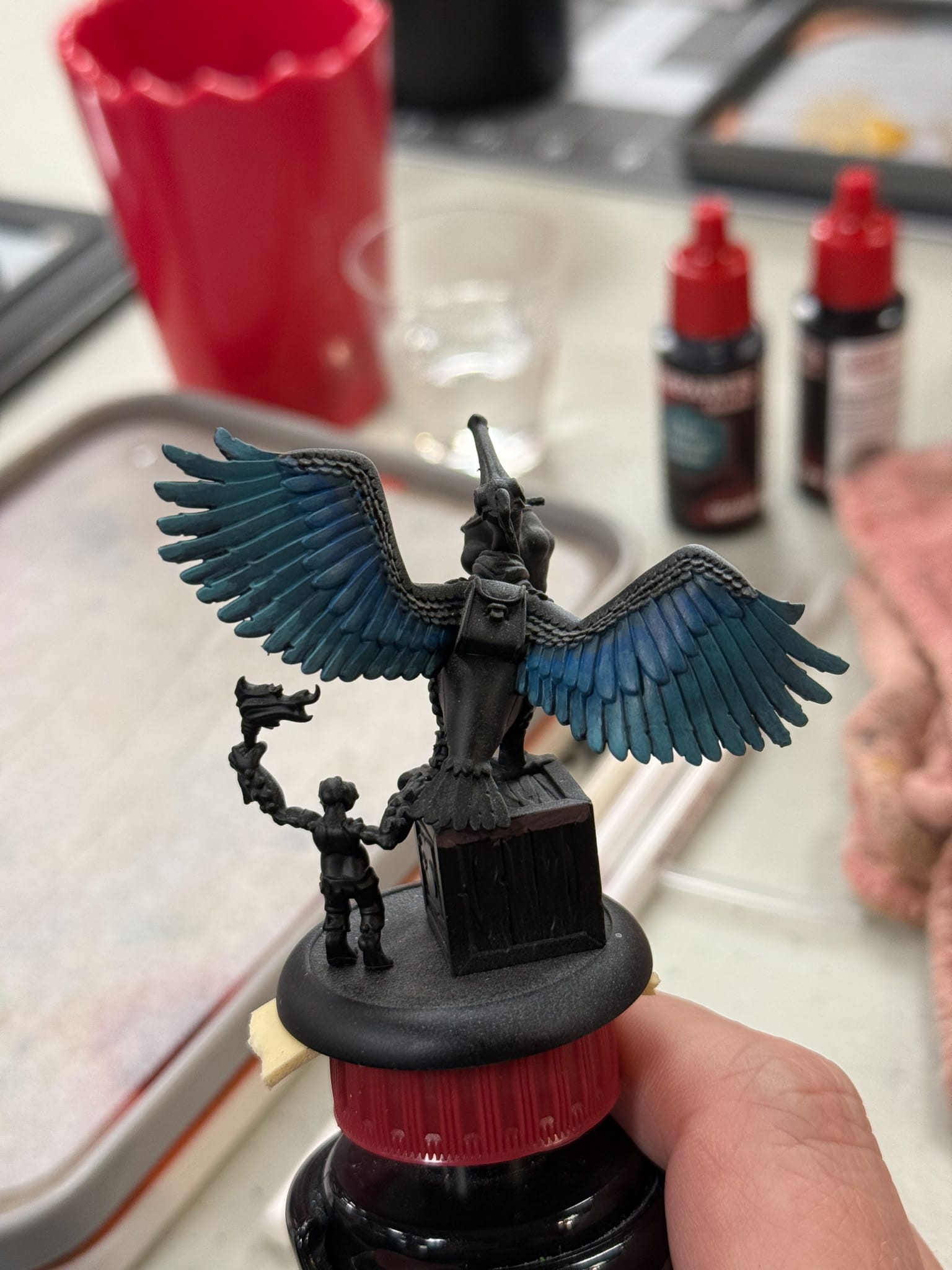
The blues and cold colors of Vol 3 layer very nicely and are highly pigmented
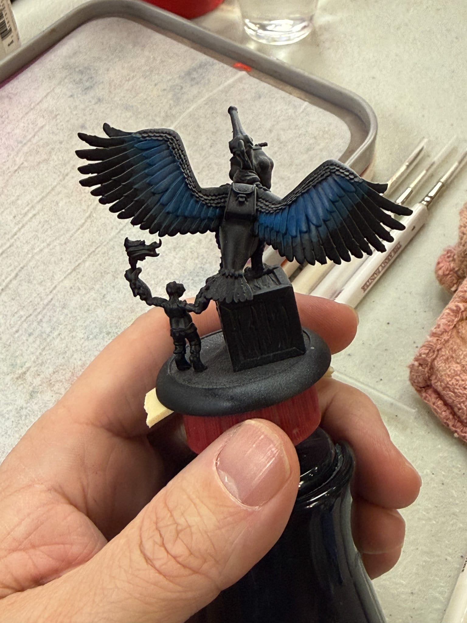
For the bird, I wanted to render it in these cool tones, and I figured the paints from volume 4 would compliment the rest of the model nicely.
First, these paints are very pigmented. In fact, I feel like they're more pigmented than other Warpaints, and while I cannot determine if they are, they still feel that way.
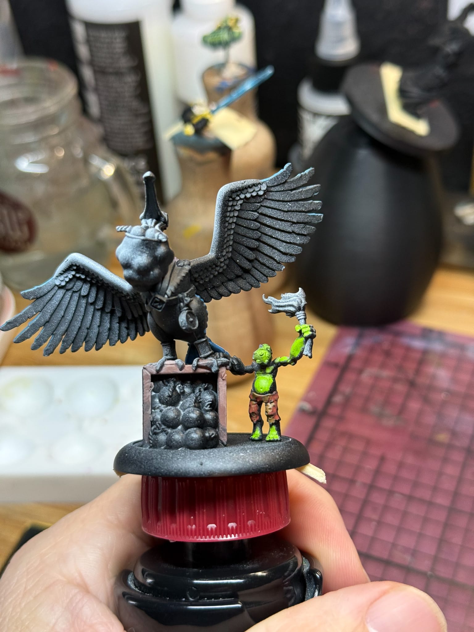
I started with Frostveil as my base tone, hoping that the blue wouldn't overpower the other paints that I mix. I was happy to find that mixing Dewpath into the blue started to give me a nice turquoise to blue mix, which helps when painting gradients. Bramble Grove was a great shadow tone in the mix. I used layering techniques on the feathers, and then glazed on Dewpath in the overlapping areas. As I got closer to the body, Shadow Thorn helped create subtle shadows, and when glazed down, made for great transitions. Lastly, for the spot feathers towards the top, Moonpetal mixed with the Nightroot gave me some darker pink tones, and both Iceborn and Skyshard did the work as highlight tones. Patience and a few passes, and the back of the model was complete.
For the bag and the box the bird is standing on, I used Ashroot with equal combinations of Shadow Thorn for the dark tones, and Skyshard for the lighter tones. I then used both washes to help create some more textured highlights.
Volume 4
This set wildly contrasts Vol 3 by focusing on warmth. Ochre, brown, orange, and earthy green tones lead the set, along with a green wash and an orange-red wash.
Blood Thorn - Purplish Red
Emberveil - Reddish Orange
Sunpetal - Brilliant Yellow
Hearthborn - Pinkish yellow
Umberroot - Reddish Brown
Thicket Grove - Olive
Rootpath - Yellowish Brown
Gladeshard - Yellow Green
Grove Hollow Shade - Dark Green wash
Vineroot Shade - Dark Purplish wash
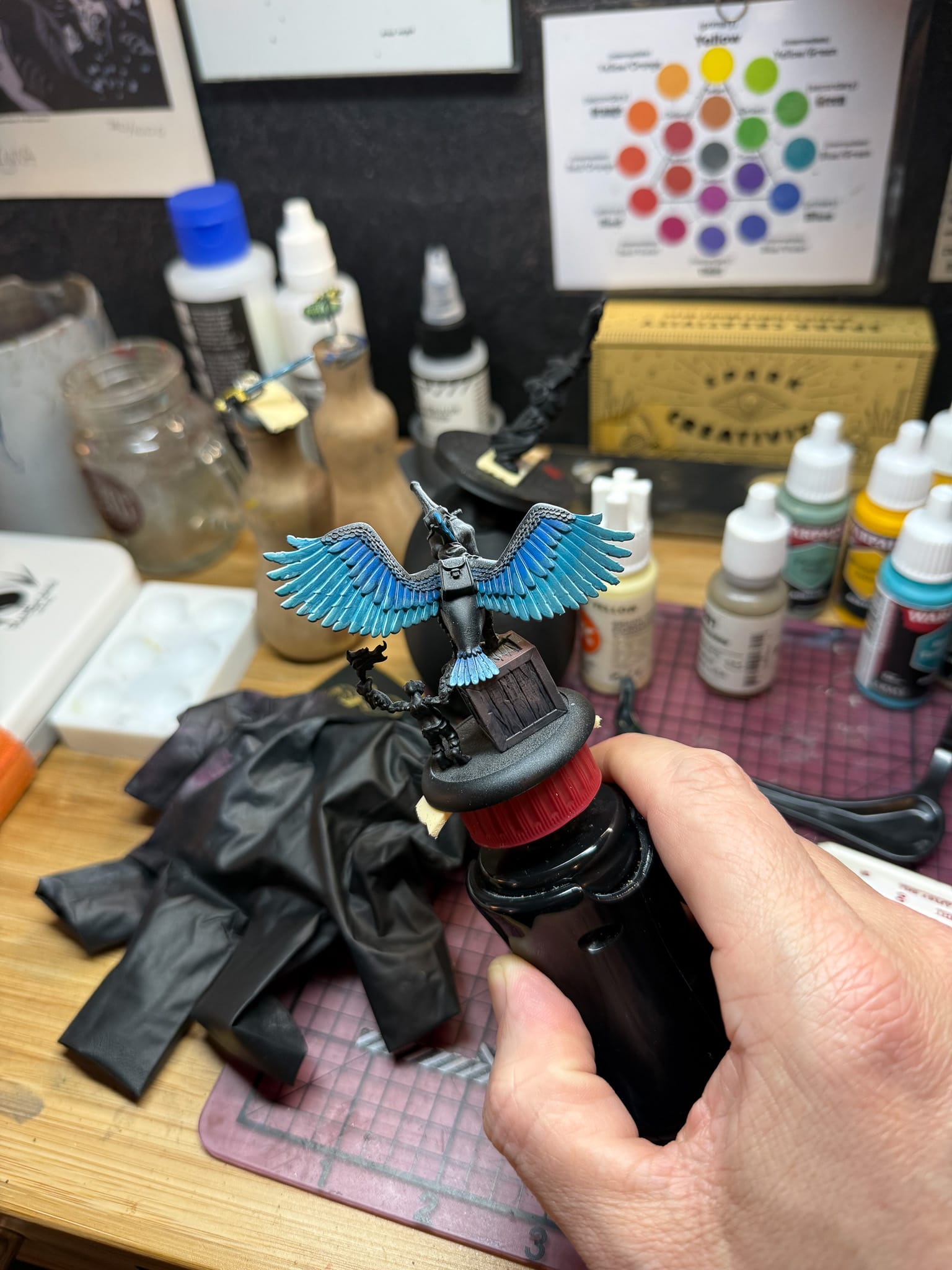
On the model, I figured that these colors would come in handy for the goblin, the beak, the details on the bird, the bombs, and a little bit of OSL. I basecoated the goblin in Gladeshard, which feels like a perfect compliment to Greenskin, a great green paint that AP makes. By mixing in increments of Sunpetal, and ultimately some Hearthborn, I found a good chain for creating highlights.
These warm colors are also vibrant and heavily pigmented. My wet palette was flawless for them, and for most of my session, all I needed to keep the paint moving was a dab of water on the brush tip every now and then.
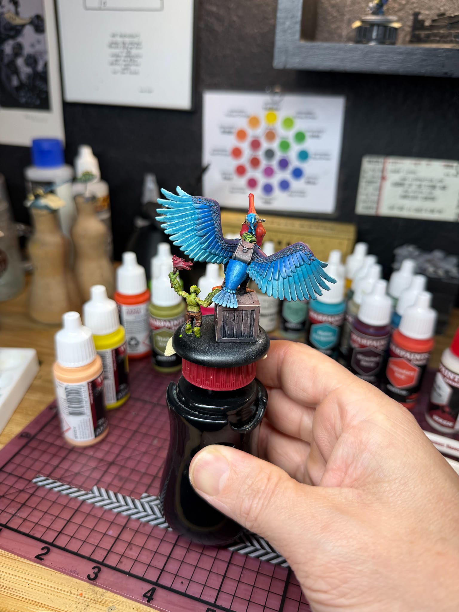
By mixing Rootpath, Sunpetal, and Hearthborn, I discovered an easy way to do some NMM Gold. You won't find a rich gold unless you put in some Blood Thorn, but this combination can still work, and was applied to the metallics on the model, like the bird's clock and the bracers.
You might be wondering, "Hey, there's bombs on this model. How will Randy render them?" I started with a full undiluted wash of Vineroot Shade on them to help fill any gaps from priming, and once dried, I used a mix of Umberoot + Hearthborn to create a shine on each bomb, with full Heathborn being my final highlight. From far away, the bombs all have the illusion of being bombs, but up close, you'll tell they're slightly brownish orange. You learn a lot about color when you limit yourself to a specific palette.
The beak of the bird is obviously an important part of the model, so Blood Thorn, Emberveil, Sunpetal, and Hearthborn served as my chain from shadow to light. These paints blend exceptionally well.
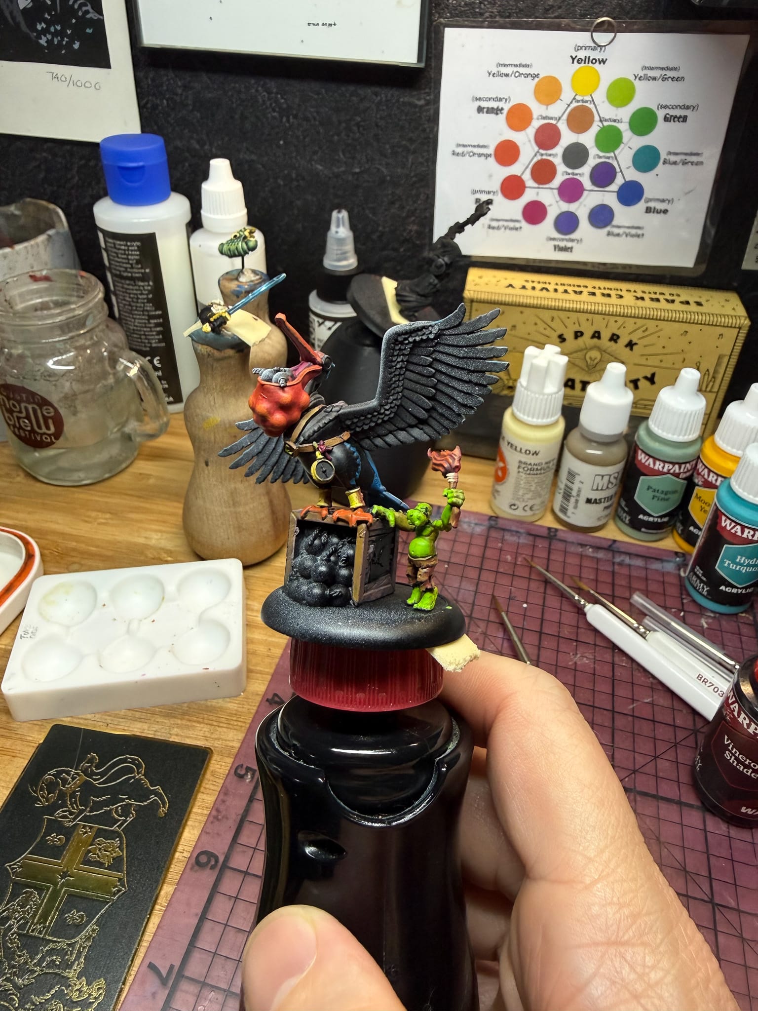
The box got some bits of Thicket Grove, Rootpath, and Grove Hollow Shade, similar to my technique on the back of the box. I then brought in some of the cooler tones from Vol 3 in order to unify my highlights and shadows, and found that all of the paints play well together and really help enhance highlights and shadows.
The intensity of Vol 4 really works well with Vol 3 and can provide wonderful tones to a model.
Lastly, the OSL. I painted the torch with Blood Thorn, Emberveil, and Sunpetal, which gave me a pretty basic flame. But with no white in the set, I had to be creative about really creating light. These paints thin down to glaze consistency quite nicely, with my medium of choice being Monument Hobbies' medium. First, by taking a mix of Dewpath and Skyshard, I defined a bright area on the wing. Then around it I used a dabbing motion and layered in glazes of Emberveil and Sunpetal, coming back in with Skyshard as a universal highlight for the feather lines. Take time with this step, as you want each layer to dry before applying the next. Glazing is a worthwhile investment to create great transitions.
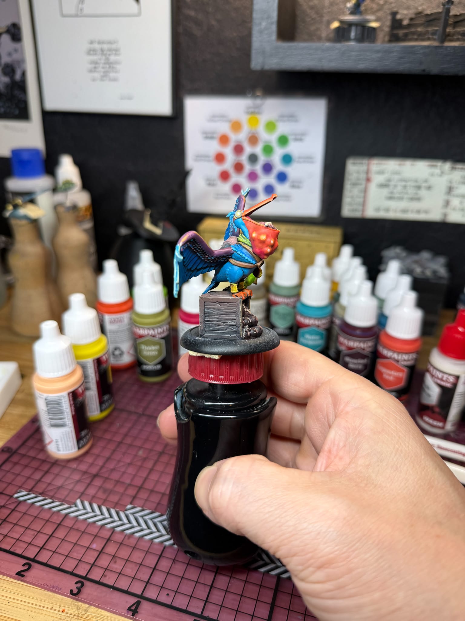
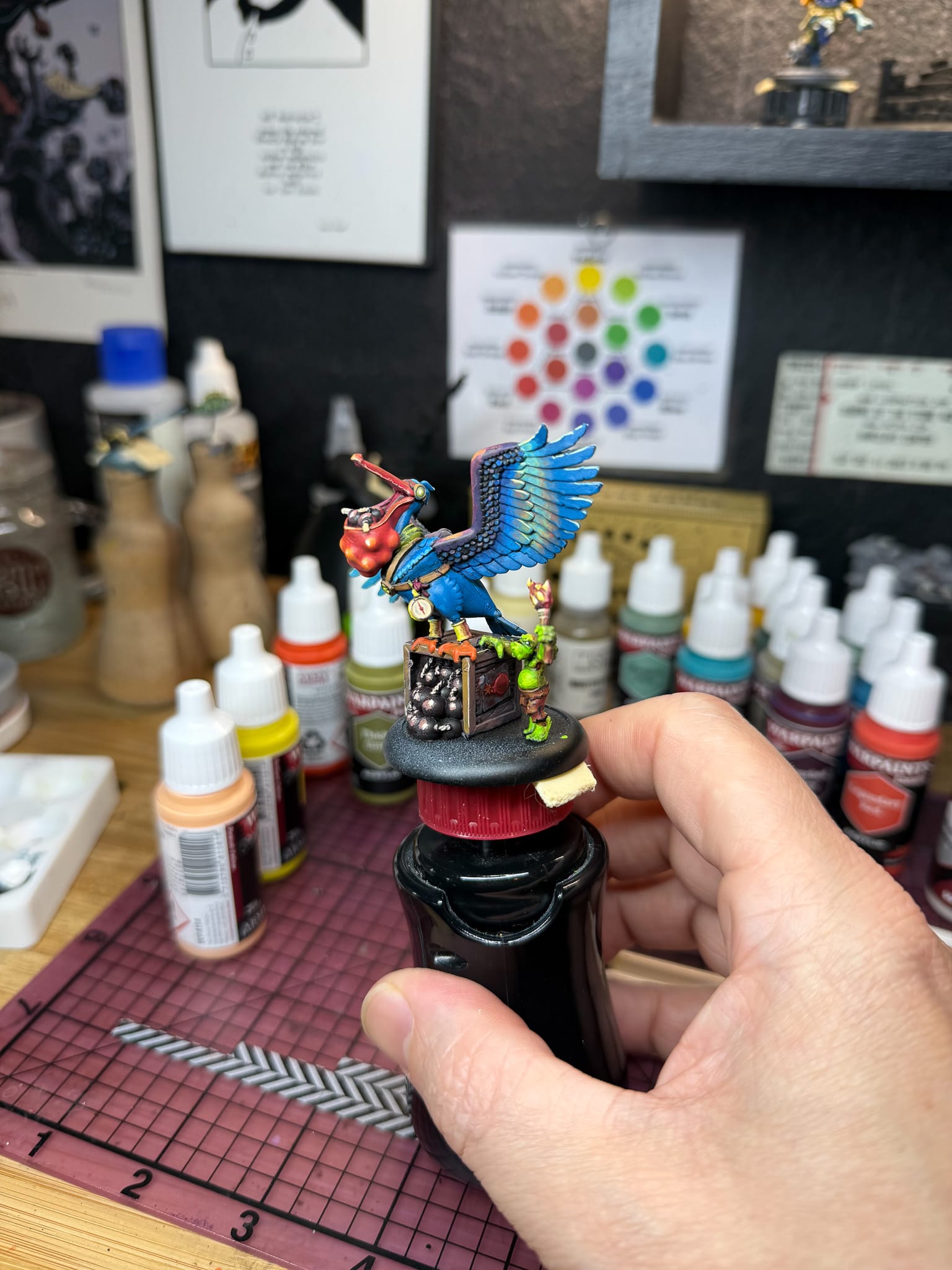
Our bird, finished! Vol 3 and Vol 4 work together wonderfully well.
And with that, the model is complete. But what about these paints? I really love them. Since receiving them, I haven't folded them into my collection because they feel so special to take out of the package, and the arrangement of colors feels so perfect. At the top of this, I mentioned how the Masterclass volumes feel like a paintset on their own, and I really want to highlight that again. Masterclass 1 and 2 brought incredible tones for light and dark, with special shades, metallics, and the best yellow and red the set has to offer. These sets fill in the gaps with cool and warm tones, and all together, the entire set could exist as everything a painter could need. As of this writing, I just noticed that AP has a full "Masterclass" set available for pre-order:
Moreover, I don't really have any critiques or concerns about this paint either. In my testing, I found each paint performed equally well; they blend very nicely, and they thin down without any real loss. This doesn't often happen for me, but I have no choice but to give these paints my highest recommendation.
I hope to see more of this collaboration, but this whole spectrum is pretty great.
The Army Painter John Blanche Masterclass Vol 3 and Vol 4
Phenomenal
If John Blanche Vol 1 and 2 were fantastic additions to the Fanatics paint range, Vol 3 and 4 are perfect.
Pros
- Wonderfully cold paints in Vol 3
- Bright, natural colors in Vol 4
- Heavily saturated paint that is consistent
Cons
- If you're looking for neons, they won't be here.
This review is based on a retail copy provided by the publisher.