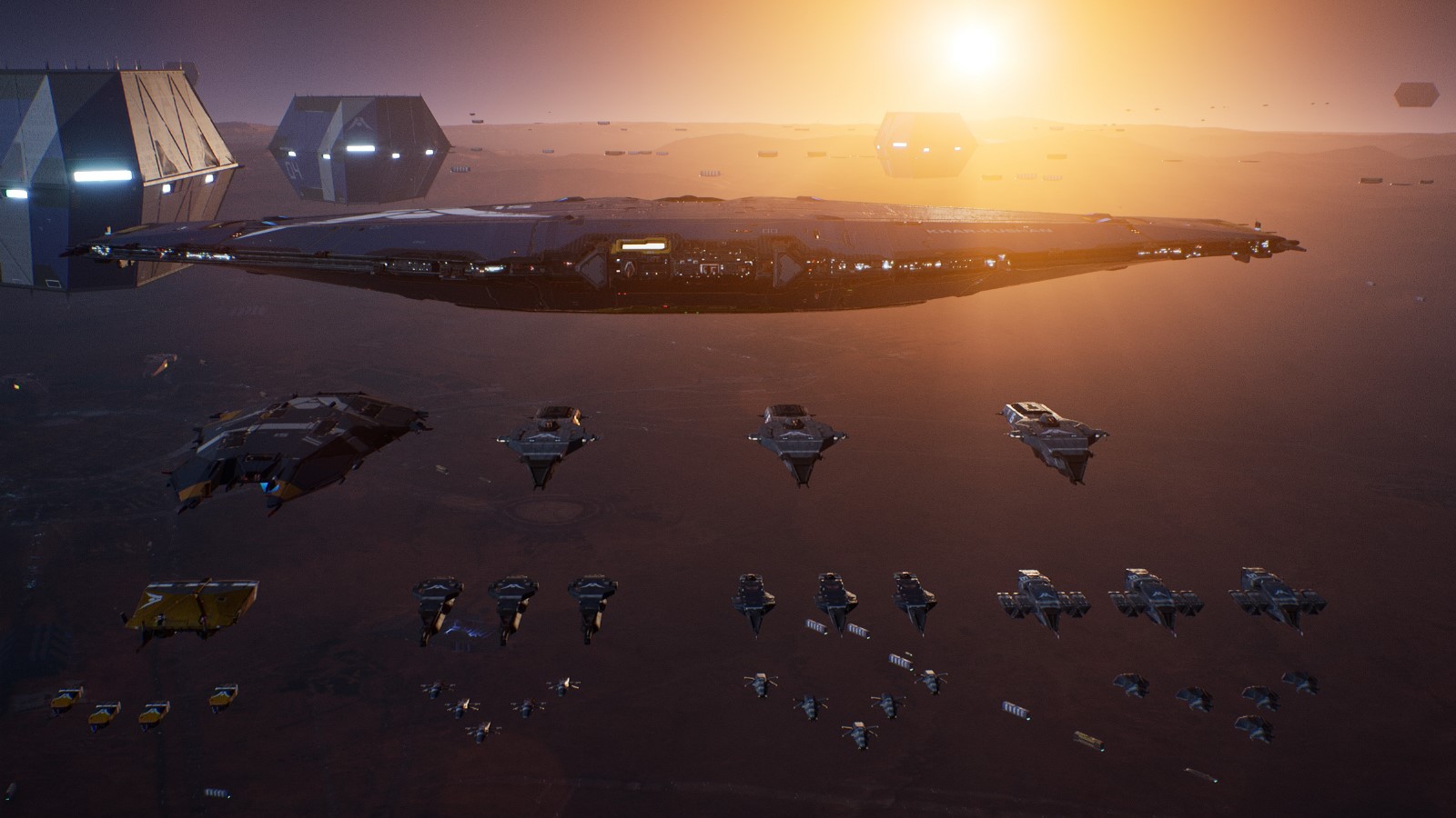
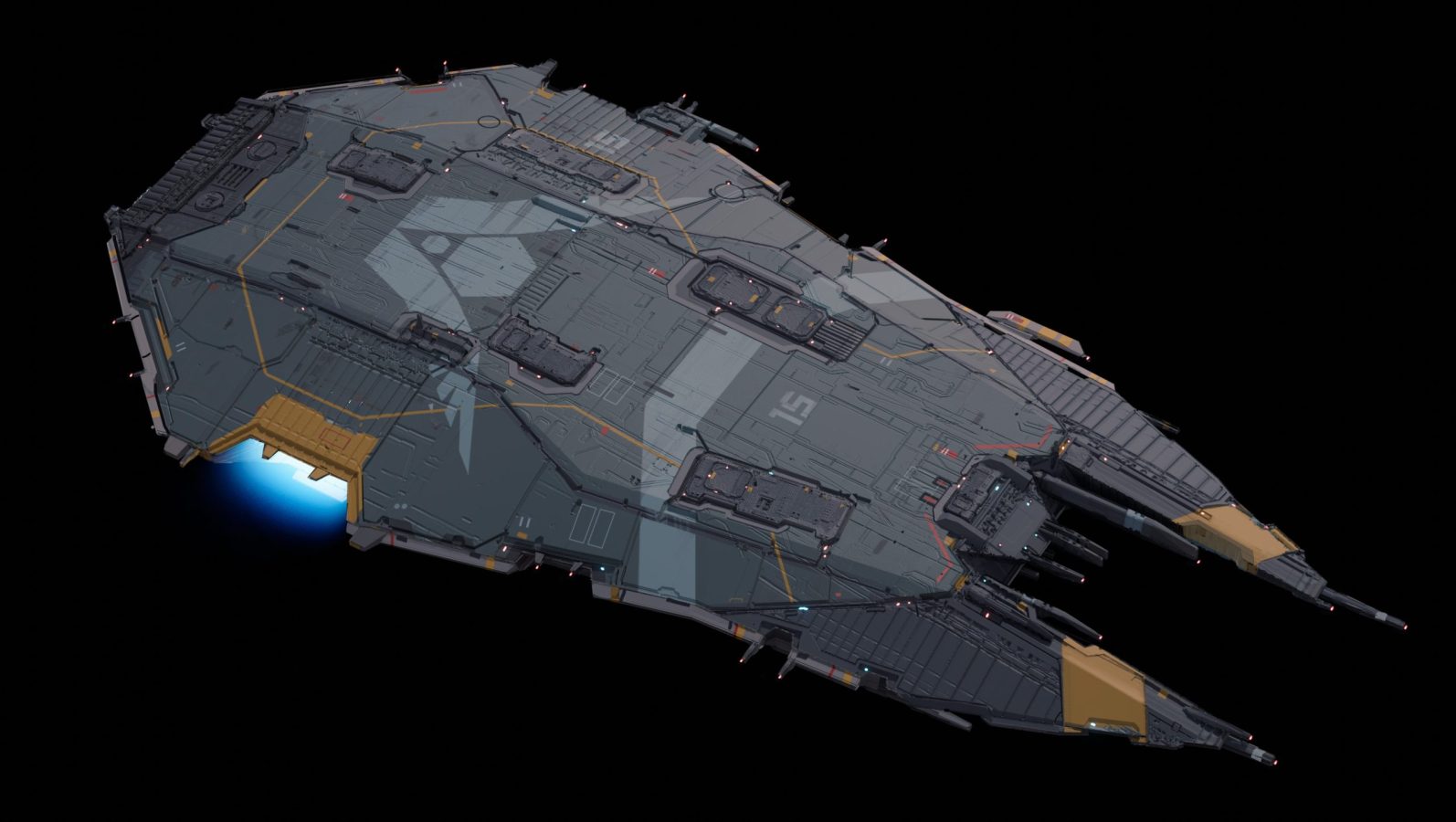
Homeworld 3 has unveiled a new Capital Class Vessel, the Hiigaran Carrier. In a new blog post Blackbird Interactive Art Director Karl Gryc goes into detail as to how the ship was created. You can check out the blog post which includes a ton of interesting illustrations or you can read below to see what he had to say about the creation process:
One Long Sketch “The Carrier”
During the Gamescom Trailer release, with a notepad in hand both the Gearbox and Blackbird team nervously lurked the community threads. A little scared but also extremely excited to see what the Fans had to say. Today I’d like to talk about “The Carrier” and all that goes into designing units for a Homeworld game.
Let me start by saying, nothing hyperspaces past the Homeworld Community. It makes this game such a labor of love for the team. You are correct, that is the same Carrier “cereal box” from the release trailer but reskinned for the Kalan Raiders. Before I show you the Hiigaran Carrier, let’s dive into some history.
Sometime in 2020 we were workshopping ideas for the Kalan Raiders, back then we just called them Pirates – the story was still very early in its evolution and we focused more on their visual backstory. Design needed a small fleet to introduce early game mechanics and the only nugget for faction identity was “Pirates that hide in terrain fields” Our first intuition was to start with some earlier concepts from Homeworld 2 to get inspired. The concept team came up with the idea of using the Civilian Tanker from Homeworld 2 as a base with the backstory of Pirates stealing civilian ships retrofitting them as their own. The idea sounded solid, so we built it in traditional linear development from early sketches, full concept, even building a final asset to be used in game. We went so far that it was the basis for our capital destruction system.
The Pirate Carrier was very far in production, but at the back of my head it just didn’t feel right. Something just didn’t quite mesh with the rest of the Raiders faction identity- their visual language was more brutalist and imposing with angular lines and animalistic pageantry. Rob Cunningham finally put it into perspective, it was “too derivative of Homeworld 2 and doesn’t feel fresh”. He was right. So I parked the problem for another date to gear up for our first gameplay trailer. We were moving rapidly sketching, building, texturing, and adding polishing touches on the Hiigaran Faction. The Hiigaran Carrier was being developed to the same level as the Pirate’s – but things were still very early in their creative process and not every piece was fine tuned. Like an orchestra, if an instrument is out of tune the whole composition just doesn’t feel right. We knew it, but more importantly the fans knew it as well.
The Carrier was not worthy of a Capital Class Vessel. The Mothership had such a strong visual identity, but the Carrier…well it was the instrument that was playing a different tune. With any decision on the project, you have to think lateral and editorial. Time spent minus time left multiplied by creative intentions to the nth power of fans -we dropped our first KUNDE design of the pirate carrier and retrofitted the Hiigaran “cereal box” Carrier…there was a breath of relief! The design just fit much nicer with the Kalan Raiders which allowed us to burn through a new improved design for the Hiigaran Carrier.
Before I discuss the Hiigaran Carrier art and design intentions, I need to give context to the overall fleet design. At the start of the project we knew the narrative was going to take us down a different path than the previous games. The original mothership was a colony ship that took an epic road trip across the stars. It was much softer with rounded features. This really supported the intention of a non-combat ship but for Homeworld 3 we’re taking the player on an epic space battle. The mothership started in horizontal orientation but as we developed the look it became more diamond cut, more battle ready and sleek like a next generation navy ship. With that as our visual guidestone, we had to build something that complemented that design ethos.
We did a few variants, but eventually found ourselves circling the same design – A wide diamond cut body that is more armored with a fork nose for frigate production and a side bay for fighter deployment. So we took all the concept sketches and refined it, then refined it more when building the final unit. There are many things that we need to consider such as the speed of the ship also being much faster than previous games, then the shapes and sizes of all the units it would need to produce. The biggest wildcard was the resource controller, it was much wider than frigates and already a unit that was further along in production. Once again, thinking laterally during development we had to widen the bay but preserve the diamond cut armored top.
With an overall shape set, the unit continued to develop during its production stages. From iteration on how the panel logic was distributed along the surface to the arrangement of antennas along the exterior. Every square inch continues to be scrutinized through all stages of development. We’re still not completely done with the carrier, there is more room to polish but at the end of the day, the path to building ships for Homeworld 3 is never linear, it’s one long sketch.
Stay tuned to Gaming Trend for all your gaming, tech, and entertainment news!

