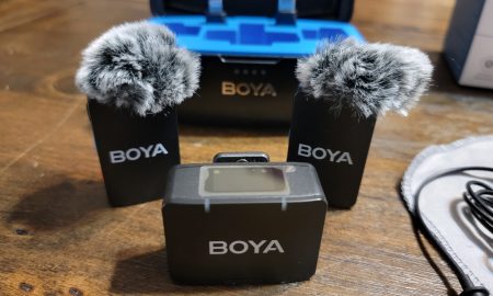
Eel Snave
Gaming Trend Senior Member
Offline
Posts: 2703
|
 |
« on: May 20, 2008, 05:16:18 PM » |
|
I'm currently designing an interface for a turn-based strategy game, and I'm having a little trouble coming up with ideas. I can't do anything transparent (AFAIK), but I'm kind of stuck.
Most turn-based games go with an interface underneath the action, but I've also seen quite a few that put the interface along the right side. Which is preferable to you guys?
|
|
|
|
|
Logged
|
|
|
|
Lordnine
Gaming Trend Senior Member
Offline
Posts: 952
Lord of the Rutabagas
|
 |
« Reply #1 on: May 21, 2008, 05:36:21 AM » |
|
Bottom. Side interfaces make me feel claustrophobic.
|
|
|
|
|
Logged
|
|
|
|
Knightshade Dragon
Administrator
Gaming Trend Senior Member
Offline
Posts: 20389
|
 |
« Reply #2 on: May 21, 2008, 12:38:08 PM » |
|
Bottom. Side interfaces make me feel claustrophobic.
Agreed, but transparent 'sidebars' are also useful if you allow folks to move stuff around. I tuck stuff like 'rest' into the lower right corner in my MMO's, for instance.
|
|
|
|
|
Logged
|
|
|
|
YellowKing
Gaming Trend Senior Member
Offline
Posts: 2255
|
 |
« Reply #3 on: May 21, 2008, 02:31:26 PM » |
|
For a strategy game, I vastly prefer the bottom interface. Like KD, I also use some sidebars in my MMOs, but those are almost always customizable and can be resized/dragged around to be as unobtrusive as possible.
I thought the most recent Command & Conquer's interface on the right hand side was horrendous. I got used to it enough to beat the game, but it still annoyed the crap out of me.
People like myself with widescreen monitors don't want 1/3 of their monitor cut off by an interface. My hunch is that just like with a television, width is more "important" to people than height. This is the same reason I can't stand when a console game only offers split-screen play via a vertical division of the screen.
|
|
|
|
|
Logged
|
|
|
|
wonderpug
Gaming Trend Senior Member
Offline
Posts: 9675
hmm...
|
 |
« Reply #4 on: May 21, 2008, 02:42:13 PM » |
|
Most turn-based games go with an interface underneath the action, but I've also seen quite a few that put the interface along the right side. Which is preferable to you guys? Does it have to be a rectangular block or can it be a more creative shape? I'd vote for having it stuffed in the corners, overflowing minimally to the bottom middle if necessary. If the game happens to be hex based then it'd be a perfect match to have the viewing area turned into a squashed hexagon.
|
|
|
|
|
Logged
|
|
|
|
Eel Snave
Gaming Trend Senior Member
Offline
Posts: 2703
|
 |
« Reply #5 on: May 22, 2008, 09:04:07 PM » |
|
Most turn-based games go with an interface underneath the action, but I've also seen quite a few that put the interface along the right side. Which is preferable to you guys? Does it have to be a rectangular block or can it be a more creative shape? I'd vote for having it stuffed in the corners, overflowing minimally to the bottom middle if necessary. If the game happens to be hex based then it'd be a perfect match to have the viewing area turned into a squashed hexagon. Huh. Interesting. I never thought about that way... I've been toying with a right-side interface for a bit, just because I like them, but lately I see a lot more games going with bottom interfaces. I can tuck some buttons off to the side maybe. I'm not sure yet. Keep the suggestions coming...
|
|
|
|
|
Logged
|
|
|
|
Eel Snave
Gaming Trend Senior Member
Offline
Posts: 2703
|
 |
« Reply #6 on: May 29, 2008, 04:25:09 PM » |
|
So, here's my interface design thus far. The stuff in the main screen is a stretched & distended screenshot of the game I'm shamelessly ripping off. I like how it's coming.
|
|
|
|
|
Logged
|
|
|
|
Eel Snave
Gaming Trend Senior Member
Offline
Posts: 2703
|
 |
« Reply #7 on: May 29, 2008, 04:31:49 PM » |
|
Oh, and also my game logo.
|
|
|
|
|
Logged
|
|
|
|
Larraque
Gaming Trend Senior Member
Offline
Posts: 2392
|
 |
« Reply #8 on: May 29, 2008, 06:41:09 PM » |
|
Keyboard shortcuts for everything.
|
|
|
|
|
Logged
|
|
|
|
wonderpug
Gaming Trend Senior Member
Offline
Posts: 9675
hmm...
|
 |
« Reply #9 on: May 29, 2008, 06:46:03 PM » |
|
In the bottom right corner there should be a giant "LET'S GET DIGGING!" button.
|
|
|
|
|
Logged
|
|
|
|
Eel Snave
Gaming Trend Senior Member
Offline
Posts: 2703
|
 |
« Reply #10 on: May 29, 2008, 07:03:40 PM » |
|
In the bottom right corner there should be a giant "LET'S GET DIGGING!" button.
Is there room in your fan club for one more?
|
|
|
|
|
Logged
|
|
|
|
wonderpug
Gaming Trend Senior Member
Offline
Posts: 9675
hmm...
|
 |
« Reply #11 on: May 29, 2008, 07:32:55 PM » |
|
In the bottom right corner there should be a giant "LET'S GET DIGGING!" button.
Is there room in your fan club for one more? I'll join your fan club if this project works out! I did a triple take when I saw your screenshot mockup.
|
|
|
|
|
Logged
|
|
|
|
Turtle
Gaming Trend Senior Member
Offline
Posts: 8280
|
 |
« Reply #12 on: June 26, 2008, 07:27:27 AM » |
|
There's really no need for a giant "File" button on screen, it just takes up valuable play area. Most of the time the game menu is called up via escape or F10. If you really need a button you can just make it an small button with a small icon either in the top left or right, or on the dashboard.
I'd advise against Black letter fonts like the ones you're using. They aren't very readable, especially at smaller point sizes. This makes you size them up much larger than needed, taking up more precious space on the dashboard. Use them sparingly for titles and such, then just use a more standard font to convey the normal information. Consider looking at what type families best represent the setting and mood that your game wants to convey, then choose a readable typeface in that family to be your main text.
Consider using more icons to represent things. You have "Crowns" spelled out in big blackletter type when all you need is a gold coin icon. Same for income and expenses.
Also, you could get by with just the minimap in a corner surrounded by small buttons to call up specific windows as needed, with most of the game information presented as pop up windows based on context (selecting an object, holding the mouse over an object, etc...)
|
|
|
|
|
Logged
|
|
|
|
|